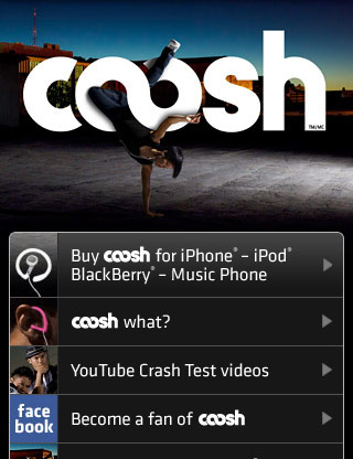
What I find interesting is that personal preference lies with the ones that tend to imitate iPhone apps styling. They don't necessarily have to be the same colour, but curved edged boxes that hold the main content or links is styling that I seem to like more so. Or alternatively, big chunky links - both of which are illustrated above.
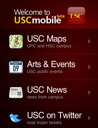
Nonetheless, there are a few things that I've picked up from this roundup and have proved encouraging/inspirng. Take this one below which shirks traditional navigation options layouts:
The navigation options are tucked behind a drop down list. This makes the styling cleaner - a benefit. However, by positioning the navigation drop down close to another button, it could prove more difficult by pushing the wrong one, due to their close proximity on an already small screen.
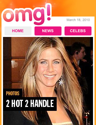
Also, listed in the Webdesignerwall round-up is an example of an already existing gossip site, so that means that Gossip Blox will now probably be shelved. I like the designs created so far, so I shall just have to repurpose for artifact 5 instead.
@
No comments:
Post a Comment