So then, that's one term done.
I've had my presentation today and showed the three pieces of work. One hour before going down to Waverley I actually lost my powerpoint somewhere in computer land, which I'd spent about 6 hours thinking about and making! So I had to put down the bare necessities on another and go with the flow.
They suggested areas that I can look at on the side, that being broaden and try unusual new things (manga for instance). These bits of work don't need to be long and elaborate, just simple dummies as experiments. Have fun with it too! No need to be all serious and deep!
So I'm gonna take this on board... and basically, play around! I'm allowed to! You only get a 3rd if you do course set stuff. So the more the better!
@
Tuesday, 11 December 2007
Sunday, 9 December 2007
interactive narrative - "love thy neighbour?"
The last little bit of interactive narratives is to comment on a peer's piece of work.
However, as of now, I think people may be in the same boat as myself - probably wondering how to get it online!
As soon as I find someone's work, I'll post right back here...
@
However, as of now, I think people may be in the same boat as myself - probably wondering how to get it online!
As soon as I find someone's work, I'll post right back here...
@
interactive narrative - evaluation&conclusion
It has definitely been a learning curve in this last project of the Narrative module. But as of now, I am able to use Flash, know where to find things, and how to get it to do things (most of the time!)
But at long last here it is: 'Suburbia - bliss?'
It is all fully functioning, the buttons link to the right places, the sound cue and sync with the correct frame. Lastly, and most importantly, it tells a story, an interactive story.
 Suburbia - bliss?
 One Shot
 Killer Shoes
We were told that narrative was the primary focus for this piece and I believe I have tackled that aspect well - the main message of my piece being 'get help'. It also highlights the difficulties that people do have to live through, and although a narrative, I want it to reflect and make aware that this is not just a story, but reality.
I was worried at one stage that this was more a click the next button interactive piece (which is really no different to turning the page in a book) and thereby wasn't really interactive at all. However, to combat this, I included more options than I originally envisioned. All the options still run across the same story timeline, but result in slightly different outcomes along the way.
What I also believe works well, as I mentioned before in my media post, are the images that really capture the moment: the sadness of Sarah, the awfulness of Steve's actions/personality. Words can tell a narrative, but to really connect with an audience, the images that we as human beings are able to read and interpret, are much more convincing and engaging.


(Seeing as Blogger is now owned by Google, this image is all part of the family so I'll use it here!)
I did pursue the use of housing estate plans that building firms originally create for their plot layouts. I must admit its quite basic, but had this been about the art, I would have put a lot more into it.
In addition, they are only little bits, but the sound effects that play in the background, the chopping of the carrots, the ironing sound, the beeping of the keys as she uses the phone - all little touches that help make it more realistic. If I had completely omitted them, they wouldn't noticeably be missed, but included, I believe, is far better for the piece as a whole.
But at long last here it is: 'Suburbia - bliss?'
It is all fully functioning, the buttons link to the right places, the sound cue and sync with the correct frame. Lastly, and most importantly, it tells a story, an interactive story.
The whole process of making this has been again an enjoyable one, quite fulfilling, if tedious at times (blame the darn computers!)
I am really happy with this piece as it is the first of its kind that I have ever produced. The images I took are all relevant, and in my opinion, really lend themselves to the telling of the story. It is true that a picture can tell a thousand words, and I have to thank the people who were involved in the shooting and recording process.
My other projects in the Narrative module have been edited so in effect, are mostly devoid of bright, vibrant colour (or none at all in 'One Shot'), whereas in this one, it makes a change to feature the full colour world we live in. -This being the reason I didn't go for any effects, as I wanted this piece to be realistic, so left it as it was captured by the camera.
 Suburbia - bliss?
 One Shot
 Killer Shoes
We were told that narrative was the primary focus for this piece and I believe I have tackled that aspect well - the main message of my piece being 'get help'. It also highlights the difficulties that people do have to live through, and although a narrative, I want it to reflect and make aware that this is not just a story, but reality.
Initally, the brief told us that we had to have a minimum of 7 images. I honestly couldn't see how you could tell a convincing narrative in this at all - it would be over before you'd really started. Hence, when I set about taking the pictures, I didn't limit myself, I just shot and captured what I thought was needed to fulfil and give justice to what I was trying to tell. In all, my piece features over 40 images! (Only a tad more than the minimal 7 I hear you say!)
I was worried at one stage that this was more a click the next button interactive piece (which is really no different to turning the page in a book) and thereby wasn't really interactive at all. However, to combat this, I included more options than I originally envisioned. All the options still run across the same story timeline, but result in slightly different outcomes along the way.
Importantly, a convincing narrative I believe is one that engages the audience. Hopefully I have managed to achieve this, and if we turn our attention to the character profiles moulded, it could be here that goal is met. The audience should be on Sarah's side, feeling sorrow and sadness for her. On the other hand, Steve should seem quite a horrible, nasty character, even distasteful. If the audience are able to feel this, it means they are engaging with the piece, being involved in what's happening. The icing on the top of the cake is that they can then influence the progress of the story they are seeing unfold. They should be eager and looking out for the next opportunity to help Sarah out and get her help/to safety. -The very essence of an interactive narrative.
I did have to pay attention to the sensitive subject that I was talking about. Sound clips I could have included at the start, maybe just a little jingle, wouldn't have fitted with the violence, and could have proved distasteful so I made sure the dialogue, sound, and images were all as appropriate as possible. The instances where we do see violence, it isn't too over the top, not making light of the subject, but instead, is straight forward, so the audience can get the gist, and then not to have to see a nasty fight ensuing, proving uncomfortable if not done well / correctly.
When it came to the recording of the sound clips for the dialogue, I tried to make sure the vulnerability of Sarah was brought over as much as possible. I wanted everything to sync in together, i.e. to see a hurt Sarah, to hear a hurt Sarah, and to feel for hurt Sarah. To have someone talking flatly, and without feeling would draw back from what this whole piece could provide as an experience: I wanted it to be convincing, not just a project that I'd been set, which needed sound and so I recorded sound.
The original template used big yellow, arcade game style buttons.
This didn't fit with the navigation I wanted to implement, so I had to create a host of buttons. In all, I made forward buttons, similar to that on audio equipment, back buttons, in addition, to 'yes', 'no', 'kitchen', 'lounge' and other scene specific buttons.


This didn't fit with the navigation I wanted to implement, so I had to create a host of buttons. In all, I made forward buttons, similar to that on audio equipment, back buttons, in addition, to 'yes', 'no', 'kitchen', 'lounge' and other scene specific buttons.


In addition, it was really a must that I use a different style from the arcade style gamer buttons as it simply wouldn't have fitted with the domestic violence premise.
What I also believe works well, as I mentioned before in my media post, are the images that really capture the moment: the sadness of Sarah, the awfulness of Steve's actions/personality. Words can tell a narrative, but to really connect with an audience, the images that we as human beings are able to read and interpret, are much more convincing and engaging.


The title screen that opens the piece I would have liked to use a Google Map satellite image of an area of suburbia - exactly what the piece is about. However, there being problems with copyright, I went about making something in the vein of a house estate plan.

(Seeing as Blogger is now owned by Google, this image is all part of the family so I'll use it here!)
I did pursue the use of housing estate plans that building firms originally create for their plot layouts. I must admit its quite basic, but had this been about the art, I would have put a lot more into it.
In addition, they are only little bits, but the sound effects that play in the background, the chopping of the carrots, the ironing sound, the beeping of the keys as she uses the phone - all little touches that help make it more realistic. If I had completely omitted them, they wouldn't noticeably be missed, but included, I believe, is far better for the piece as a whole.
The downside that I experienced during the piece came in the form of coding simply not functioning. It wasn't just myself, others experienced the same trouble with it looping, and on checking, correcting and then re-checking the coding script, it still wouldn't work. Very annoying. The only way I knew how to properly correct it without any doubt, was to simply start over. And that I did. It may have proved a bonus though, as in effect, it was the third time I was dealing with the scripting (first was simply to play with Jool's template script, second I manipulated to incorporate all my buttons) and so I was able to watch out for and progress past previous mistakes I'd made. And it worked!!
Lastly, this isn't really anything to do with the work but incorporating the images, the sounds, the text meant that Flash was using quite a bit of processing power. This added to the tediousness of having to wait for it to load, then load when testing the movie. So a powerful computer does help. In addition, (and I actually learnt this along the way), instead of using the high resolution images captured by the camera, compress them down, so they can be worked with, more easily! You cannot tell the loss in quality and it makes life for you and the computer a lot easier.
If I were to do this project again, I would maybe consider doing a happy, fun concept for a change! In no way is the piece I've created bad, or worse off because of being a more serious, deep premise, in fact, I think if offers more to explore, but I think I can excel equally in light hearted, happy ventures, whilst still telling important messages.
Also, whilst thinking through the interactive parts to Suburbia, I originally intended to use image map type links, hiding them in the picture, sort of like the Myst games, where you have to really look what needs to be done, to progress. However, I was met with other challenges before I came to this in Flash, and so had to opt for a more simple button format, just to ensure I could get the whole thing to run from start to finish. Therefore, attempting at trying something like image mapped navigation would be a definite option I'd like to pursue. It would add to the professionalism of the piece, making it seem more sophisticated. However, on the other hand, it could cause problems with the viewer, in that they might find it more difficult to progress, not being aware of what and where the links are situated - something I'd have to consider.
Overall, I am very pleased with Suburbia, quite proud too. It fulfills the original brief, along with the rules set out: at least 7 images, image, text and audio seriously examined, use Action Script 3.0 to build interactivity, individual assignment. It has also acted as a learning opportunity that I've been able to undertake, in Flash. I was able to draw on my previous experience from English when implementing the natural speech featues and crafting the narrative, but then also IT and the technical side to pull it all together, in a tidy, good looking package.
I feel I am now fitting in more as a Multimedia practionier. It is now quite easy to make a movie on a computer, whereas to make something like this, takes a little more effort and knowledge. Ok, Flash isn't that hard to pick up, but still, I'm building abilities and know-how in industry used software, as well as opening up to more platforms for use in Multimedia.
@
interactive narrative - re testing
Well, the reports are in and Suburbia needed a few tweeks here and there.
Firstly, I have learnt that the text box option doesn't wrap the text. In the editing mode, when you get to the edge of the line it places the next word on the line below. However, in preview and publishing mode it simply disappears outside of the box. This is the first instance of what I needed to alter.
Secondly, the sound clips for some reason wouldn't always start at the very beginning. I couldn't reason or find out why this was, maybe it is something Flash has a special way of altering, but it definitely proved a problem when trying to get the clips to all play properly. Luckily, it didn't prove too much a problem as I had left some blank space at the start of all these dialogue clips, so it only meant having to alter the dialogue text that accompanied the frame.
The last occasion in which I needed to alter the piece was that the dialogue boxes I used at the start were transparent. At the time of making them, I could read the text and all was legible. However, through testing I found that you couldn't make everything out. This was solved simply, by selecting the option to frame and fill the box and thereby make it all viewable.
Now all that's left to do is publish in the two formats (html and swf) and the job as they say, is a good un!
@
Sunday, 2 December 2007
interactive narrative - media: text, sound, images
The interactive piece I am making features 3 types of media: text, sound and image. Each plays and brings a different part to the overall feel and meaning of the piece.
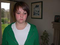

On the other side, this picture shows the negative aspect of emotion: anger or nastiness, painting Steve as the clear villain. The dominance he has in the picture, he is right in the centre, fills it from top to bottom and there is nothing to distract our attention away from him. Again, the look on his face tells a thousand words, no text is needed to say how he feels. The audience should be involved with the piece in that I've created this to make a feeling of strong dislike towards Steve. He clearly isn't in the right throughout the piece, in any way, at all.

This line has several aspects to it. 'I'll start over again for you' shows that she is still willing and wants to do things to please her boyfriend ('for you'). We have Sarah blaming herself, a typical act of somebody enduring domestic violence, which she apologises for too, showing a submissive position. Also, the last bit of 'you don't like carrots' shows this is a petty thing for Steve to have gotten angry over. The audience should be able to see the unfairness of how he treats her and thoroughly feel sorry for the girl.
This line occurs when at last she is seeking help. Her hesitancy shown by the dots/elipsis, shows she is timid and scared, especially to talk about this subject. In addition, the use of 'I think' again reveals something emphatic in that she is unsure in whether she is in need of help. She is unsure on whether she is being out of place or if she should be able to deal with this. The audience may perceive this as the turning point, a break through. They should want to get on with the story in aid of finding that help, whilst also feeling sadness from her above mentioned emotions.
This line from Steve lets us see that he demands things of Sarah 'where's my dinner?', as well as using "Oi" to get her attention, quite bluntly and rudely. He also puts her down by saying that she forgets things - this may well be true, but nonetheless, it isn't nice for partners to be voicing this opinion. It would come as quite a hard hitting negative. The accumulation of Steve's dialogue should completely dissuade viewers from finding him to be a likeable character, helping them to cast opinions about him and engaging with the story.
The dialogue I took a few attempts at recording with the actress. We did it using different types of intonation: soft, quickly, powerful. The voice used seems quite soft, unharmful. Contrast this then with the deep, alpha male type voice I created for Steve and you can see a distinction. I created Steve's voice using a program called Audacity. Here it gives you the options to amplify, change the speed, and even the pitch. This came in useful as the male voice I recorded, in my opinion, was higher for what I wanted. So editing it in Audacity produced a better result.
From our brief, one of the rules lists:
'It is important that image, text, and audio are seriously examined in an attempt to truly consider audience engagement and interaction'
The images I have taken, for me, make up the main part of the piece, they are story telling.It would be a rough understanding, but you could follow the pictures throughout and get what this piece is on about, without text or speech.
On another level however, the images are highly emotive. Talented authors can certainly draw out great feeling from their readers by use of finely crafting the words and syntax in their texts. Images too have the ability to do the same thing.

This picture, for me, really says it all. (If you maximise the picture) you can see the emotion in Sarah's eyes, her sadness. The way they are looking down, as in, she cannot even look at her boyfriend who is ordering her about, creates a real vulnerbility. It is one of the skills, us, as humans are able to do: communicate through body language, and so, anybody looking at this picture should be able to fully understand what is happening, how she is feeling and how you feel for her; thereby engaging in the piece. Definitely emotive.
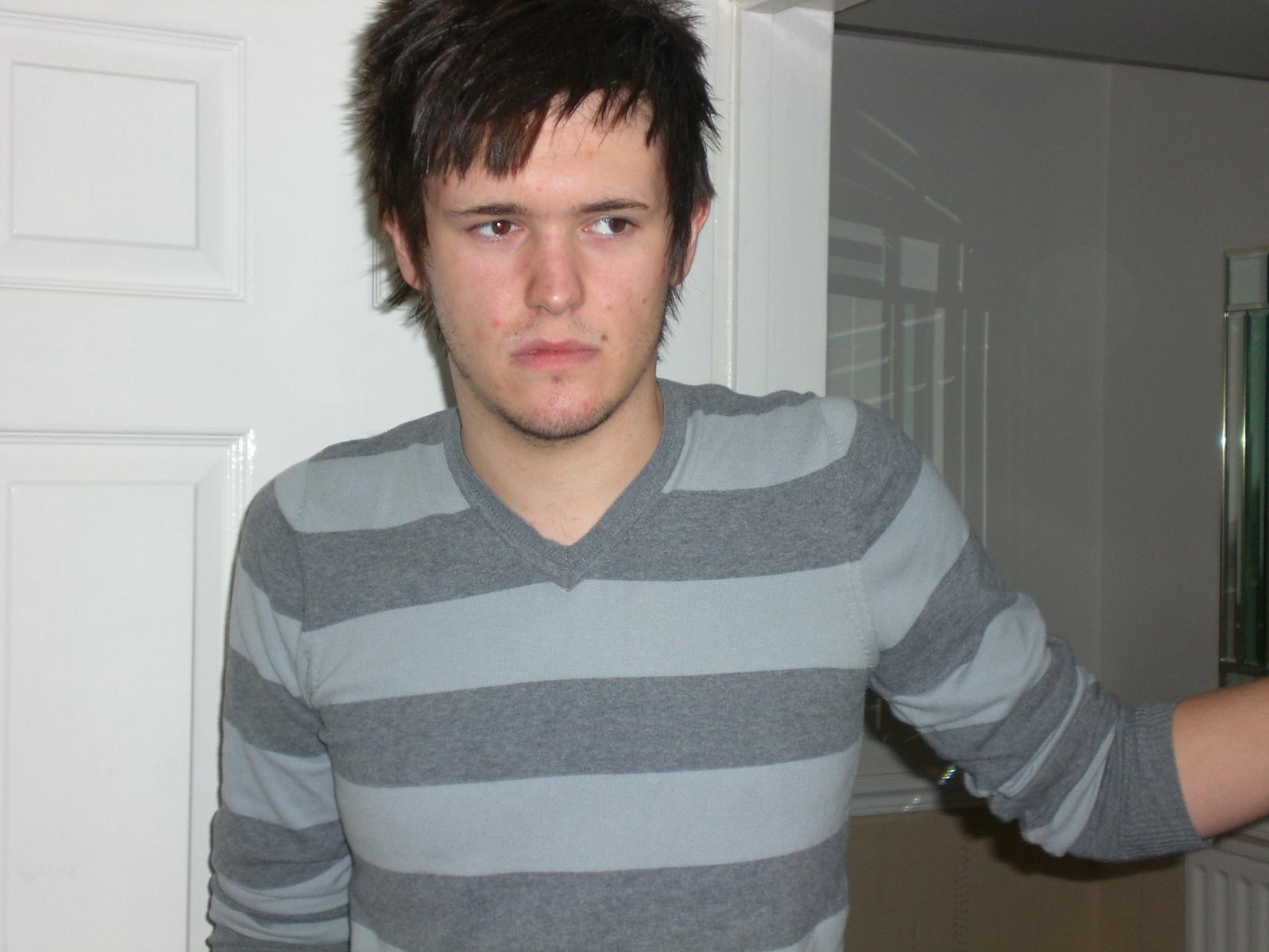
On the other side, this picture shows the negative aspect of emotion: anger or nastiness, painting Steve as the clear villain. The dominance he has in the picture, he is right in the centre, fills it from top to bottom and there is nothing to distract our attention away from him. Again, the look on his face tells a thousand words, no text is needed to say how he feels. The audience should be involved with the piece in that I've created this to make a feeling of strong dislike towards Steve. He clearly isn't in the right throughout the piece, in any way, at all.

This is quite a dynamic shot, focusing on the violent action. His arm is raised, quite close to her face, whilst the knife remains in place meaning she can't thrash out against him. Again, the dominance is represented by Steve being the most forward, foregrounded?, whilst Sarah is behind him, further back in the shot. The body language displayed by Sarah, particularly her facial reaction shows this to be a VERY uncomfortable, horrible and dangerous situation. The audience should definitely be able to perceive this, whilst at the same time being shocked at Steve's actions, a sort of gasping moment?
The various pieces of text in the form of narrative or dialogue help build up the scene. I have been careful to word the piece and structure it so to replicate realistic situations - so the text can be found to use features of natural speech (elipsis, colloquial language, dialect).
"I'll start over again for you. I'm sorry. It's my fault. I forgot you don't like carrots."
This line has several aspects to it. 'I'll start over again for you' shows that she is still willing and wants to do things to please her boyfriend ('for you'). We have Sarah blaming herself, a typical act of somebody enduring domestic violence, which she apologises for too, showing a submissive position. Also, the last bit of 'you don't like carrots' shows this is a petty thing for Steve to have gotten angry over. The audience should be able to see the unfairness of how he treats her and thoroughly feel sorry for the girl.
"I don't think... I don't think I can take this anymore"
This line occurs when at last she is seeking help. Her hesitancy shown by the dots/elipsis, shows she is timid and scared, especially to talk about this subject. In addition, the use of 'I think' again reveals something emphatic in that she is unsure in whether she is in need of help. She is unsure on whether she is being out of place or if she should be able to deal with this. The audience may perceive this as the turning point, a break through. They should want to get on with the story in aid of finding that help, whilst also feeling sadness from her above mentioned emotions.
"Oi, where's my dinner. You're no good at remembering anything."
This line from Steve lets us see that he demands things of Sarah 'where's my dinner?', as well as using "Oi" to get her attention, quite bluntly and rudely. He also puts her down by saying that she forgets things - this may well be true, but nonetheless, it isn't nice for partners to be voicing this opinion. It would come as quite a hard hitting negative. The accumulation of Steve's dialogue should completely dissuade viewers from finding him to be a likeable character, helping them to cast opinions about him and engaging with the story.
-As a side, the general character I sought for Steve is that of a highly sexist man. He expects his partner to cook and clean, whilst he 'goes out to work'. Furthermore, he shows no remorse after being violent towards her, he instead goes down the pub with his mates. He is in no way grateful for what Sarah does for him, this seen by him just dropping his magazines on the floor and also pushing her out of the way when he wants his shirt ironing faster - he is very simply, an abuser of his patriarchal position and exploits her vulnerability - a very unnice man.
The last thing to comment on is the use of sound, more particularly background soundtrack and the sound effects.
The dialogue I took a few attempts at recording with the actress. We did it using different types of intonation: soft, quickly, powerful. The voice used seems quite soft, unharmful. Contrast this then with the deep, alpha male type voice I created for Steve and you can see a distinction. I created Steve's voice using a program called Audacity. Here it gives you the options to amplify, change the speed, and even the pitch. This came in useful as the male voice I recorded, in my opinion, was higher for what I wanted. So editing it in Audacity produced a better result.
When it came to the sound effects and background noise, I think these work well, they are the little touches that make the interactive narrative seem better overall. Instead of just seeing her iron, we have the ironing noise of steam and going across the material. At the start, where we see the front door and are told it is a normal suburban house, there are birds tweeting. It is all these little bits that whilst recording seem stupid, when connected with an image, fit.
I was torn between adding a running soundtrack throughout. Being honest, with Flash being a totally new venture for me, I could predict that I would have problems with getting it at the right volume at the right point, not having it interfere with the sound effects and dialogue. Also, I had no idea what sort of music should accompany it. To just use a soundtrack from a movie would have been simple, but then it might not have been perfect. This is one area in the future where I'll definitely expand: I'm going to pursue getting music produced, whether that being myself on an instrument, or finding a musician around and about!
@
interactive narrative - testing
Well, it happens with everything I do! Surprise surprise, there is a glitch in the programming, meaning something I've written isn't working correctly.
I know exactly where the problems lies, but cannot fathom out why it isn't following my code which counteracts the error. Flash automatically just jumps through all the frames you've included, sort of like a slideshow. What is normally required is to enter "stop ()" into the coding and it recognises that it shouldn't move on. With the links embedded in the buttons, when the user clicks this it then takes them to the next page.
However, mine just simply plays all the frames, slideshow stylee and I just don't why! The code is exact on each and every slide's action settings?
Will have to call on Jools for this.
UPDATE:
Right, well seminar on Tues I found out that I wasn't on my own. Natalie's Flash worked but then decided to go loop de loop like mine. Jools couldn't fathom out what was the cause, only that it may be to do with the coding.
So I have to admit, the one and only way I knew how to fix the problem was to start again. Checking the coding proved that the error didn't lie there, so I have spent today doing it all again. Every single frame, text caption and image. And its been worth the while - it now works!! YAHOO!!
@interactive narrative - flash
Well, after spending a few hours on Flash, watching the tutorials, trying it out on Flash, and then watching the tutorials again, I'm making some progress with the software.


It can get quite difficult and tedious remembering the number button you inserted, then the 'handle click' you're currently working on, and which frame you want 'yesBtn5' to link up to. But I certainly do like the look and feel of what I'm producing. I am now making a point of repeatedly saving just incase I lose it and that means having to go through importing the images, changing the code - all timeconsuming activities, but more over, annoying!
I've always been able to use computers, I can never remember being 'trained' how to make them work, or to do certain things. I always just used to have a go on the ones in the shops and just sort of knew what to do. With Multimedia being my first time at the Adobe Creative Suite, I'll admite I have felt a little lost at first. I'm used to Windows: how they lay everything out, and where to find this button that does that. Adobe on the other hand is a brand new setup for me, so slowly but surely I am having to pick up bits here and there.
Another thing I've noted is that the tutorials aren't quite as up to date as the software, we're on CS3 now, things change, move place and so it can confuse you just a little!
Jools provided us with a template with the coding and so on already included. It had a few plain buttons and so to be understandable to everybody, it is generally quite basic.


I wanted to add to this though, change the buttons, add alternate wording and generally do the yes, no, yes, yes pattern (which works behind scenes) in my own order. Soooo, I've basically only kept the code and built my own from scratch. Whether I'll be thankful or hating this decision, but I've got over 40 shots, so if it comes to the situation that I need to alter code, it's going to take a little longer than 5 minutes!


It can get quite difficult and tedious remembering the number button you inserted, then the 'handle click' you're currently working on, and which frame you want 'yesBtn5' to link up to. But I certainly do like the look and feel of what I'm producing. I am now making a point of repeatedly saving just incase I lose it and that means having to go through importing the images, changing the code - all timeconsuming activities, but more over, annoying!
I'll repeat it again, but this piece is really quite heartfelt, the acting is fantastic in putting over the emotion the girl is feeling. I just hope that I'm not being too easy on the subject, i.e. disrespecting the sensitivity. I worry that I am just being full on, maybe in need of a bit more tact? -But this is all due to the topic I'm covering, so I will focus on this throughout, when reviewing.
What is going to be very important is to perform a testing session. Firstly, to make sure the code all links where I want it to, but also, that the text is all legible and the target audience can follow the story and know what they are meant to click on and do.
In the mean time, I've got to record some dialogue to add over the top. I'll also need to decide whether to include a soundtrack, this may divert attention away from the piece, or not be 100%suitable. I'm a perfectionist so not happy until everything is spot on! Equally though, music could feed into it well. A bit of genre analysis and exploration I think is needed!
@
interative narrative - story timeline and activity
From looking at my scrappy notes of the various things that be ascribed as tasks that could make up the Suburbia idea. I'll now list a few:
- Ironing - Boyfriend needs a shirt to go out with his friends down the pub. She starts ironing and then he is not happy so takes over, pushing her aside from the iron. When finished, instead of offering any thanks, he simply walks out of the room.
- Hoovering - simply using a vacuum cleaner to do the carpet. Maybe introductory, a chance to say this is Sarah, whilst also showing straight off that she has chores to complete
- Tidying up magazines - this serves as having a two part purpose. One, her boyfriend could be reading them and drop them off the floor when he is done, which she then needs to tidy. But also, in that stack of magazines, is a Yellow Pages. This would let the viewer subliminally know, for later on, that is where she needs to go to get a phone number for help.
- Dinner - her boyfriend asks her to make some food. She starts chopping up some vegetables, and he decides that he doesn't want that. Options can appear offering the choice of making something else (submitting to his dominence, but then not putting herself in harms way) or making him eat it (causing controversy and possibly agression, but standing her ground). From this then, the boyfriend turns a knife on her, confirming the threatening violence, but also revealling a bruise or mark on her arm revealing past violence.
---
I have since been home to capture the shots. It worked well in my opinion, and some of the shots are quite unsettling. The narrative is not only displayed through the narration that will appear on screen and then the dialogue that will be added, but also just the stand alone images, where her feelings of sadness are SO obvious and tell a thousand words.
I've now made these into a storyboard type timeline document, where the option of pursuing different routes comes up, this is represented by the double line of action underneath.

I will be using this whilst making my way through Flash and Action Script 3.0. It'll be my first time using the software, so fingers crossed it'll go ok. If not, them o so useful (but then sometimes o so slow) tutorials can be called on for help!
@
I have since been home to capture the shots. It worked well in my opinion, and some of the shots are quite unsettling. The narrative is not only displayed through the narration that will appear on screen and then the dialogue that will be added, but also just the stand alone images, where her feelings of sadness are SO obvious and tell a thousand words.
I've now made these into a storyboard type timeline document, where the option of pursuing different routes comes up, this is represented by the double line of action underneath.


I will be using this whilst making my way through Flash and Action Script 3.0. It'll be my first time using the software, so fingers crossed it'll go ok. If not, them o so useful (but then sometimes o so slow) tutorials can be called on for help!
@
interactive narrative - ideas
Right, it's been a while since I last posted but I've been storing up all my work bits for now.
We've been set our last project in the Narrative module, and this time, narrative must play an important part, technology second. When referring to my Collins dictionary narrative is, "an account, story", but then Jools also expressed that we should make it more meaningful, not just A to B, click randomly along the way. Make it have meaning.
From our seminar session, we've done some genre analysis. From this the main point that everybody picked out about a good, decent interactive narrative is that it has to include or comprise of:
Again, we've been given a free rein or what we can focus on, so when thinking about the narrative aspect, I've decided to pursue a theme and see what ideas I can get branching from that.
"Get help" are the buzz words I've decided to use.
1) Beat the bullies
The first initial idea I gained from this is relating to a school kid. He is at school, and throughout his journey he has to make choices regarding to standing up for himself and getting help against the bullies. Possible interactive options include getting him to choose to walk past the bullies, or take another route, telling the teacher when he see's something not right happening. In addition, a banana skin trick could be included, where the viewer has to spot it and click on it to stop him falling over.
-I like this idea, as it is probably something that everybody can relate to. The various interactive bits would probably turn out to be quite fun, whilst also be reinforcing the idea that pupils should speak out if they are not being treated fairly by others. It would be slightly difficult to be able to get a child, and then be able to capture the images in a school like environment, along with the extras in the form of staff, classmates, the bullies. But definitely a valuable and valid route I could take, fulfilling the interactive and narrative aspects: self directed whilst going through, reading and clicking, engaging to the audience.
2) Suburbia
This idea focuses around violence at home. The title suburbia has quite idyllic, positive connotations and so the contrast in theme should prove a little shocking when the viewer gets going with the story. Again, this fits in well with the 'get help' theme, as possible interactivity in the story would be complying with what the violent partner wants, or risking being attacked again and saying 'no'. Then there's the options of where to find the help, to use the phone to call. Personally, I can picture shots even now, with the girl being so down heartened, and sad, and vulnerable - it just is a really emphatic narrative idea.
-This I think would be a contentious subject to approach, due to it being quite a sensitive subject, however, it does have potential to put over a story, and lend emotion/feeling to the viewer. Really, the audience would be interacting on two parts, that of following the story and choosing the direction of where it goes, but then also, engaging them into feeling for the character: being emphatic. It would definitely create a strong hold on the viewer, being able to connect with their emotions. It wouldn't be difficult to achieve when taking the images either, all the items would be domestic objects readily available. Again, this will definitely fill the interactivity criteria set out earlier.
3) Waste not, want not
This idea comes from the other side of help, as in, the user would be the one helping the character in the narrative. It focuses on quite a hot issue nowadays, that of our use of energy, carbon footprint and recycling. You would be introduced to a messy house where lights are on, taps dripping, cardboard rubbish is waiting to be disposed. The user would have to be alert and turn off, for example, a TV that is playing to itself and instead of buying card, have a rummage and find some that they can recycle.
-This is quite a meaningful idea, as it gives a sort of moral to the viewer. It teaches them about ways of being more eco-friendly. I do question the narrative side though, in that how can it be a convincing story, rather than simply clicking randomly to achieve a goal.
Of these three, when considering the potential to follow through the narrative aspect, I think I may follow up Suburbia.
The Suburbia idea could be fleshed out quite a bit, becoming quite effective in telling a story, reflecting strong emotion. Conducting some research I've found that most victims blame themselves and so there are avenues for the interactivity: I could perhaps pose a rhetorical question, but then open it up for the audience to answer. It would add once more to the sympathy, but also engagement in wanting to help the victim - interactive.
It would also be practical for me to produce, as I can go home where the required amenities of iron and ironing board, cooking stuff etc are available. In addition, from browsing the field, it has shown me that the scenario of needing to get help, experiencing the traumas, worrying about getting help and doing something/or not doing something is a very real occurence - narrative.
I liked the schoolboy idea but worry that I wouldn't be able to get it done and have a professional piece at the end. (It could just appear to be somebody placed in a building, that could be a school but then also couldn't be, and then not really of school age, thereby not really capitalising on the emotive side.) In addition, a negative aspect is that I may not be able to offer that much interactivity, or if I did, it would be quite weak, and not really of great use.
The CO2 idea again I like, could do really easily, but I am drawn to the Suburbia idea due to it being deeper and I feel has more potential to tell a convincing story. The environmentally friendly campaign is one that's very important at the minute, but some users may dismiss it instantly as being maybe a quick novelty game and not find any worth in it.
Consequently, I think I'm going to go down the Suburbia road. As of now, I need to develop and build on that idea.
@
We've been set our last project in the Narrative module, and this time, narrative must play an important part, technology second. When referring to my Collins dictionary narrative is, "an account, story", but then Jools also expressed that we should make it more meaningful, not just A to B, click randomly along the way. Make it have meaning.
From our seminar session, we've done some genre analysis. From this the main point that everybody picked out about a good, decent interactive narrative is that it has to include or comprise of:
- Self directed pursuit
- Reading, clicking and following the links
- Appeal to the audience, fulfil what the audience expect it to do
- Challenging conventions
- Include restraints/limits (so to keep the user on track with what must happen)
Again, we've been given a free rein or what we can focus on, so when thinking about the narrative aspect, I've decided to pursue a theme and see what ideas I can get branching from that.
"Get help" are the buzz words I've decided to use.
1) Beat the bullies
The first initial idea I gained from this is relating to a school kid. He is at school, and throughout his journey he has to make choices regarding to standing up for himself and getting help against the bullies. Possible interactive options include getting him to choose to walk past the bullies, or take another route, telling the teacher when he see's something not right happening. In addition, a banana skin trick could be included, where the viewer has to spot it and click on it to stop him falling over.
-I like this idea, as it is probably something that everybody can relate to. The various interactive bits would probably turn out to be quite fun, whilst also be reinforcing the idea that pupils should speak out if they are not being treated fairly by others. It would be slightly difficult to be able to get a child, and then be able to capture the images in a school like environment, along with the extras in the form of staff, classmates, the bullies. But definitely a valuable and valid route I could take, fulfilling the interactive and narrative aspects: self directed whilst going through, reading and clicking, engaging to the audience.
2) Suburbia
This idea focuses around violence at home. The title suburbia has quite idyllic, positive connotations and so the contrast in theme should prove a little shocking when the viewer gets going with the story. Again, this fits in well with the 'get help' theme, as possible interactivity in the story would be complying with what the violent partner wants, or risking being attacked again and saying 'no'. Then there's the options of where to find the help, to use the phone to call. Personally, I can picture shots even now, with the girl being so down heartened, and sad, and vulnerable - it just is a really emphatic narrative idea.
-This I think would be a contentious subject to approach, due to it being quite a sensitive subject, however, it does have potential to put over a story, and lend emotion/feeling to the viewer. Really, the audience would be interacting on two parts, that of following the story and choosing the direction of where it goes, but then also, engaging them into feeling for the character: being emphatic. It would definitely create a strong hold on the viewer, being able to connect with their emotions. It wouldn't be difficult to achieve when taking the images either, all the items would be domestic objects readily available. Again, this will definitely fill the interactivity criteria set out earlier.
3) Waste not, want not
This idea comes from the other side of help, as in, the user would be the one helping the character in the narrative. It focuses on quite a hot issue nowadays, that of our use of energy, carbon footprint and recycling. You would be introduced to a messy house where lights are on, taps dripping, cardboard rubbish is waiting to be disposed. The user would have to be alert and turn off, for example, a TV that is playing to itself and instead of buying card, have a rummage and find some that they can recycle.
-This is quite a meaningful idea, as it gives a sort of moral to the viewer. It teaches them about ways of being more eco-friendly. I do question the narrative side though, in that how can it be a convincing story, rather than simply clicking randomly to achieve a goal.
Of these three, when considering the potential to follow through the narrative aspect, I think I may follow up Suburbia.
The Suburbia idea could be fleshed out quite a bit, becoming quite effective in telling a story, reflecting strong emotion. Conducting some research I've found that most victims blame themselves and so there are avenues for the interactivity: I could perhaps pose a rhetorical question, but then open it up for the audience to answer. It would add once more to the sympathy, but also engagement in wanting to help the victim - interactive.
It would also be practical for me to produce, as I can go home where the required amenities of iron and ironing board, cooking stuff etc are available. In addition, from browsing the field, it has shown me that the scenario of needing to get help, experiencing the traumas, worrying about getting help and doing something/or not doing something is a very real occurence - narrative.
I liked the schoolboy idea but worry that I wouldn't be able to get it done and have a professional piece at the end. (It could just appear to be somebody placed in a building, that could be a school but then also couldn't be, and then not really of school age, thereby not really capitalising on the emotive side.) In addition, a negative aspect is that I may not be able to offer that much interactivity, or if I did, it would be quite weak, and not really of great use.
The CO2 idea again I like, could do really easily, but I am drawn to the Suburbia idea due to it being deeper and I feel has more potential to tell a convincing story. The environmentally friendly campaign is one that's very important at the minute, but some users may dismiss it instantly as being maybe a quick novelty game and not find any worth in it.
Consequently, I think I'm going to go down the Suburbia road. As of now, I need to develop and build on that idea.
@
Friday, 23 November 2007
aesthetics of my motor car mouse
Right, we've now another task to complete, for SPP1 tutorial but then also set in our lecture.
I have decided to use my mouse as my focus point when considering it's overall aesthetics.


I have decided to use my mouse as my focus point when considering it's overall aesthetics.

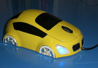
First things first, as can be seen, its a mouse mimicing a motor car! Function-wise, it has a left button, right button and a scroll wheel to accumulatively make it easier to browse our computers.
Visually, the palm sized mouse comprises of 2 main colours: yellow and black. The strong contrast this makes draws the eye and thereafter, the electric blue lit headlamps prove another point of fascination. It has a shiny, glossy paint effect that has been used, adding that alure for it being something quite sexy, but then at the same time cute.
The headlamps of a triangular shape are quite a contemporary design as opposed to the rectanglular form used, say, a decade ago. It gives the car mouse some character. It reminds me of being quite cat-like for some reason. They shine a bright neon like blue light, which draw the eye, but in functional terms, alert the user to know that the mouse is on and connected.
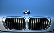
In mimicing a true car, the wheels feature silver 'alloys' (although my heavy use has worn that down just a "tad") and in particular, a 6 spoke design, along with shiny metallic rimmed grills on the front. The half moon choice for the wheels are used so to make it a properly functioning mouse, but could be deemed futuristic, that of a hover car maybe, gliding along the ground. The combination of the black positioned next to the silver for the grills is a scheme which compliments each other. We know the front black panels to be grills due to the ribbed effect that has been applied, and in my opinion, are synonomous with the design of BMW cars, whose public image is that of expensive, refined cars.
The headlamps of a triangular shape are quite a contemporary design as opposed to the rectanglular form used, say, a decade ago. It gives the car mouse some character. It reminds me of being quite cat-like for some reason. They shine a bright neon like blue light, which draw the eye, but in functional terms, alert the user to know that the mouse is on and connected.
In mimicing a true car, the wheels feature silver 'alloys' (although my heavy use has worn that down just a "tad") and in particular, a 6 spoke design, along with shiny metallic rimmed grills on the front. The half moon choice for the wheels are used so to make it a properly functioning mouse, but could be deemed futuristic, that of a hover car maybe, gliding along the ground. The combination of the black positioned next to the silver for the grills is a scheme which compliments each other. We know the front black panels to be grills due to the ribbed effect that has been applied, and in my opinion, are synonomous with the design of BMW cars, whose public image is that of expensive, refined cars.

The lines which form the body plates of the car mouse are all fluid, giving it that realistic sports car look. The curves, although no doubt being there to fit the ergonomics for a hand holding the mouse, mean it altogether appears a sleek design, streamlined, coupled with the small narrow side windows reinforcing the sexy sports car appeal. Of particular note, the blacked out windows give it a sort of racy, edgy feel, as opposed to, for example, a family car with big, clear windows.
In all, I really like the aesthetics of my mini car mouse. It looks futuristic, it's neat and being packed in a relatively small form, again, I believe, gives it some character, cuteness. What sets it aside from a bog standard mouse, it's major selling point you could say, is that it grabs your attention: the colours, the design with sleek lines, but then also the bright blue headlights and the red brake lights. In addition, it would appeal to car lovers alike. If I were to use one word to describe it, it would have to be, very simply, cool.
In all, I really like the aesthetics of my mini car mouse. It looks futuristic, it's neat and being packed in a relatively small form, again, I believe, gives it some character, cuteness. What sets it aside from a bog standard mouse, it's major selling point you could say, is that it grabs your attention: the colours, the design with sleek lines, but then also the bright blue headlights and the red brake lights. In addition, it would appeal to car lovers alike. If I were to use one word to describe it, it would have to be, very simply, cool.
When thinking further afield, the idea leaves you thinking of all the other regular items in our life that can be altered into the guise of a mouse. Saying this though, there are already so many attempts that have been made, some better, more ingenious than others:


Comments
I've commented on Diana's multi-colour candle posting as well.
"I like your candle! and it is true what you say about the flame, in that they do provide some sort of calming quality. for me, i think the different colours that the candle drips make it look not too dissimilar to a stick of rock?! main stream candles nowadays all tend to be them large thick ones, normally just of one colour, so your thin one, with a variety of colours gives it some uniqueness! also, as with all candles, when they are lit the wax then runs down, but this adds to the visuals, as the dried drips give it more texture and in my opinion, that aged maybe even archaic, traditional candle look."
Over and out...
@
Tuesday, 20 November 2007
Narrative part 3, extra 3 examples interactivity
Right, for the third and final part of our Narrative module, some self directed study calls on us to extend examples and analysis of interactive sites.
I have had trouble finding more interactive narrative sites, so the narrative aspect may be difficult to discern when considering these few examples. Apologies! I am aware of the meaning behind narrative - it is a way/viewpoint of telling a story. It has meanings to it, a message you could say, along with attitudes and values which you are trying to push, not just a simple story going from A to B.
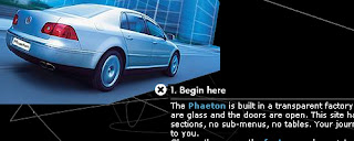
http://www.thephaeton.co.uk/universe/
The first is a Volkswagen site, which immediately introduces us to the site saying "this site has no sections, no sub-menus, no tables. Your journey is unique to you." This is exactly what interactive narratives are all about - the user makes the experience themselves, they have to sort of fathom out and self direct themselves along their journey.
This site informs the user of the various aspects that make up their new product, but also the factory that produce them. It is certainly of an informational purpose, but also could be perceived as a marketing tool for the new car.
Titled 'Universe', you very much do have to explore the galaxy, by clicking and then reading to find out the information. Some could complain that it is too difficult or time consuming to find out what you wish to know. However, a great search and map option is included to find your desired selection.
In terms of spacial awareness the site fills the browser window, but may alter depending upon the users aspect ratio. It is truly a 'Universe' with the black filling the screen, and then the white lines and flashing dots mimicing that of a galaxy and its stars. Aesthetically, it looks verrrry nice, I really like the look of it. This white line starts at the beginning and swirls and bends all throughout the progression of the website, with the various information boxes on a sort of timeline along this line, showing again the progression aspect to this site.
The site makes use of text, images, graphics and audio. The space like background noise merely goes alongside what is being illustrated - a cosmic, space sort of feel. It could possibly provide a soothing atmosphere, whereas, it could well become annoying.
It is highly legible, and the links easy to follow due to the large white dots, or the navigation bar found at the top. You can click anywhere you wish, or alternatively, follow the hyperlinks found within each text bubble, which follow a more structured order in terms of logic or progression. The white dots/stars pinpoint exactly where more information is held, meaning you are never stuck for something else to read.

The next site I've found is http://www.agencynet.com/, a site, that as can be seen, advertises and informs about the agency company.
The user can navigate the site through two options: the more traditional click on the menu and it'll display the information you want. Or, on the other hand, you can navigate from the birds eye point of view, and find the room you need for the information you require. When you click on these rooms, it'll bring up the same information the traditional route retrieves, but both are in a notepad style writing, as if it is that of an office members information.
By being able to navigate through the office by the birds eye view it does make it feel a lot more intriguing/in control feel. You are almost God like, being able to pick and choose where you go in the office, what you see and so on. This I find highly appealing, and is quite inducive.
We see the office directly in the centre of the browser window, the surrounds of this mimicing a desk. When the newer information is selected, these layer on top of the previous piece, as in, new sheets are placed on top of what you were looking at previously, so it is always available to go back to where you were. The surrounding wooden desk reinforces the office idea, whilst being a dark wooden colour means most of the focus remains in the birds eye view window.
The site features video, text, images and wind sounding audio in the background. Another special touch is that people have been recorded and then miniature characture versions can be seen walking, talking and sitting in the various rooms. You can traverse the site when going more in depth, for example, by pushing the buttons on a remote control and the video plays on a TV shown in the office. In addition, there is a sort of wordsearch game, where you have to find the hidden words and these refer to some of the products available. Once found, it tells you the relevant information. The gist of this site is you have to work (in a fun way) to get the information you want.
The text used is legible purposefully trying to mimic that of real life: newspaper fonts, felt tip pen scribbles on paper. It tries to add a touch of realism. The use of bright colours brings the site to life.

The last example I have decided to use is http://www.woodlands-junior.kent.sch.uk/studentssite/pokemon/intro.html. This is actually a very simple story where you make the decision involved in the world of Pokemon! (ha, don't laugh!) Quality wise, it is as basic as can be, but this means that the essentials are included and it isn't overly fussy with distracting elements.
The information is displayed in mainly the centre of your browser, it increasing and reducing to accommodate the bits wanting to be displayed. It is all of an entertaining value, it is a story after all where you direct the choices to where it will progress.
It comprises of mainly text, but visual prompts are provided in the form of animated graphics. Colours are used to effect, for example, to distinguish from narrative and dialogue. Sound clips are included which reinforce the Pokemon theme, sounds reflecting the Pokemon action involved in the story. These iconic sounds fans would be well aware of, but others may merely accept these as being for the story.
The interaction comes in the form of reading the text, looking at the images and then choosing appropriate options which link you to the next page to show you the outcome of your choice. The links are all underlined and even sometimes use a different colour to better distinguish them. The arrow navigation button is used as well, an arrow pointing to the right naturally meaning go on, for example. Pretty simple, but very easy to follow and work with.
It is a quite basic (in terms of production) interactive piece, but it definitely fits when considering it being a story thats interactive ~ an interactive narrative though maybe pushing it a bit! It meets its audience needs by using large, and simple fonts so the children using will be able to read and follow. The pictures are really supplementary to the story, but are symbols to quickly display what in the story is occurring. Surprisingly, there is A LOT of content: 7 chapters. Nonetheless, after going through and experiencing the first chapter you could find the following 6 merely to be repeats and therefore tedious.
Onwards...
What's now important is picking out the recurring techniques used throughout to implement in the planning and creation of my own interactive narrative. Building on all the good points should ultimately mean my work is successful and of good value. Also, I need to think of something worthy of being told, not just a simple A to B piece.
@
Monday, 19 November 2007
Rate it
The final task set in part two of our Narrative module is to rate/review/comment on another groups work.
With us all being in the same boat, majority being new to the whole University project work, I'm going to look mainly at the successful sides to the groups work, but then if there are any downsides, suggest areas to improve the work.
What I think works here is that looking through the keyhole makes it seem really quite sinister. It has quite a daunting effect, as the viewpoint is as if you are truly looking through the eye of the captive. The slight shakes that can be seen on the camera add that feeling of anxiety, or being afraid. In addition, with it being difficult to get a clear view through the keyhole, this side of the lock really feels quite closterophobic. They have done really well. Even the small touches of the figure being hooded so we cannot really make out who he is, adds once more to the disturbia. The grungy heavy rock music again provides us with a reference to find this piece quite discomforting and oppressive. Lastly, the heavy breathing displays the intrepidation of the victim and brings us close to their humanity, something emotive.
I can only find a slight downside in that the piece is quite long, at 2 minutes. We spend a while sitting with no dialogue, and then for another 1.30 mins the dialogue kicks in but its quite hard to distinguish or make out. The phone call isn't straight and to the point, but instead reveals the killer to be quite chatty, and for me, not really that ruthless/hard. This though, isn't really to do with the production, but instead is the way of acting it out.
If I were to improve anything about the piece, you could perhaps make the killer tougher. You could do this by limiting his conversation to the essentials and maybe have him in a more "grunting" manner. We actually see this briefly in the ending, so more of the same but throughout.
In regards to the piece as a whole though, The Captive works for me. At first the piece may seem irregular/unconventional, but once picking out the techniques in use, it makes its worth far greater. Good work, well done, it definitely had me looking through the eyes of the captive and feeling the heat.
@
Sunday, 18 November 2007
final cut part2
In the next section of our single shot write up, we're meant to compare our work to that of another group and then comment on their work - what's good, what's not so good and what would change about it to improve it.
However... at this stage in time, I haven't found anybodies finished pieces on their blogs... I must have just looked through about 15+ blogs! (And seeing as people are in groups of 4, that would make up roughly a member from each of the groups.) So for now, it's going to have to be a waiting game... and when someone does post their finished piece, I'll pounce! And comment! lol
UPDATE:
Right, i've found a groups posted work, which can be found on http://dannythiele.blogspot.com/.
Titled 'Beautiful Betrayal', it similarly(in comparison to our 'One Shot') is a film noir type. Set in a graveyard, it features two characters, one of which seeks positive things, whilst the other negative and ends the film by stabbing the good character. There is a sense of intrigue in the piece as the audience doesn't exactly know what will happen, the murder definitely isn't a full drawn conclusion, this again being like our film where the end is obscure and more difficult to predict.
In a similar fashion to our own film, the group have made use of shadows, again, dark representing bad and good being in the stark bright light.
There is also a comparison drawn from the fact that the film features little dialogue, but instead a predominant sound in the background; a music score for Beautiful Betrayal.
Nonetheless, this group has included echoed dialogue from the characters. It adds another form to narrate the piece and give direction as to what is occurring.
A further contrast found is that we chose to use slightly tighter shots, whereas 'Beautiful Betrayal' has scenery around the main characters: that of the graveyard and headstones. This tempts to viewer to think of it as being a sad, but safe place to be. However, when the murder is committed at the end, it also reinforces that this is a place relating to death.
Also, as a side, the group have included credits listing who was involved in the actual film and importantly, the production.
-These in total form the comparisons I've been able to draw between 'One Shot' and 'Beautiful Betrayal'.
@
final cut
Right, its been a 3 week project, its been 4 peoples efforts, but ultimately, its a 1 minute(ish) single shot film.
I really like the look of the film. In a word, it's DARK. Both visually, but also metaphorically. The contrast and the dimness of the grayscale sort of preempts the negative, ominous feel of the piece - this certainly isn't a happy go lucky chick flick or family friendly kid scene. You could criticise it due to that you cannot make out what is in the background very well with it being covered by the shadow/darkness. However, that isn't whats important about this piece - the main action is the main character, who is perfectly visible due to wearing a bright white shirt.
Whilst on this point, you should be able to notice that from our original take, the shots becomes alot tighter, more up close. This is something I repeatedly focused on during filming, from the learning in our seminar sessions. Instead of a wide open, ornate background for the audience to wander off into and lose the close intensity and anxiety we sought, the majority of the screen focuses on the job in hand - the main character. I much prefer it this way, as I can see the worthiness of the technique we were shown - you are in there and with little background distraction to lose your focus. This is why the key parts to the film, particularly the ending with the gun, are tight, close up shots, magnifying the effect of the action on screen.
The gun that David brought in was spot on for what we wanted. It looked like the real thing, and is another small thing I notice as working well for the film. When pointing against Davids head and the pillowcase, you couldn't get any stronger a contrast in colour - white and black, which is another way of representing good and evil.
The heartbeat effect I really like as well, it creates a rhythm, it sets the mood/tone - an identifiable sound effect used nowadays to signify stress or anxiety. The volume we tried to increase throughout, although it isn't that noticeable because we could only do it a little due to the sound distorting. Nonetheless, we did this with the intention of upping the anty, and increasing the intensity of our main character. Whilst filming, the door slamming sound conveniently came coupled with the sound of metal reverberating from the door slam. This wasn't intended, but from the first run through and finding out this happened, we definitely knew it should be included. To capitalise on this, the heartbeat sound mutes during this time, to make sure the door bang is noticed and emphasised.
We were unlucky not to be able to obtain a studio when we hoped for, and thereby delaying us, but it is a lesson to be learnt, and means I'll definitely ensure we secure a location early on. Also, nobody had any tape to film onto, so Leanne had to hot foot it to WHSmiths. Being 100% prepared is therefore another thing to highlight just to smooth out any potential problems that could occur! But these are all really quite minor.
Nonetheless, it is the accumulation of all these pros, and cons, that have resulted in our final piece. I am very happy with the look of it, and feel it has been a really beneficial and productive module, something I'm proud of - 'One Shot'.
As a last note, in our brief we were told that the camera was only permitted one move. We asked Deb what specifically was meant by this and she gestured as picking up and moving the camera. When watching our take, we pan up and down a few more times than once, but hopefully this will be permitted. Other groups have taken it as being a non moving shot at all, i.e. the camera can only move OR pan once. Fingers crossed we won't be penalised. :(
--
Teamwork was divided into several categories.
The pre-production aspect saw Leanne drawing us up some storyboards. I myself, being the main author of the idea took on a sort of directive role, pitching the idea, hinting at deeper meanings that the piece could pursue, and then writing all this up in the Synopsis, Summary of Action and Scheduling documents - chief organiser or so to speak! Andria decided she would like to try her hand at the actual filming, so alongside this, wrote a piece about the look on screen, how it would be composed and so on. Last but not least, David took on the role of finding us a location, booking the equipment and studio facility.
Whilst filming, David was the main actor of the piece, myself the executer. Leanne donned her earphones and pitched up the mike, to capture sound, whilst Andria operated the camera and grabbed all the shots! We all played a part in setting up the camera, positioning it, the lighting rigs and placing set pieces.
Post production saw us all playing a part. Leanne initially captured the raw dv and then as a group we all came up with a different version of the final piece, then coming together and choosing the best bits, mixing these ideas all into our best and final final cut.
In terms of what we could have improved on, we could really have made it an absolute priority to attend our little meetings. It is difficult to get everybody in the same place at the same time, and admittedly, we experienced this. Leanne lives away from uni so it meant a long bus trek for her, and then the same back, meaning bus times can wreak havoc when you want to dig in and crack on. Obviously life can throw up problems and get in the way, but if we all could turn up, we would all be in the know and be up to date with the way the piece is going, whilst also knowing what tasks they need to be looking at and working on. This really is the only not so successful aspect of our group work project. We didn't experience bickering, we all managed to come to compromises when dealing with the ideas, ways we can work in and so on, meaning it all came together well.
As a last little bit, I've done my own edit of the piece. It's ALOT darker - instead of applying one light reduction effect, I doubled that, along with doubling the grayscale! I also went with the soundclip of the heart where the increase in volume is more easy to perceive.
If I'm being honest, I do prefer my cut due to it looking alot darker and for me, more grim. Nonetheless, our collective effort is our group choice and so will be the definitive edit.
@
I really like the look of the film. In a word, it's DARK. Both visually, but also metaphorically. The contrast and the dimness of the grayscale sort of preempts the negative, ominous feel of the piece - this certainly isn't a happy go lucky chick flick or family friendly kid scene. You could criticise it due to that you cannot make out what is in the background very well with it being covered by the shadow/darkness. However, that isn't whats important about this piece - the main action is the main character, who is perfectly visible due to wearing a bright white shirt.
Whilst on this point, you should be able to notice that from our original take, the shots becomes alot tighter, more up close. This is something I repeatedly focused on during filming, from the learning in our seminar sessions. Instead of a wide open, ornate background for the audience to wander off into and lose the close intensity and anxiety we sought, the majority of the screen focuses on the job in hand - the main character. I much prefer it this way, as I can see the worthiness of the technique we were shown - you are in there and with little background distraction to lose your focus. This is why the key parts to the film, particularly the ending with the gun, are tight, close up shots, magnifying the effect of the action on screen.
The gun that David brought in was spot on for what we wanted. It looked like the real thing, and is another small thing I notice as working well for the film. When pointing against Davids head and the pillowcase, you couldn't get any stronger a contrast in colour - white and black, which is another way of representing good and evil.
The heartbeat effect I really like as well, it creates a rhythm, it sets the mood/tone - an identifiable sound effect used nowadays to signify stress or anxiety. The volume we tried to increase throughout, although it isn't that noticeable because we could only do it a little due to the sound distorting. Nonetheless, we did this with the intention of upping the anty, and increasing the intensity of our main character. Whilst filming, the door slamming sound conveniently came coupled with the sound of metal reverberating from the door slam. This wasn't intended, but from the first run through and finding out this happened, we definitely knew it should be included. To capitalise on this, the heartbeat sound mutes during this time, to make sure the door bang is noticed and emphasised.
Whats more, at the end where the screen goes blank, the beat continues, this again is something I really like. You only have that thumping heartbeat to concentrate or focus on, silence and then the loud BANG of the gunshot answers the question about our characters outcome, but also is quite a dramatic ending, a definite ending to the piece.
If I were to pick out any niggles about the piece, there is a slight bit in the middle where David goes down to pick up the pillowcase to hood himself with, and his head goes up and off the shot for a second. It is only for a quick second as he recovers by lowering himself and putting on the hood, but if I were to change anything, it would be to make sure his head remains on screen, all the time. This though, is only a tiny bit I have picked up on in the post production stage.
We did have a few slight discrepancies over which direction to take the piece in, and these were really very minimal - i.e. the man should stay on the chair, or the man should get off and get onto his knees, there should be a gunshot at the end, there shouldn't be a gunshot, but we quickly sorted this out by clarifying the options behind each of the choices, and then as a group, agreeing on the solution. It will probably be a never ending circle as to should we or shouldn't we have included the bang at the end, it has equal outcomes for the audience. The gunshot that we have gone for, I am in cooperation with as gives a forceful end, packing a punch to close the film. But silence would work equally as well. Lastly, we could maybe have thought more about the costume used. If David were say to have used a dirty, messy, crumpled up shirt, that would have provided more visual signals.
We were unlucky not to be able to obtain a studio when we hoped for, and thereby delaying us, but it is a lesson to be learnt, and means I'll definitely ensure we secure a location early on. Also, nobody had any tape to film onto, so Leanne had to hot foot it to WHSmiths. Being 100% prepared is therefore another thing to highlight just to smooth out any potential problems that could occur! But these are all really quite minor.
Nonetheless, it is the accumulation of all these pros, and cons, that have resulted in our final piece. I am very happy with the look of it, and feel it has been a really beneficial and productive module, something I'm proud of - 'One Shot'.
As a last note, in our brief we were told that the camera was only permitted one move. We asked Deb what specifically was meant by this and she gestured as picking up and moving the camera. When watching our take, we pan up and down a few more times than once, but hopefully this will be permitted. Other groups have taken it as being a non moving shot at all, i.e. the camera can only move OR pan once. Fingers crossed we won't be penalised. :(
--
Teamwork was divided into several categories.
The pre-production aspect saw Leanne drawing us up some storyboards. I myself, being the main author of the idea took on a sort of directive role, pitching the idea, hinting at deeper meanings that the piece could pursue, and then writing all this up in the Synopsis, Summary of Action and Scheduling documents - chief organiser or so to speak! Andria decided she would like to try her hand at the actual filming, so alongside this, wrote a piece about the look on screen, how it would be composed and so on. Last but not least, David took on the role of finding us a location, booking the equipment and studio facility.
Whilst filming, David was the main actor of the piece, myself the executer. Leanne donned her earphones and pitched up the mike, to capture sound, whilst Andria operated the camera and grabbed all the shots! We all played a part in setting up the camera, positioning it, the lighting rigs and placing set pieces.
Post production saw us all playing a part. Leanne initially captured the raw dv and then as a group we all came up with a different version of the final piece, then coming together and choosing the best bits, mixing these ideas all into our best and final final cut.
In terms of what we could have improved on, we could really have made it an absolute priority to attend our little meetings. It is difficult to get everybody in the same place at the same time, and admittedly, we experienced this. Leanne lives away from uni so it meant a long bus trek for her, and then the same back, meaning bus times can wreak havoc when you want to dig in and crack on. Obviously life can throw up problems and get in the way, but if we all could turn up, we would all be in the know and be up to date with the way the piece is going, whilst also knowing what tasks they need to be looking at and working on. This really is the only not so successful aspect of our group work project. We didn't experience bickering, we all managed to come to compromises when dealing with the ideas, ways we can work in and so on, meaning it all came together well.
As a last little bit, I've done my own edit of the piece. It's ALOT darker - instead of applying one light reduction effect, I doubled that, along with doubling the grayscale! I also went with the soundclip of the heart where the increase in volume is more easy to perceive.
If I'm being honest, I do prefer my cut due to it looking alot darker and for me, more grim. Nonetheless, our collective effort is our group choice and so will be the definitive edit.
@
Friday, 16 November 2007
pixilation inspiration
For our SPP1 tutorial, we now need to post and comment on sources that provided inspiration for our pixilation pieces.
In Killer Shoes i decided to apply the dreamy overly white effect, making it seem quite supernatural.
The first thing that I recall when thinking of such an effect is from watching a dream like, surreal scene from Desperate Housewives.
http://www.youtube.com/watch?v=81aY62IseLU
When looking at this scene, it seems to have a blurry edge to all that is in shot. Towards the end there is also a predominance of white (from the fences and so on.)
I like how this looks aesthetically, but also the reasoning behind it as well. It fits in with the dream concept, as when we recall dreams, they do tend to be hazy, none perfect, and obviously, non real.
The second reference point I can call on is the ending of GHOST with Demi Moore and Patrick Swayse. At the end (about 40 seconds in) when he is going to heaven, as in my piece, there is an abudance of white surrounding the main articles of the shot. It gives it that supernatural feel, placing an aura around the objects in focus.
http://www.youtube.com/watch?v=wTAWt9stVAw&feature=related
A pair of living, walking, and attacking shoes are really not of the norm, and therefore could be demonstrated as something supernatural. The glowing effect may normally be linked to that of heavenly and Godly, but for my piece, I think it fits in with the weird and supernatural aspect.
The actual concept of the shoes coming to life was really a random stroke of genius, but I can wager a bet that everybody in our class has at sometime seen Toy Story. This indeed, also features inanimate objects coming to life. Of course the toys featured in the Disney classic are working for the greater good, but there is a section in the film where the toys fight back against a rebellious owner... and this isn't that far away from a viewpoint you could take for Killer Shoes. Toy Story too then is another reference point I can call up.
You sort of become accustomed, or afixed in your own mind on how a certain concept should look and play out. Its therefore difficult sometimes to nail the exact source of where you garnered the 'look', having it just built up over your lifetime, through the experiences you have had. But for me, this is how I pictured a surreal/supernatural/dream scene to play out and look.
@
Subscribe to:
Posts (Atom)