Showing posts with label web apps. Show all posts

Tuesday, 23 March 2010

Share button widget

The SHARE button is commonplace across the web nowadays, however here is a great customisable widget that encorporates all of the popular ones such as share by email, Facebook, Twitter, Windows Live, Delicious, Google Booksmarks, Digg, Stumbleupon to name but a few.


Whereas Facebook and Twitter offer their own independent APIs I like this for providing it in one package. Furthermore, the options to tweak it on the site, alongside the ease of implementation make it a great option.


Want to share on your site? Get it here.

@

Wednesday, 2 December 2009

Testing for IE - no longer a problem*


On Vista and 7 in the least, once you upgrade your version of Internet Explorer to the latest, in this case, currently being IE8, you then lose the capability to have any other version installed. Sure, people have hacked it for XP to install previous versions such as IE5.5 and 6, but it doesn't answer the problem for all.


An alternative is browsershots, however anyone trying that will know that there is a lot of unticking boxes to specify what you want your site tested in, and also, it takes a long time to get the browser shots back. Sometimes, they don't come back at all!

Enter a great application I've found: IETester. Using the new Microsoft Ribbon style for the user interface, it allows you to view any site, through the eyes of IE 5.5, 6, 7, 8. You simply open a tab in whichever version you prefer and type in the address. Perfect.


*Although on testing in IE6 etc you then open up a whole new can of worms - IE's poor conformance to standards.


@

Thursday, 19 November 2009

Getting started with a custom Wordpress


For the
external client project I mentioned before, another of the tasks was to get them set up and integrated with a custom Wordpress. Basically, Wordpress will be a free Content Management System.


There is almost a definitive set of pages on the Wordpress.org site, nicknamed Codex, but just looking at a page is enough to confuse a newcomer to the technology. It is very text heavy.


Fortunately, just two days ago, Webdesigner Wall posted a how-to guide. It goes through from start to finish, detailing how to get Wordpress up and running on your own server. Furthermore, it isn't just a slab of text. It has images and breaks the process up into steps.


Really handy should you ever need it in the future, for a free way to provide CMS for a client. View the tutorial.

@

Wednesday, 11 November 2009

sIFR (dynamic typeface replacement) - the good, the bad & the ugly

Alongside Uni work, I've been busy with a client project for Nottingham creative agency Active Ingredient.


The task set was to updating their Flash site to something a bit more contemporary looking and power it using Wordpress, following a design already made. So far so good.

One of the challenges I experienced on the project was getting the typeface used in their design: Vag Standard to render on all browsers. Above Arial, Times, Georgia and Garamond there isn't that much more that displays on both Windows and Mac. And without going for the relatively simple and straightforward image with hotspot hyperlinks I had to find some alternatives.

Enter sIFR.


Using preformulated javascript and a Flash swf that cleverly exports your chosen font in place of the browser default, it seemed promising. And once it works, it really is quite cool. Lots of sites use it.


In short, I really had a struggle in getting it to implement and work correctly. I initially tried the v2.0 that is offered on all main links from Google. However, after reading of an update fixing bugs, I found the latest nightly build of 3.0 here.

The earliest problem I encountered was that there doesn't seem to be a well considered, user friendly tutorial immediately available. After some searching though I think this is the best introductory one I could find.

Sometimes the sIFR would not render at all. This was solved by having to play around with the CSS in the original stylesheet, a sIFR.css stylesheet and then also a js-config.js file. They basically all needing telling a variant of the same thing - font, colour, margins. Importantly, size is not an issue as the coding works this out from our original design.


The next problem was text wrapping onto another line. Randomly. In Chrome it would work and then Firefox would display two with multi-lined text. A refresh of the page would have only one with multi-line. Talk about odd.


After reading suggestions of altering the margins or the line-height, on the different stylesheets, this didn't work. It was only at the 11th hour that I found a forum thread which mentioned a coding error in the deluge of javascript.


A simple change and the sIFR renders correctly!

var AN=x.forceSingleLine===true;
var AS=x.preventWrap===true&&!AN;

to

var AN=true;
var AS=true;


Hoorah. Unfortunately, it still isn't perfect though. Due to the nature of the design - using five colours in navigation links, these all require a separate request from the server and for Flash to produce these five distinct colours. The effect can be either a blinking flash or delayed appearance on screen, sometimes appearing piece by piece. Nothing big, but something, nonetheless.


In all, I'm glad I'm on this side of the sIFR experience ladder and have sample code that I know to work. I certainly am looking at using sIFR again, as having custom typefaces on a site really is a boon and lends itself to creating more aesthetically pleasing designs. However, frustration was a key issue when trying to implement sIFR for the first time. It really does take perseverance. Be warned!

----

All of this dynamic text replacement just makes the adoption of CSS3 even more urgent. The ability to host a font online and specify a font-face in the CSS once will be so much simpler.
That's more or less all there is to it. I'm ready for simplicity!

@

Thursday, 16 July 2009

Image compression tool - smush.it

Although broadband speeds are increasing and the Government proposes 2MBPS for everyone, it doesn't do any harm to compact the files that you want people to see online.


A great tool available for image compression is smush.it. You install it, direct it to your site's images either by uploading or providing URLS and it outputs your smaller images in a zip telling you how much data has been saved.

In fact, a great article in .net issue 192 offers advice and incite into the whole topic of web compression and features smush.it.

@

Sunday, 22 March 2009

Social networking site - recycling is good

My last post about Flash banners for Get In: Get Gaming was unfortunate in that I went to the effort of making a banner which I then didn't think was good enough for the site and so didn't use it! 

However, as I'm increasingly finding with design, every idea has a worth and is useful. 
Back when I was making Villains I did an initial batch of logos, naturally, only one being chosen to use. When needing a specialised header for the pages, I combed through my original designs and successfully implemented/incorporated them together, thereby fuelling a recycling scenario.

I have been fortunate enough to do this again for the social networking site. 

The light blue tone was the main problem the first time around - it stuck out too much and downgraded the overall feel. 


The image above I darkened by adding a darker filter along with a black border. Alas, it was to no avail. I still wasn't pleased with it.

Cut to a few days before hand in and me turning my attention to filling the pages with content and I had an idea. Utilising the gradient background that already proved successful I decided to do a typographic sort motion piece just reinforcing the title of the website. Naturally, the choice of neon light blue was instantaneous. This time however I went for a techy, digital feel using LCDDOT custom font from dafont.com.

>

Initially I expected this to go onto the main page, but it ended up placed to appear once the user has logged in. In terms of literary meaning, I know this is a little off: "get in: get gaming" probably should be before they login, but it was the second banner, courtesy of recycling, a gaming legends banner that felt more apt on the homepage. It served a better purpose: attracting the attention of potential visitors.

Whereas previously the gaming icons floated, spun, faded on and off the horizontal banner, this time I just decided to go with a scrolling from right to left effect. 

>

I dropped images that weren't square i.e. having whitespace etc so to conform to the square rigidity of the piece. I think this is an effective Flash banner as it should draw in the eye to the gamer on first loading the index page, particularly as the colourful images make for a strong contrast against the black backing. Furthermore, the scrolling effect makes for a nice piece of motionary graphics.

In terms of Flash complexity, I wanted to loop it so the first one would join with the last one, making it cyclic. Unfortunately with limited time and PHP being the key priority I merely inserted a second string of images after the first load. Should the user hang around long enough on the first page they will see it scroll through but hopefully not long enough for it to get to the actual end where a black void will appear momentarily!

In all, this was an exercise that showed and proved that ideas are not dead and gone the first time they don't fit. It is reassuring and feels good to know the effort you put in is worth it. Furthermore, being a fan of motion graphics, I'm pleased with these pieces as they play nicely on the eye.

@

Tuesday, 17 March 2009

Social networking site - one step forward, one step back


I've spent quite a few hours trying to implement various pieces of code to try and achieve the register page, or upload image page. Unfortunately, all to no luck. It's highly frustrating and wedges even more distance between me liking PHP. 4 hours of one massive circle doesn't bode well, each time.

To combat the feeling of incomptency, I noticed that the top header section of my site appeared a little bare. It currently stands as a black box. 


The Playstaton site uses scrolling banners that feature gamers, or gaming characters behind a semi opaque colouring. I admired this in my earlier analysis.


I decided to try and make a Flash banner that incorporated the colour highlight of my current design and then mix it in with legendary gaming characters.


The neon light blue was naturally the most in keeping but also a distinct enough colour to draw attention. The grey was too drab, and the blue a little too much of a different hue to appear to aid continuity with the design.


Notably, framing it within a curved corner border made it more fitting with the sort of on screen game menu graphics we are used to. I liked the motion tween movement of the characters that I inserted, it varied between moving across the screen, fading in, spinning out, growing and having tremors. It certainly wouldn't be amiss on all the other typical gaming sites.

Feeling that development wasn't over, I tried to add a little more visual interest, as the blue with a character did look a little uninspiring. 

Firstly, I added a graph paper grid behind. This added that sort of visual detail that I was seeking but wasn't stylish enough in my opinion. I exchanged it for raised dots from my sugar lump design. I love recycling designs.


Thinking that I'd made a worthy banner, after having tweaked with the colouring of the light blue - lighter, darker, more blue, more grey, I added it to the site.

It looked OK, but it didn't fit in with the sophisticated visual elsewhere. I've noticed more and more since completing the design that the grey gradients and black make for a real sophisticated feel. The addition of the neon light blue make for a contemporary twist. I am proud and pleased with this design, I think it embodies stylishness. However, the banner looked tacky. It was difficult to get the colourisation of the blue to match when using a reduced alpha channel, and so, regrettably, I decided not to even use it.

Talk about one step forward, one step back. This PHP is tainted!

So, moving forwards, I hope to fix some code together to get the site to function. As I said, I am pleased with the design, and if I document what I intended the site to do, I think the premise is good. Just a shame that the code and I are not currently friends.

@

Wednesday, 4 March 2009

Social networking - designs

Taking in what I've researched, for the design stage I tried to implement what I have learnt.

I thought the majority of the social networking sites missed an opportunity in trying to reincarnate the visual designs of the actual consoles. Admittedly this might be to do with copyright and IP, but making something in the vein of that will familiarise the user, and maintain a strong visual standard.

Following a useful tutorial that I found a few weeks ago, I started trying a Wii look.


I particularly like the glow effect of the neon light blue to show which page you are on. Soft grey gradients are very popular nowadays, making for a quite a spacious feel. Plus, a design trend for 2009 is large type so I thought that the buttons although simplistic, work. Couple that with big easy to hit buttons, and it mimics the Wii well.

The next attempt was somewhat Xbox360 like, with nice web2.0 glossy buttons. However, compared to the other designs, this one felt limited. I couldn't picture a full layout, perhaps due to a lack of familiarity with the console. Furthermore, the green that I was trying to couple it with just didn't work in one package. 


It was the Playstation 3/Vista look that I really felt had potential. Knowing that the Wii design was too much of a rip off, I wished to incorporate the neon light blue which is a great colour for highlights/distinction etc. 


Again, the use of big buttons, perhaps amateurish to some, but I like it when you hover over and it changes quite a large slab of button to the hover display. The gradients here aren't horizontal which is what most do, instead using a combination of diagonal effects adds subtle highlights. 

This design could be described as quite dark and broody, which is somewhat associated with the image of more traditional gamers, but I find that the glass buttons and blue outlinedicons referencing gaming icons - space invader alien, Playstation control add a little more light hearted character.

Whilst experimenting in Photoshop I produced a really distinct off-shoot design. Using a LCD like dot font in the similar shade colour as the background, but then adding a gradient makes for an interesting look. I really wanted to try to develop the look, feeling it had potential, but I met with difficulty in transferring the dot font look elsewhere for the main content in the site. 


In all, I think the clear winner is the black PS3 one. I've not seen anything like that in my research for social networking sites, yes it is black and a bit typical look, but the added effects such as the glass buttons, the neon blue, and sophisticated gradients make it different, in my opinion. It looks stylised and this is why I favour it. Perhaps a little too much so, so that might need addressing shortly.

@

Thursday, 26 February 2009

Gaming social network sites - analysis/evaluation

Ugame


Of everything, I do have to compliment this site's creators for the large background image which blends between gaming imagery, whilst using transparency bars for the menu. It's my achilles heel after all. Using a three colour palette of black, blue and yellow, the latter is instantly recognisable and stands out, proving a good divider bar.

The site uses a traditional nav bar at the top, which is clear and easy to understand. Noticeably, the login function isn't behind a button, but instead close to the top of the main page.

The pages tend to hold a lot of information and using a smaller font adds to the information packed feel of the site. Likewise, the use of images, which aaccompany every bit of text, again make the site feel fuller.


In terms of the players list, they have gone for a look much like Facebook - a list. Along with the username, they add favourite games, and even a status update per brief display. It wouldn't be unexpected for this to be linked in with Facebook, as the layout and information seem so similar.


Raptr goes for a more information lead approach in regards profile information. The activity feed makes the page quite lengthy, whilst the profile picture, username and other brief stats are placed neatly in the top right hand corner. With the priority of the site being about gaming and what the user is playing, this seems a sensible choice. However, I would prefer the gamer information atop such information.


Oncemore, the game thumbnails are very small. The black, white and orange look is quite modern, but the use of capital italics is unusual for a site that you would expect to be in keeping with modern webdesign conventions. In fact, italics form a large part of the site's typography. It isn't something I am keen on, whilst important links in orange are not instantly easy to read.

However, I do like the quick access bar that can be opened by clicking at the bottom of the page. It holds all the links you would need in a clear, understandable way. The navigation bar at the top whilst being clear and succint, seems a little uninspriring with the rather plain orange header. This could be capitalised on with game images etc.


This site goes with a visual look I expected. The greens and black look is prioritised, but I welcome the transparency that is again used on the home page. Here, the search function takes priority allowing the user to find their favourite game. Everything seems a little boxy however, but not in the way that the console producers use it to section information neatly. The lines whereas useful in places, do seem a little too much, for example, the navigation bar at the top.

Images of games are larger are quite small, much like the previous two. This seems to be a contrasting decision compared with the Nintendo/Microsoft/Sony idea of what gaming websites are best like. Personally, I much prefer larger images. They have an impact.


In terms of user profile, the page does seem a little scattered. There is a gaming activity calendar, then the profile picture, GamerDNA traits, plus links all vying for attention. Plus, the background visuals vary, some being linear gradients, others radial, then images with transparency. It just seems to lack consistency: some text is green, white, underlined. Tidying this up would probably make for a more logical reading of the information.

I find the GamerDNA site the best of the three sites reviewed. It seems to fulfil what I expected of a gaming social network site visually, and data wise, rather than being a new Twitter.

--

Important things I can take from this - images are key, a cohesiveness with the visual design is important, a clear and logical structure is needed, the user information should have priority, and should be easy to navigate and find information.

@

Wednesday, 21 January 2009

A browse for social networking sites

We all know the generic ones now - Facebook, and Myspace. However, after delving a little deeper online, I managed to find a few others which weren't as mainstream or polished as the big ones.

The first, ZigiMe, seemed to put over a very stripped back computer techy feel from the start, noted through it's visuals. To me, the use of green upon black reminds me of the very old school computer days, or the Matrix code. 


Clicking through to some of the sections, such as Browse, for instance, alters the green to red. Yet, the boxy/rigid look still remains. What comes as a surprise is the type of people using the site - it almost seems unexpected. Normal people! The rainbow use throughout the site does provide a little life, however I am not really into the boxy line look. It seems almost amateurish or for an era goneby. 

--

Then there's Google not so known effort - orkut. Apparently this didn't pan out too well, apart from Brazil.


As can be seen, it looks very much like the old Facebook. That might please some.

What I really like is that the photos of friends are are displayed on one side of the page, you don't need to click through several links to find the folder you want - I suppose this mimics myspace pretty well. This is something Facebook seem to have distanced themselves from, along with moving everything everything else to a set place, behind a tabbed menu option. I also like how the options are really clearly displayed on the left handside, they don't seem ambiguous which is another problem I found with Facebook - I knew what I wanted, but had to search through several menu tabs to find it. 

Unfortunately however, with applications like iFan and the ability to share photographs, Orkut just joins the list of social networking sites, as in, it doesn't seem to do anything different or specialise in a particular area/way. Perhaps being simple and clear counts?

--

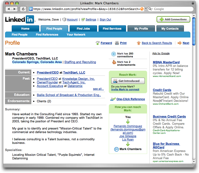
One last site seemed quite useful, in regards to networking. Linkedin.


It advertises itself very much in the same vein as all the others (FriendsReunited, Facebook etc) but then also has a section for finding yourself a job/careers advice through professional contacts. Interesting. And that was actually enough to get me to consider signing up! - Job done you might say in terms of the successfulness of a social networking site - the more members, the supposedly more popular it is.

In terms of looks I do find it to appear quite like a price comparison site, or on thinking about it - Play.com? I think that may be down to using the same coloured links for Adverts (right hand side) as well as internal links all in a similar blue. If those GoogleAds weren't dotted around the site, it perhaps wouldn't seem so overloaded with textual information - not enough whitespace for my liking.

It is clearly sectioned at the top - find friends, find jobs etc so the user wouldn't be confused in terms of where they should click. I suppose being business minded it doesn't wish to emphasise a fun/playful character, hence the more formal look.

--

Soooo, just from looking at those three examples it has helped me recognise what my expectations of a social network site are, what I like in a site and more importantly what I don't. - Focusing on the social side, I wish my site to not be too formal, or serious. I want it to be simple to understand, but have a nice modern, shiny, visual aesthetic. 

@