Tuesday 30 March 2010

Recommended Wordpress plugins

After utilising Wordpress for a couple of web design projects now, I found this post useful. There are thousands of Wordpress plugins to use, and so sifting through the various good and bad offerings is made a little easier with this article.

10 Essential WordPress Plugins You Should Be Using

10 good plugins for Wordpress. Examples include SEO, database backup, and super cache for quicker page loads.

@

PRP - more mobile websites

Another good round up of iPhone compatible site, provided by Webdesignerwall.

screencap

What I find interesting is that personal preference lies with the ones that tend to imitate iPhone apps styling. They don't necessarily have to be the same colour, but curved edged boxes that hold the main content or links is styling that I seem to like more so. Or alternatively, big chunky links - both of which are illustrated above.

Nonetheless, there are a few things that I've picked up from this roundup and have proved encouraging/inspirng. Take this one below which shirks traditional navigation options layouts:

screencap

The navigation options are tucked behind a drop down list. This makes the styling cleaner - a benefit. However, by positioning the navigation drop down close to another button, it could prove more difficult by pushing the wrong one, due to their close proximity on an already small screen.

screencap

Also, listed in the Webdesignerwall round-up is an example of an already existing gossip site, so that means that Gossip Blox will now probably be shelved. I like the designs created so far, so I shall just have to repurpose for artifact 5 instead.

@

Monday 29 March 2010

Pipes by Yahoo - RSS mashup

One of the designs I suggested for my app was a female gossip centre.

Rather than just making a dummy app I hoped instead to get something that functioned and updated regularly.


Enter Pipes by Yahoo an RSS mashup aggregator type thing. This has been available for a while now yet it still offers great value. What's really cool is the user interface. It's all drag and drop and done through on screen graphics.


At first it's a little daunting to know what you are expected to do, or to even get it to function. But after following the video tutorials made available (RECOMMENDED) I have managed to amalgamate a suitable feed for the app, Gossip Blox.

Specifically this 'Pipe' takes the RSS feed from heatworld and digitalspy and strips them of surplus news entries older than a day. It then removes through a keyword search any duplicate content. Lastly, the content is trimmed to a mere three posts and ordered with the newest first.


------------

This is all well and good. I had high hopes for implementing the designs that I had set out for the app. However, Yahoo have made presenting your pipe sort of accessible and sort of not. You can grab the script which they provide as a 'badge' and embed it, which I tried. Thereafter I tried styling and positioning the content through CSS however it didn't work as I expected. A lot of the formatting is overridden (no doubt purposefully) through the scripting. Certain properties are passable in the head of the HTML but not enough to enable the design I wanted. :(


Sooooo, although I've found a great tool, which I would recommend to anybody in need of one, this testing will have to go down as research and experimentation.

@

Friday 26 March 2010

Sticky footer

A recent freelance update I did required the footer to stick at the bottom of the page, but should the content expand down below it, it will push the footer down too.


After several trials, I have found this link to offer the solution: http://www.cssstickyfooter.com/using-sticky-footer-code.html.

It works in all the browsers, requires no Javascript or CSS clear fix hacks.

@

Thursday 25 March 2010

PRP - artifact #5 - iPhone GUI resource

I discovered this resource whilst reading up on the iPad and how it will differ (or more likely won't) when compared with the iPhone.

As an example, the back arrow button has now become synonymous with iPhone apps and so I believe this package could come in handy as a valuable asset for my artifact's production.


Obviously some of the components available here won't be possible for the html version of a mobile site - the 'label two', 'label three' scroller wouldn't work for example.

However, trying to maintain the visual appearance of an Apple iPhone app is important if you want to maintain the perception of quality.

@

Client - Footworks XHTML validation

It was important to try and achieve validation for Footworks site as it better ensures correct rendering across browsers.

-----------

In my quest for validation, XHTML Strict, the most demanding validation testing - it took a bit of effort, the first problem regarding making a whole div a hyperlink.

The problem lies in the fact that divs aren't allowed to have a hyperlink wrapped around them, like this:


It breaks the rules set out for XHTML Strict.

It was eventually after reading this forum thread that I discovered why: http://www.webmasterworld.com/forum83/5857.html.

A quick change to the code, making the inline content have the hyperlink attached, and applying a 100% width/height, and making the targeted <> tag { display : block } means that this problem is eradicated and the homepage validates.


--------

Unfortunately, there is one page that does not get the green tick for validation on Footworks.


The Contact page uses a plugin called Contact Form 7. It's versatility makes it a great plugin - you can basically get the contact form to have the input fields you want, the correct input types you expect, error messages written exactly in the correct tone etc. Great...

However, the creator has made each of the input fields a list item. For some reason, he has failed to apply these list items in an unordered list tag wrapper. Hence, the fail.


I did try going into the plugin codings, looking at the php and javascript but failed to locate where this list was generated. I don't believe this to be that bad a fault though, minor really.

-------

In all the site validates all apart from this contact page. I am content with this, and will look into seeing if the plugin can be fixed.

@

Wednesday 24 March 2010

Time to geek out - Nintendo 3DS

Nintendo have announced that their next iteration of the DS will feature glasses-free 3D gaming. And that doesn't mean merely 3D graphics.

This following youtube video demonstrates what is already capable on the DSi, using the camera lens to measure depth and perspective.


If the new one turns out anything like this then I think Nintendo have got another winner on their hands. Damn new technology!! Depletes bank accounts!!

@

Tuesday 23 March 2010

Share button widget

The SHARE button is commonplace across the web nowadays, however here is a great customisable widget that encorporates all of the popular ones such as share by email, Facebook, Twitter, Windows Live, Delicious, Google Booksmarks, Digg, Stumbleupon to name but a few.


Whereas Facebook and Twitter offer their own independent APIs I like this for providing it in one package. Furthermore, the options to tweak it on the site, alongside the ease of implementation make it a great option.


Want to share on your site? Get it here.

@

PRP - artifact #5 - potential designs

Having considered a gossip app for the iPhone app I am building, here are a few mock up designs I produced.

The first is more cohesive with app design in that it uses a bottom menu bar, that allows users to access other areas of the app. Typically it is coloured black, in keeping with app designs for iPhone.


One area where I have done something different is at the top. The status bar I can style and colour black. Alongside this then I have aligned another extra status-like component of my own -a Twitter feed. The way the bar curves up to the top of the page means that it will align seamlessly when viewed on the handset with the OS's status information.

All of the buttons in the app are purposefully high contrast for better legibility. In addition, they each have a glossy layer applied, something web2.0 but also a helpful indicator that it is a pushable button, being reflective of how physical buttons would have a shine from the light.

--------------

The other design came about as a result of playing with the various options within JQTouch. One animation is named cube and when activated, it 3Dimensionally rotates the screen around.

This got me thinking about the potential of incorporating this within a design. Enter Gossip Blox.
This then developed to imagining a homepage full of blox.
I like the unique and different design, as it will allow quite a bit of information to be displayed at one time but is still appealing and touchable.

The design progressed to something fashion magazine inspired. Such magazines all use black, greys and pink to appeal to their target market.


Admittedly the design is more edgy that the fashion magazines, but it would work well on the iPhone, being appropriate visually. Ideas from the first design have been incorporated here too - glossy buttons, big touchable areas.

What's different is that that bottom bar often found in apps is no longer present. When I conducted my research back in artifact 2, it took people a while to locate this bar. Instead, to speed up usability the more button has been incorporated into the main touchable area. Artifact 2 therefore has proved useful in identifying suitable design decisions for the touch screen.

@

Friday 19 March 2010

How the web has changed (for the better)

This article, found on gizmodo offers quite an interesting trip down memory lane - see Google, Apple, Toyota, Lego circa 199X using the Way Back website.


Type in a URL and it'll take you back as far as 1996!

What's scary is that some sites out there still look like this!! Cue us, the web designers 2.0, to modernise their image.


Proof that Apple hasn't always been the magical device making, design trend setters?


@

Thursday 18 March 2010

Client - cross browser testing issues

I've had to tackle a few minimal Internet Explorer bugs, but this time, Internet Explorer (no doubt through a fault) is rendering text correctly whilst the others (Firefox, Chrome, Opera) do not.

How I want it to look:


How it shouldn't look:


What is strange is that this unordered list works on other pages. I have checked and I believe that it is an issue to do with
  • not wrapping?


  • SOLVED:

    I managed to overcome this problem by removing the float:left on the
      and adding a big margin-left so that it clears the images that are a consistent feature on most pages.

    ------------------

    Elsewhere, Internet Explorer 7 has been playing up, true to form.


    The padding or height of the showreel was being ignored. This was easily fixed with a conditional styling statement at the top of the page.

    -----------------------

    The shadow effect that I have applied around the outside of the master div is not completing at the bottom of the page's content. Instead it runs off the bottom of the screen.


    I managed to get it so the bottom shadow is displayed through informing IE7 to impose margin-bottom:0px on the sideshadows. The problem lies in the fact that I can't set a strict height for the side shadows as they expand with the content on the page. Overflow:hidden doesn't work.


    Out of frustration, and with regret, I have had to turn off the shadows for IE7.

    --------------------

    Lastly, IE7 is clipping longer sections of the custom font text found in the navigation bar.


    If you look you can see it on foot health and foot health tips. I attempted to fix this by increasing the width of the line, increasing the padding and altering the word-spacing. The problem lies in the fact that SIFR reproduces text in the same size area that the default font, in this case Arial takes up.

    After trying out a number of the Javascript options, I had not made any progress. Altering the styling in one place means it disrupts the rest of the browsers.

    Fortunately the documentation page for sifr3 proved quite detailed in allowing slight adjustments. After trying tuneWidth, fitExactly and a few others, unsuccessfully, I tried letter-spacing, combined with tuneWidth and have managed to find an inbetween that fits both IE7 et al. Phew.

    --------------

    Ultimately this all signifies the benefits people can get from having the latest browser version.

    @

    Wednesday 17 March 2010

    PRP - looks like this app business is big money

    Despite only really knowing programming for Action Script, with the help of JQTouch I am getting along well with the styling of the pseudo-App.

    It looks promising too if this report is anything to go by:


    http://news.bbc.co.uk/1/hi/technology/8571210.stm

    Tuesday 16 March 2010

    PRP - artifact #5 - pseudo-iPhone design

    As part of my experimentation into App creation, I have come across a great plugin called JQTouch. This basically packages Javascript/Jquery and allows the animations and also graphic based components of an Apple styled iPhone app.

    After much fiddling with the CSS, (opting to make my own stylesheet rather than using the one provided) I've discovered that far more advanced tags can be used. This is due to the mobile Safari browser being compliant with CSS3. Having tested this previously, I realise I have missed a number of tags out. That, or they weren't around when I tested them? Probably the former.

    For example, CSS3's border-image.


    This tutorial provides a great way to become familiar with the technique. I needed it after having issues with the left pointing Back arrow.

    @

    Monday 15 March 2010

    PRP - artifact #5 - site ideas

    I decided for artifact 5 to make an app, so to eliminate some of the need of loading graphical site components.

    First things first though, it's been hard to think up what content I should provide in the mobile app I'm making. After all, the content will influence the styling and so this is an important first decision.

    Considerations so far have included:


    This would offer the opportunity to make some nice weather graphics and depending on the feeds sourced, could offer some map associated or postcode results.


    I found a great site called FlightStats which offers RSS feeds for flight departure, arrival, delays etc. This one proved the most promising. They also provide XML data in an evaluation period membership, which students have been granted free access to if they were using the data into a new platform. GREAT SO FAR...

    However, on going into the dedicated developer section of the site I find that there are already 3 iphone apps covering largely the same content and one for Android. What surprised me was that these apps are priced ones, and so people would have to spend to access this information that is already available for free on the main site or through various downloadable widgets. I figure it's the user interface and mobile capability that they believe justifies the charge.


    Technology news


    There are so many tech blogs/news sites out there. The good thing is that with this choice you can dip in and out of whatever story interests you, whilst also hopefully getting a more balanced opinion on news topics, as sites can be a little biased sometimes. OK, the news content could be repeated but to establish themselves as desktop sites, these sites have had to diverge slightly in their editorial content and so hopefully a mobile amalgamation of these sites wouldn't result in four news headlines all about the same thing.


    Gossip


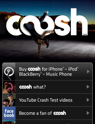
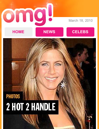
    This last one I think has real potential. When I googled the apps existing they were all for American news. In Britain, Heat, Now, OK, Hello, Closer et al have big readerships and I wondered if this would translate in the digital market. Furthermore, iPhones has helped encourage females perceptions of a gadget product, and so I thought perhaps creating a gossip mobile app, with all the associative stylings would prove an interesting venture. This would likely contrast with the gadget news I suggested before which on the whole would likely incur a male following and thereby dictate the styling somewhat.

    ------

    I based these ideas upon using RSS feeds to power the app. The purpose of using the app in the first place is that it will encourage more use if it is constantly updated. I myself won't be doing this, so in comes the useful really simple syndication.

    @

    Sunday 14 March 2010

    SPP - catalogue images - presentation ideas #2

    Hi-res screenshot:


    Graphics grid:


    Zoom grid:


    Span/spray:


    Cover flow:

    3D stack:

    Friday 12 March 2010

    SPP3 - catalogue pictures - presentation ideas


    From the looks of this it would appear that I'm a bit of an Apple fanboy. Whats good though is that the mobile designs I've completed as part of PRP will be easily contextualised when displayed on a phone screen.

    Likewise putting my work on the laptop screen, particularly the first one which is at an angle, makes it seem stylish and realisitc. The one that looks straight on feels a little dull and lifeless. Too clean cut.

    Only problem is such an idea is that you wouldn't be able to get a close look at the work. Perhaps trying out a zoomed birds eye view of a desk will work?

    @

    Client - without SIFR styling

    As part of the design, I incorporated SIFR so to continue the content management approach. When my client changes the text in the Wordpress interface, the text on screen, in this custom font, will change also.

    So far three components in the page design are powered with the custom font Nilland.

    Navigation:


    Introductory text:


    Individual page headings:


    The complication arises when a user doesn't have Flash , or have turned it off. Thankfully SIFR degrades, but it still requires checking what the site will look like, and style as necessary.

    ----------------------

    Navigation:


    Fortunately it isn't that bad. Georgia isn't that far off width-wise to Nilland. The hyperlink underlines just need removing though to neaten up the navigation. Also, they need the grey shade used elsewhere so to aid consistency.

    INTRODUCTORY TEXT:


    Again, here it is perfectly reasonable replacement. However, not being a fan of Georgia bold, I tried altering it to font-weight:normal; and much prefer the results:


    Notably the hyperlinks are in a darker colour that the rest of the site. This was simply addressed, whilst the underline is kept to indicate slightly better that it is a link.


    @