Friday 23 November 2007

aesthetics of my motor car mouse

Right, we've now another task to complete, for SPP1 tutorial but then also set in our lecture.

I have decided to use my mouse as my focus point when considering it's overall aesthetics.


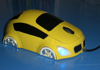
First things first, as can be seen, its a mouse mimicing a motor car! Function-wise, it has a left button, right button and a scroll wheel to accumulatively make it easier to browse our computers.

Visually, the palm sized mouse comprises of 2 main colours: yellow and black. The strong contrast this makes draws the eye and thereafter, the electric blue lit headlamps prove another point of fascination. It has a shiny, glossy paint effect that has been used, adding that alure for it being something quite sexy, but then at the same time cute.

The headlamps of a triangular shape are quite a contemporary design as opposed to the rectanglular form used, say, a decade ago. It gives the car mouse some character. It reminds me of being quite cat-like for some reason. They shine a bright neon like blue light, which draw the eye, but in functional terms, alert the user to know that the mouse is on and connected.

In mimicing a true car, the wheels feature silver 'alloys' (although my heavy use has worn that down just a "tad") and in particular, a 6 spoke design, along with shiny metallic rimmed grills on the front. The half moon choice for the wheels are used so to make it a properly functioning mouse, but could be deemed futuristic, that of a hover car maybe, gliding along the ground. The combination of the black positioned next to the silver for the grills is a scheme which compliments each other. We know the front black panels to be grills due to the ribbed effect that has been applied, and in my opinion, are synonomous with the design of BMW cars, whose public image is that of expensive, refined cars.


The lines which form the body plates of the car mouse are all fluid, giving it that realistic sports car look. The curves, although no doubt being there to fit the ergonomics for a hand holding the mouse, mean it altogether appears a sleek design, streamlined, coupled with the small narrow side windows reinforcing the sexy sports car appeal. Of particular note, the blacked out windows give it a sort of racy, edgy feel, as opposed to, for example, a family car with big, clear windows.

In all, I really like the aesthetics of my mini car mouse. It looks futuristic, it's neat and being packed in a relatively small form, again, I believe, gives it some character, cuteness. What sets it aside from a bog standard mouse, it's major selling point you could say, is that it grabs your attention: the colours, the design with sleek lines, but then also the bright blue headlights and the red brake lights. In addition, it would appeal to car lovers alike. If I were to use one word to describe it, it would have to be, very simply, cool.

When thinking further afield, the idea leaves you thinking of all the other regular items in our life that can be altered into the guise of a mouse. Saying this though, there are already so many attempts that have been made, some better, more ingenious than others:


Comments

I've commented on Diana's multi-colour candle posting as well.


"I like your candle! and it is true what you say about the flame, in that they do provide some sort of calming quality. for me, i think the different colours that the candle drips make it look not too dissimilar to a stick of rock?! main stream candles nowadays all tend to be them large thick ones, normally just of one colour, so your thin one, with a variety of colours gives it some uniqueness! also, as with all candles, when they are lit the wax then runs down, but this adds to the visuals, as the dried drips give it more texture and in my opinion, that aged maybe even archaic, traditional candle look."

Over and out...
@

Tuesday 20 November 2007

Narrative part 3, extra 3 examples interactivity

Right, for the third and final part of our Narrative module, some self directed study calls on us to extend examples and analysis of interactive sites.

I have had trouble finding more interactive narrative sites, so the narrative aspect may be difficult to discern when considering these few examples. Apologies! I am aware of the meaning behind narrative - it is a way/viewpoint of telling a story. It has meanings to it, a message you could say, along with attitudes and values which you are trying to push, not just a simple story going from A to B.


http://www.thephaeton.co.uk/universe/


The first is a Volkswagen site, which immediately introduces us to the site saying "this site has no sections, no sub-menus, no tables. Your journey is unique to you." This is exactly what interactive narratives are all about - the user makes the experience themselves, they have to sort of fathom out and self direct themselves along their journey.

This site informs the user of the various aspects that make up their new product, but also the factory that produce them. It is certainly of an informational purpose, but also could be perceived as a marketing tool for the new car.

Titled 'Universe', you very much do have to explore the galaxy, by clicking and then reading to find out the information. Some could complain that it is too difficult or time consuming to find out what you wish to know. However, a great search and map option is included to find your desired selection.

In terms of spacial awareness the site fills the browser window, but may alter depending upon the users aspect ratio. It is truly a 'Universe' with the black filling the screen, and then the white lines and flashing dots mimicing that of a galaxy and its stars. Aesthetically, it looks verrrry nice, I really like the look of it. This white line starts at the beginning and swirls and bends all throughout the progression of the website, with the various information boxes on a sort of timeline along this line, showing again the progression aspect to this site.

The site makes use of text, images, graphics and audio. The space like background noise merely goes alongside what is being illustrated - a cosmic, space sort of feel. It could possibly provide a soothing atmosphere, whereas, it could well become annoying.

It is highly legible, and the links easy to follow due to the large white dots, or the navigation bar found at the top. You can click anywhere you wish, or alternatively, follow the hyperlinks found within each text bubble, which follow a more structured order in terms of logic or progression. The white dots/stars pinpoint exactly where more information is held, meaning you are never stuck for something else to read.


The next site I've found is http://www.agencynet.com/, a site, that as can be seen, advertises and informs about the agency company.

The user can navigate the site through two options: the more traditional click on the menu and it'll display the information you want. Or, on the other hand, you can navigate from the birds eye point of view, and find the room you need for the information you require. When you click on these rooms, it'll bring up the same information the traditional route retrieves, but both are in a notepad style writing, as if it is that of an office members information.


By being able to navigate through the office by the birds eye view it does make it feel a lot more intriguing/in control feel. You are almost God like, being able to pick and choose where you go in the office, what you see and so on. This I find highly appealing, and is quite inducive.

We see the office directly in the centre of the browser window, the surrounds of this mimicing a desk. When the newer information is selected, these layer on top of the previous piece, as in, new sheets are placed on top of what you were looking at previously, so it is always available to go back to where you were. The surrounding wooden desk reinforces the office idea, whilst being a dark wooden colour means most of the focus remains in the birds eye view window.

The site features video, text, images and wind sounding audio in the background. Another special touch is that people have been recorded and then miniature characture versions can be seen walking, talking and sitting in the various rooms. You can traverse the site when going more in depth, for example, by pushing the buttons on a remote control and the video plays on a TV shown in the office. In addition, there is a sort of wordsearch game, where you have to find the hidden words and these refer to some of the products available. Once found, it tells you the relevant information. The gist of this site is you have to work (in a fun way) to get the information you want.

The text used is legible purposefully trying to mimic that of real life: newspaper fonts, felt tip pen scribbles on paper. It tries to add a touch of realism. The use of bright colours brings the site to life.


The last example I have decided to use is
http://www.woodlands-junior.kent.sch.uk/studentssite/pokemon/intro.html. This is actually a very simple story where you make the decision involved in the world of Pokemon! (ha, don't laugh!) Quality wise, it is as basic as can be, but this means that the essentials are included and it isn't overly fussy with distracting elements.

The information is displayed in mainly the centre of your browser, it increasing and reducing to accommodate the bits wanting to be displayed. It is all of an entertaining value, it is a story after all where you direct the choices to where it will progress.

It comprises of mainly text, but visual prompts are provided in the form of animated graphics. Colours are used to effect, for example, to distinguish from narrative and dialogue. Sound clips are included which reinforce the Pokemon theme, sounds reflecting the Pokemon action involved in the story. These iconic sounds fans would be well aware of, but others may merely accept these as being for the story.

The interaction comes in the form of reading the text, looking at the images and then choosing appropriate options which link you to the next page to show you the outcome of your choice. The links are all underlined and even sometimes use a different colour to better distinguish them. The arrow navigation button is used as well, an arrow pointing to the right naturally meaning go on, for example. Pretty simple, but very easy to follow and work with.

It is a quite basic (in terms of production) interactive piece, but it definitely fits when considering it being a story thats interactive ~ an interactive narrative though maybe pushing it a bit! It meets its audience needs by using large, and simple fonts so the children using will be able to read and follow. The pictures are really supplementary to the story, but are symbols to quickly display what in the story is occurring. Surprisingly, there is A LOT of content: 7 chapters. Nonetheless, after going through and experiencing the first chapter you could find the following 6 merely to be repeats and therefore tedious.

Onwards...
What's now important is picking out the recurring techniques used throughout to implement in the planning and creation of my own interactive narrative. Building on all the good points should ultimately mean my work is successful and of good value. Also, I need to think of something worthy of being told, not just a simple A to B piece.

@

Monday 19 November 2007

Rate it

The final task set in part two of our Narrative module is to rate/review/comment on another groups work.

With us all being in the same boat, majority being new to the whole University project work, I'm going to look mainly at the successful sides to the groups work, but then if there are any downsides, suggest areas to improve the work.


What I think works here is that looking through the keyhole makes it seem really quite sinister. It has quite a daunting effect, as the viewpoint is as if you are truly looking through the eye of the captive. The slight shakes that can be seen on the camera add that feeling of anxiety, or being afraid. In addition, with it being difficult to get a clear view through the keyhole, this side of the lock really feels quite closterophobic. They have done really well. Even the small touches of the figure being hooded so we cannot really make out who he is, adds once more to the disturbia. The grungy heavy rock music again provides us with a reference to find this piece quite discomforting and oppressive. Lastly, the heavy breathing displays the intrepidation of the victim and brings us close to their humanity, something emotive.

I can only find a slight downside in that the piece is quite long, at 2 minutes. We spend a while sitting with no dialogue, and then for another 1.30 mins the dialogue kicks in but its quite hard to distinguish or make out. The phone call isn't straight and to the point, but instead reveals the killer to be quite chatty, and for me, not really that ruthless/hard. This though, isn't really to do with the production, but instead is the way of acting it out.

If I were to improve anything about the piece, you could perhaps make the killer tougher. You could do this by limiting his conversation to the essentials and maybe have him in a more "grunting" manner. We actually see this briefly in the ending, so more of the same but throughout.

In regards to the piece as a whole though, The Captive works for me. At first the piece may seem irregular/unconventional, but once picking out the techniques in use, it makes its worth far greater. Good work, well done, it definitely had me looking through the eyes of the captive and feeling the heat.

@

Sunday 18 November 2007

final cut part2

In the next section of our single shot write up, we're meant to compare our work to that of another group and then comment on their work - what's good, what's not so good and what would change about it to improve it.

However... at this stage in time, I haven't found anybodies finished pieces on their blogs... I must have just looked through about 15+ blogs! (And seeing as people are in groups of 4, that would make up roughly a member from each of the groups.) So for now, it's going to have to be a waiting game... and when someone does post their finished piece, I'll pounce! And comment! lol


UPDATE:

Right, i've found a groups posted work, which can be found on http://dannythiele.blogspot.com/.

Titled 'Beautiful Betrayal', it similarly(in comparison to our 'One Shot') is a film noir type. Set in a graveyard, it features two characters, one of which seeks positive things, whilst the other negative and ends the film by stabbing the good character. There is a sense of intrigue in the piece as the audience doesn't exactly know what will happen, the murder definitely isn't a full drawn conclusion, this again being like our film where the end is obscure and more difficult to predict.

In a similar fashion to our own film, the group have made use of shadows, again, dark representing bad and good being in the stark bright light.

There is also a comparison drawn from the fact that the film features little dialogue, but instead a predominant sound in the background; a music score for Beautiful Betrayal.
Nonetheless, this group has included echoed dialogue from the characters. It adds another form to narrate the piece and give direction as to what is occurring.

A further contrast found is that we chose to use slightly tighter shots, whereas 'Beautiful Betrayal' has scenery around the main characters: that of the graveyard and headstones. This tempts to viewer to think of it as being a sad, but safe place to be. However, when the murder is committed at the end, it also reinforces that this is a place relating to death.

Also, as a side, the group have included credits listing who was involved in the actual film and importantly, the production.

-These in total form the comparisons I've been able to draw between 'One Shot' and 'Beautiful Betrayal'.

@

final cut

Right, its been a 3 week project, its been 4 peoples efforts, but ultimately, its a 1 minute(ish) single shot film.


http://www.youtube.com/v/zpwRIL5Hgbo&rel=1">http://www.youtube.com/v/zpwRIL5Hgbo&rel=1" type="application/x-shockwave-flash" wmode="transparent" width="425" height="355">


I really like the look of the film. In a word, it's DARK. Both visually, but also metaphorically. The contrast and the dimness of the grayscale sort of preempts the negative, ominous feel of the piece - this certainly isn't a happy go lucky chick flick or family friendly kid scene. You could criticise it due to that you cannot make out what is in the background very well with it being covered by the shadow/darkness. However, that isn't whats important about this piece - the main action is the main character, who is perfectly visible due to wearing a bright white shirt.

Whilst on this point, you should be able to notice that from our original take, the shots becomes alot tighter, more up close. This is something I repeatedly focused on during filming, from the learning in our seminar sessions. Instead of a wide open, ornate background for the audience to wander off into and lose the close intensity and anxiety we sought, the majority of the screen focuses on the job in hand - the main character. I much prefer it this way, as I can see the worthiness of the technique we were shown - you are in there and with little background distraction to lose your focus. This is why the key parts to the film, particularly the ending with the gun, are tight, close up shots, magnifying the effect of the action on screen.

The gun that David brought in was spot on for what we wanted. It looked like the real thing, and is another small thing I notice as working well for the film. When pointing against Davids head and the pillowcase, you couldn't get any stronger a contrast in colour - white and black, which is another way of representing good and evil.

The heartbeat effect I really like as well, it creates a rhythm, it sets the mood/tone - an identifiable sound effect used nowadays to signify stress or anxiety. The volume we tried to increase throughout, although it isn't that noticeable because we could only do it a little due to the sound distorting. Nonetheless, we did this with the intention of upping the anty, and increasing the intensity of our main character. Whilst filming, the door slamming sound conveniently came coupled with the sound of metal reverberating from the door slam. This wasn't intended, but from the first run through and finding out this happened, we definitely knew it should be included. To capitalise on this, the heartbeat sound mutes during this time, to make sure the door bang is noticed and emphasised.


Whats more, at the end where the screen goes blank, the beat continues, this again is something I really like. You only have that thumping heartbeat to concentrate or focus on, silence and then the loud BANG of the gunshot answers the question about our characters outcome, but also is quite a dramatic ending, a definite ending to the piece.

If I were to pick out any niggles about the piece, there is a slight bit in the middle where David goes down to pick up the pillowcase to hood himself with, and his head goes up and off the shot for a second. It is only for a quick second as he recovers by lowering himself and putting on the hood, but if I were to change anything, it would be to make sure his head remains on screen, all the time. This though, is only a tiny bit I have picked up on in the post production stage.

We did have a few slight discrepancies over which direction to take the piece in, and these were really very minimal - i.e. the man should stay on the chair, or the man should get off and get onto his knees, there should be a gunshot at the end, there shouldn't be a gunshot, but we quickly sorted this out by clarifying the options behind each of the choices, and then as a group, agreeing on the solution. It will probably be a never ending circle as to should we or shouldn't we have included the bang at the end, it has equal outcomes for the audience. The gunshot that we have gone for, I am in cooperation with as gives a forceful end, packing a punch to close the film. But silence would work equally as well. Lastly, we could maybe have thought more about the costume used. If David were say to have used a dirty, messy, crumpled up shirt, that would have provided more visual signals.


We were unlucky not to be able to obtain a studio when we hoped for, and thereby delaying us, but it is a lesson to be learnt, and means I'll definitely ensure we secure a location early on. Also, nobody had any tape to film onto, so Leanne had to hot foot it to WHSmiths. Being 100% prepared is therefore another thing to highlight just to smooth out any potential problems that could occur! But these are all really quite minor.


Nonetheless, it is the accumulation of all these pros, and cons, that have resulted in our final piece. I am very happy with the look of it, and feel it has been a really beneficial and productive module, something I'm proud of - 'One Shot'.

As a last note, in our brief we were told that the camera was only permitted one move. We asked Deb what specifically was meant by this and she gestured as picking up and moving the camera. When watching our take, we pan up and down a few more times than once, but hopefully this will be permitted. Other groups have taken it as being a non moving shot at all, i.e. the camera can only move OR pan once. Fingers crossed we won't be penalised. :(

--

Teamwork was divided into several categories.

The pre-production aspect saw Leanne drawing us up some storyboards. I myself, being the main author of the idea took on a sort of directive role, pitching the idea, hinting at deeper meanings that the piece could pursue, and then writing all this up in the Synopsis, Summary of Action and Scheduling documents - chief organiser or so to speak! Andria decided she would like to try her hand at the actual filming, so alongside this, wrote a piece about the look on screen, how it would be composed and so on. Last but not least, David took on the role of finding us a location, booking the equipment and studio facility.

Whilst filming, David was the main actor of the piece, myself the executer. Leanne donned her earphones and pitched up the mike, to capture sound, whilst Andria operated the camera and grabbed all the shots! We all played a part in setting up the camera, positioning it, the lighting rigs and placing set pieces.

Post production saw us all playing a part. Leanne initially captured the raw dv and then as a group we all came up with a different version of the final piece, then coming together and choosing the best bits, mixing these ideas all into our best and final final cut.

In terms of what we could have improved on, we could really have made it an absolute priority to attend our little meetings. It is difficult to get everybody in the same place at the same time, and admittedly, we experienced this. Leanne lives away from uni so it meant a long bus trek for her, and then the same back, meaning bus times can wreak havoc when you want to dig in and crack on. Obviously life can throw up problems and get in the way, but if we all could turn up, we would all be in the know and be up to date with the way the piece is going, whilst also knowing what tasks they need to be looking at and working on. This really is the only not so successful aspect of our group work project. We didn't experience bickering, we all managed to come to compromises when dealing with the ideas, ways we can work in and so on, meaning it all came together well.

As a last little bit, I've done my own edit of the piece. It's ALOT darker - instead of applying one light reduction effect, I doubled that, along with doubling the grayscale! I also went with the soundclip of the heart where the increase in volume is more easy to perceive.


If I'm being honest, I do prefer my cut due to it looking alot darker and for me, more grim. Nonetheless, our collective effort is our group choice and so will be the definitive edit.

@

Friday 16 November 2007

pixilation inspiration

For our SPP1 tutorial, we now need to post and comment on sources that provided inspiration for our pixilation pieces.

In Killer Shoes i decided to apply the dreamy overly white effect, making it seem quite supernatural.

The first thing that I recall when thinking of such an effect is from watching a dream like, surreal scene from Desperate Housewives.

http://www.youtube.com/watch?v=81aY62IseLU


When looking at this scene, it seems to have a blurry edge to all that is in shot. Towards the end there is also a predominance of white (from the fences and so on.)

I like how this looks aesthetically, but also the reasoning behind it as well. It fits in with the dream concept, as when we recall dreams, they do tend to be hazy, none perfect, and obviously, non real.


The second reference point I can call on is the ending of GHOST with Demi Moore and Patrick Swayse. At the end (about 40 seconds in) when he is going to heaven, as in my piece, there is an abudance of white surrounding the main articles of the shot. It gives it that supernatural feel, placing an aura around the objects in focus.

http://www.youtube.com/watch?v=wTAWt9stVAw&feature=related


A pair of living, walking, and attacking shoes are really not of the norm, and therefore could be demonstrated as something supernatural. The glowing effect may normally be linked to that of heavenly and Godly, but for my piece, I think it fits in with the weird and supernatural aspect.


The actual concept of the shoes coming to life was really a random stroke of genius, but I can wager a bet that everybody in our class has at sometime seen Toy Story. This indeed, also features inanimate objects coming to life. Of course the toys featured in the Disney classic are working for the greater good, but there is a section in the film where the toys fight back against a rebellious owner... and this isn't that far away from a viewpoint you could take for Killer Shoes. Toy Story too then is another reference point I can call up.


You sort of become accustomed, or afixed in your own mind on how a certain concept should look and play out. Its therefore difficult sometimes to nail the exact source of where you garnered the 'look', having it just built up over your lifetime, through the experiences you have had. But for me, this is how I pictured a surreal/supernatural/dream scene to play out and look.

@

Thursday 15 November 2007

cameras rolling

Right, it seems like its been a long time coming but we got our footage down today!

In all we took 5 takes, each time, I believe it getting better, and noticeably too.

(Word of warning: This features all the shots we took. It will be the fourth draft/take we will use for our final edit.)

I'll start with the tiny amount of downsides experienced during our filming. Firstly, it did seem to be a case, unfortunately, of too many cooks spoiling the broth. This was in terms of when we were initially thinking about how we should direct the piece, where the lights should and shouldn't be, and where the camera should be positioned. Definite areas for focus in the future.

We could have improved this by just having rigidly defined roles, or, being adament on what was set out in the storyboards, after all, thats what they are there for! Also we could have done more extension planning, where we would set the lights up and so on, exactly where the camera would stand. But being new to it all, it's something we're learning along the way. Also, to a degree, we wouldn't have been able to definitively specify lights, because we wouldn't know how it would look.

We had issues with trying to get Davids eyes in shot at the start, as when praying, naturally, you look down and close them. We omitted the close up of his eyes, instead, showing his bowing head and then slowly getting up, but the mishap can be put down to theory clashing with the physical reality, the film logistics. It may not be clear what he is doing at the start, due to the restrictions on how we could move and position the camera, so this is a slight shame. Hopefully not too much of a downside. :(

After faffing around with different gels on the lights, we realised that the mood we wanted (dingy, dark, shadowy) could be achieved by just having one key light. Taking this simple approach worked out well, creating shadows where we wanted them: cast over half of his face, and body.

Lastly, we could have made more an effort with the costuming. Adding some dirt, or grime, and screwing it up may have further pointed out the nature of the man. This is something that if we were to do it again, we'd take into consideration even more.

Nevertheless, once we started filming, it really was an enjoyable process. We had fun, we were also officially "working" and learning on the go. Nobody argued, it was actually a case of us wanting to do more more more shots!

It started off with a really wide shot, taking in the background, and really, alot of unneeded image. However, paying attention to what we had learnt previously in our seminar, about increasing tension, we likewise, tightened the shot, bringing it alot closer and thereby adding some intensity (hopefully!)

One possible problem we were initially met with was that David was wearing a white shirt and coupled with the lights, may have been over exposed. Furthermore, the pillowcase he places over his head, again, was white and may have been hard to distinguish from his normal clothes. However, when acting it through and seeing it on screen, this didn't prove a problem. The plus side to the white pillowcase issue, I believe, was the contrast created between pillowcase and the black gun. It is probably something nobody will notice, but it struck me. You cannot get any stronger a contrast than that: black, and white, good vs bad.

Also, in terms of the pros, we had it so the barrel of the gun appears into the screen, so that we are more or less looking down that barrel. Zooming in with the movement of the executor adds a dynamic nature, whilst also drawing us in very close to the headshot coupled with the gun. Sort of perfectly setting up the final and ending scene.

The scene ended up being 1min 9seconds, so shows that our planning, through the summary of action, was correct for the set length of the piece. We didn't have to ad lib on any sections, nor speed any up. It all fitted nicely, not being rushed and showing a progression through the piece, in the allotted time.

When it comes to our final editing of the piece, the heavy breathing we picked up using the mic will usefully play a part. However, being able to introduce extra sound effects should as a heavy thumping heart beat should add another convincing element, hopefully helping display that the man is under pressure, and creates a sort of rhythm whilst watching the one minute piece.

In addition, we will be able to alter the colour settings. We are looking to achieve the film noir styley; another symbol of the dark tone intended. It should look quite arty as well, what with the shadows.

For now, it's off to the editing suite, to nail our final piece. Although not finished, this whole process has been highly enjoyable, and once we complete the piece, ive expectation for it to be a rewarding one as well.

@
Monday 12 November 2007

stop [nintendo classic in] motion


Just found this on a site. Personally I think it's brilliant.

Compare this to our first attempt at stop motion and you can see the difference. They obviously took ALOT more shots, which makes the piece flow smoother and also, last much longer.

What makes this great is the attention to detail - it's what makes the piece. The spark signs that they add to each vehicle as it goes round the corner, the retro sound clips which are easily identifiable to nintendo fans, and also, the way that when one of the players hits a box, he gains speed and this is represented on screen by either taking more shots and having him blast off, or leaving more gaps in between their shots.

Either way, very impressive and probably appreciated all the more so by Nintendo fanboys (me one of them!)

That's all for now...

@

lights, camera... no action

Unfortunately, we weren't able to secure the booking of a studio room for today, meaning we couldn't film, as scheduled.

Whilst this is frustrating, it also means that we won't fully be able to make use of the seminar session tomorrow either, but there is now nothing we can do about it.

It isn't and won't be too much of a worry though - David is confirming a time and date when we will be able to set up and film the piece, hopefully now Thursday 15th November, when all members can attend and be in full form to 'nail it'!


In the meantime, as I've had a free day, I've been sharpening my video editing skills making a fun 3 minute piece about one of the girls in my flat.

I've learnt how to get the images on screen to match that of the sound playing, its simply a case of looking at the peeks and troughs of the sound wave of the music file. It now is much easier, and a lot less tedious than having to play through a piece 10 times to get it in time, as I've previously done in the past! Also, the way I chop the frames in turn with the music I think I've bettered myself with. It's just a case of playing around with several different techniques and finding the best one, a more effective and productive one.

So today hasn't been a complete waste, I've learnt something new today!

Over and out...

@

Friday 9 November 2007

'one shot' #6.5

Right, now for the updated storyboards. Many thanks to Leanne for the quick turn around.

As can be seen, they now reflect the adapted story and omit the hooded figures. Hopefully this will work out for the better... only time will tell once we get to the shooting part on Monday!


As can be seen, we've taken on what we learnt from our irritation piece and included a couple of tight, close up shots to add intensity. It's totally befitting of what we are trying to represent - an anxious and intense circumstance - and just really, in terms of the composition of the shot, it shows that you do learn from your experience, as we probably wouldn't have been aware of this without doing our seminar with Deb.

You should be able to notice the alterations we made to the staging/placing of the character, towards the end of the piece. This, in my opinion, is for the better. Although a glimpse of the executors lower body may come into shot, no faces, or anything personal/human will be displayed of this figure. I think this will make it a lot more grim and unsettling. This lack, again, leaves something to the audience's imagination, and means they themselves will create their own fear in their own heads.

-

I've managed to collect some royalty free sound clips and have been editing them on a program called 'audacity'. I've had to change the speed, frequency of ticking and so on. (Its a shame blogger doesn't let you load up sound because could have sampled the edits I've made.) The decision to which ones we'll use will come into play Tuesday onwards, where we have a seminar devoted to the editing in Premiere.

In all, things are looking good!

@

Thursday 8 November 2007

'one shot' #6?

Right, we're coming very close to filming, hopefully this taking place on Mon 12th as I mentioned in the schedule post.

We had a group planning meeting today and it was worthwhile, as we've tightened up on the story, in terms of the action that will take place and its specific order.


Notably from the last synopsis and action summary posted, we've removed the hooded figures the main character joins. Not only will this make it easier in filming terms, i.e. not having to ask people to pose in our film, but also, it should make the impact of the execution more noticeable. The man is up against a gun - quite a haunting prospect. Leanne is currently doing a second version of the storyboards, and I will post as soon as they come through.

David is also going through with booking out a studio, and all the equipment we'll need, for example, lighting kit, so we can set up some moody shots with heavy shadows to create a murky, shady image on screen. That sort of effect fits in with 'One Shot': the prisoner would be found in a dingy cell and wouldn't be looking his best/polished for the camera. It also should add the right edge to the piece from the off, concreting the unsettling tone of the piece.

In the meantime, I'm set to work on finding or making some ticking clock sounds and heartbeats, as well as a gunshot noise - Leanne had quite a few random sounds but they didn't fit exactly what we were looking for.

@

Tuesday 6 November 2007

look into the light (safely!)

Just had our second seminar with Deb, this time introducing us to the wonders of light. The three point lighting system in particular, used for example on an interview sort of scene, or newsreader type behind a desk.

What we learnt was really interesting, but also really hot under the lights! In a group of four we then had to set up our own shot, taking into consideration things like aperture, shadows, the background and so on.

We used the key light, at almost the highest setting on the tripod. This provides funnily enough, the 'key' light, or is the main and strongest beam directed onto subject x. The shutters on the front of the lights are called barn doors and a small grill that covers the actual glass bulb is known as the scrim.

Next up, we used a mid height 'fill' light positioned at 45' to the subject. You can attach different sheets in front of the lamps which either diffuse the strength of the light, a blue tinted sheet alters the colour temperature to that of daylight, whilst an amber does the opposite. We used a diffuser to reduce the strength, as well as putting it further away (every metre closer creates up to 4 times the strength!) as intitially we found that it created too much a glare on the face.

Lastly, we added a back light positioned, surprise surprise, to the back of the subject, yet again at an angle so to light the background wall as well. This was the lowest in our set up, and oncemore to reduce the strength of the beam, we chose to add a diffuser.

It required a toning down of the brightness settings on the camera, which gave a really well lit shot of subject x (Kane!), but noticeably also, pointed out a really dull/plain background. This could be altered next time, by opening, closing and angling the light and barn doors so it casts a different beam of light on the back wall.

-----

Health and Safety is also v. important - death being the worst case scenario!

Common sense is pretty much the way to go, but for those not in the know:

- Check the cables when renting them out, to make sure no holes and so on
- Have the light tripod firmly and steadily based, so that it limits the chances of it falling. If it does appear to be such a position, get an extra pair of hands to hold it
-Wear the gloves when handling all hot lamps. If any holes, discard immediately as they are useless and in fact, would form another hazard if there was to be another user.
-Have the cables tidied away if at all possible, so that it limits the chances of tripping. Add a rubber mat to create a walkable gangway if too many cables become an issue.
-Run through the fire exit procedure to all crew members, confirming the doors to be exited through and ensure these remain clear throughout the production.
- When cooling down after production, ensure the lights are in a suitable place, facing the wall for instance, so that they do not get in anybodys way. Also, leave adequate time for the lights to cool down afterwards, so it is safe to place back in the casing boxes.

But after all that, lighting is something defintely of use, and something definitely I will use in future. It really makes all the difference as video is rubbish without it! Furthermore, careful planning and setting up of the light rigs can make the difference between an amateur shot and that of a professional.

@

Monday 5 November 2007

'one shot' #5

Communication

To ensure an efficient and fluid film process from start to finish, our group members will keep in regular contact, having regular face to face meetings, in addition we will text and email each other. The bonus with email is that we can attach various forms of our work which the recipient can then read, comment and even adapt, and then return this - furthering a team involvement with our work. Lastly, posting on our blogs and regular updates will in all mean the group are in regular contact with one and other.


Scheduling

To structure ourselves and to ensure maximum effectiveness of what we produce, we began the film making progress from the word ‘go’.

Initially we started off with an afternoon working on genre analysis; that is, looking at relevant examples of single shot films.

From this, we separated to brain storm ideas that could make up the main idea or theme of our piece.

This was then followed up the day after with a group meeting for a couple of hours to present our various ‘sketches’ and discuss the pros, cons, and reality of the individual ideas. The benefits of this are that the ideas were still fresh in our mind and we could toy with them a little more, with contribution from all the group members.

From this, we then chose our final idea and assigned individual tasks, which split up the workload but also provided focus for each member of the group to work on.

--

From here on in, we will be meeting at seminar sessions, and more independent group meetings (Thurs 8th, midday) in our self directed study time, to ensure everybody is afloat with the production of the piece and committing themselves to their duties. Furthermore, everything we do can be analysed from four different perspectives in these group sessions, meaning a greater crit.

Filming has been pencilled in as taking place on Mon 12th. We will have to spend time setting up the location, be that light, props, time of day and any extras. The actual filming of the piece will take a few rehearsals and then no doubt a few takes to ensure the best is captured for the final edit. We will leave plenty of time is available to get everything right and not have to rush ourselves.

The final edit will comprise of a full group’s involvement: to add titles, adjust colour levels, include and perfect the rhythm of sound with the visual footage. All the group members opinions will be considered, so that everybody is happy and confident with the piece. We may even do several drafts of an edit, meaning that each re-draft we are tightening up our piece, ultimately bettering it’s quality. A test audience could prove worthwhile.


Assigned roles

Ashley took on the writing role for the synopsis and production notes, such as ‘Summary of Action’ and ‘Reasoning behind the Piece’. In addition, Ashley will write the communication and scheduling information.

Leanne decided she would like to create the storyboarding which we will refer when we come to filming. In addition, from previous Media experience, Leanne has a collection of sound clips we could use for our piece, so will be checking through these for items we may need, such as, a ticking clock and heartbeat sounds.

Andria showed an interest in wanting to film the footage, so alongside this, volunteered herself to write a short bit on the mood, tone, colours and general visual makeup of the piece we will produce.

David meanwhile was assigned the task of sourcing a location and bearing in mind all the needs for the idea. This will be documented with pictures and an explanation of the suitability, availability of the location. David has been hoodwinked as the main character and therefore actor, in the piece as well!

'one shot' #4

Next up, we've got a bit about the actual audio and visuals.

Light/Mood/On Screen

One of the most important factors of the mood in a film is light. Therefore, the lighting of this film should reveal the feelings and the atmosphere, which are emphasized with black and white colors, and would blend well with a fade out to black.

Music

The soundtrack of the film will consist only a heartbeat or ticking clock sound - maybe a mixture of the two. A natural feature of the heartbeat is that it can become faster/slower or louder/quieter at different points and so we will defintely exploit this to match the expressions of the film.


To expand a bit on these points pointed out by Andria, for the music/sound, for example, the heartbeats although recognizable from the start, over the duration of the piece will become grossly emphasised - louder, quicker. The final part of the character forming the line could be even more intense, with the sound completely taking over and being highly foreboding. This matched with the silence afterwards and a blacked out screen should make a real dramatic ending due to such s a strong contrast. -Noticeably then, sound is going to play a major role in 'One Shot'. If we were to neglect it would mean missing out on such a useful tool and would really make this half the film it could be.

In regards to the lighting and image on screen, a gringy, colourless feel would work really well. It'd provide an unsettling mood from the off and dictate the way this film should be perceived - not in the slightest is this a fairytale with a happy ending. Therefore, I should remember this is something we will have to keep in mind when it comes to the editing suite.

'one shot' #3

Next up is a summary of action, along with the story boarding. (Again, subject to scrutiny from our group, so some slight modifications may be made whilst we're still in the design stage... or, when we come to the set and find logistics mean modifications to the staging of the piece.)


Summary of Action

In short, One Shot is about a man due to be executed.
We are introduced to this man, kneeling and praying. He is in a plain, minimally furnished small room. A clock is ticking. Revealing an agitated disposition, the man gets up and continually taps his fingers on a table. He bites his nails. His eyes twitch and in general, he appears nervous. Oddly, he then places a pillowcase/balaclava over his head and walks to join an already formed line. This line comprises of other masked figures standing against a wall. A gun is brought out, which comes into the shot pointing at the main character. After a short pause, the screen goes black.


Camera work ideas

At first the camera is panning from up to down and we can see a man praying. As the camera is panning we can observe his fingers to then tap on a table. He is biting his nails and his eyes express his feelings of nervousness, with a zoom emphasising this. Then he places a balaclava on his head and the camera zoomed in and focus on the head while he physically moves. Suddenly the camera zooms out (maybe fast) and we can see a line of people waiting to be executed. Then the gun will appear in the frame of the shot and it will fade to black.


I'm pretty impressed with these screenshots from Leanne and the camera ideas from Andria. They actually form into reality the various random pictures and ideas that have been floating around in my head the last few days. As mentioned on Leanne's blog, the way the end has been pictured is slightly different from how I'd previously pictured it, but that is by no way a bad thing. If it works on film then Im all for it, but if there are other ways that we could sample, as in, the gun appears from the bottom of the screen and then zooms to focus on the mans face, creating an intensity, that too is always another option then.


Nonetheless, just seeing it all coming together is really exciting!!

'one shot' #2

Synopsis

-An interesting short one minute piece focusing on one single male character. We follow the man in a heavily restless state as time slowly counts down. Anxiety and apprehension form the predominant tone of the piece. The male joins a formed line of hooded figures, producing shock and discomfort in the audience, especially when a rifle appears, targeting him. Reality hits: this man is a prisoner, seconds away from execution, and we have just experienced his last few moments of life.

Reasoning

The execution idea is something quite shocking and so means our piece wouldn’t just be a run of the mill student film. It is more challenging as well, being quite a contentious issue. However, without directly telling the audience the nature of the man, there is no reason as to why he couldn’t be presumed a hostage, subject to the mercy of terrorists, or a prisoner on death row. (Mise en scene would have to leave hints of his true nature.)

The way we open the scene with the man praying would maybe subject the viewer to think that this is a religious man, synonymous with being moral and decent. The ticking clock would draw our attention to time passing, perhaps counting down; exactly what the main character is having to experience. Tapping his fingers and a restless state should raise questions in the viewer’s mind, making them wonder why the man is nervous and what has happened? The next action of placing a balaclava on his head would cause confusion, again questioning the character we have been introduced to. When he walks across and joins the line of other hooded victims standing against the wall, we realise what is happening and his anxiety becomes understandable: he is a prisoner and about to be executed. This juxtaposed against the prayers we first witness the man carrying out creates quite a strong contrast. The man who at first could have been moral, decent, is about to be slaughtered. Questions would be asked as to what has he done? In general, the audience would question the type of man they’ve been watching and maybe change their opinions of the character, some the more sympathetic, others perhaps, non-trusting.

The final blacking out of the scene leaves the ending open to the viewer’s imagination. The audience would presume the execution will be followed through and this is indeed confirmed a few seconds later by a loud gunshot, something very definite, but also quite horrifying. This dramatic ending should have a more resounding impact, being much more striking.


- I am happy with the way we set out the scene and that it does have meaning behind it. The idea of execution is quite real in terrorism nowadays, so this isn't just an idea plucked out of nowhere. Furthermore, with it being unexpected, I think it proves all the more worthwhile. I really like the fact that it should shock people, and get a reaction. Art is meant to stir people up and get them thinking, or evoking a response. Hopefully this will too! And from students of all people!

'one shot' is under way #1

Right folks, our next Narrative coursework is getting well under way.

I'm in a group with Leanne, Andria and David, and we've been assigned roughly one minute to make a single shot film.

A quick word on the various random ideas that were brought to the table:


1) The Scientist

A man is seen enterring a room in a fluster. He grabs some bags on a desk and starts packing them hurridly. On the desk are what look like the remains of an old experiment. He pauses when he notices the scientific experiment and looks tempted to re start his research. He teeters on the edge, looking back at the door and then suddenly begins to mix various fluids found in bottles on his desk. This proves to be a mistake as a few seconds later, the door bursts open and a squad of men enter, moving towards the man, who looks petrified.

- This is quite a neat idea, it would work because it is for the most part feasible. It should catch people's attentions from the anxiousness displayed in the Scientist's hurry. The decisive moment of should I shouldn't I again should have the audience involved, with them deciding whether they indeed would or wouldn't. Also, as the audience wouldn't be aware of the reasons behind this man's urgency, this should create interest.

2) Mixing of the Elements

Someone stands with an umbrella. Instead of the usual rain falling from the sky, instead soil falls! The camera tilts to her feet where slowly but surely, water starts collecting around her shoes. The camera moves to reveal she has a glass in her hand... surely for drinking? Nope. It has a flame inside. Lastly, we move to her face and she opens her mouth and blows, pushing the camera backwards and ending the sketch.

-Again, this slightly bizarre sketch would definitely catch people's attentions. It is made of four simple components so wouldn't confuse due to it being too elaborate or overcontrived. However problems definitely would arrive when it came to the actual constructing and carrying out the scene. Furthermore, there isn't really a point to the piece, it is just surreal and so wouldn't provide a message and leave the audience something to leave and question.

3) Stalked

Focused on a pair of feet walking, we see at first a regular walking pace. This then starts to pick up in random spurs, and the pace suddenly quickens. Slowly we zoom out from the feet and reveal the lower leg. The body is running... but from what? The person pauses, resting their hands on their knees. Finally the camera zooms out to reveal the full person running, dressed in white, but constantly looking over their shoulder at their pursuer. The mystery figure exits the frame and slowly the camera pans to where they had been looking. In this place is a person standing in an ominous black cape. When it zooms on their facial features, it is exactly the same person just running from the shot. They are being stalked by themselves.

-I like the twist that occurs at the end of this piece. It would be unexpected, slightly chilling, but then again, may just get a "WHAT?" from the viewers. But downsides I can point out are that filling a minute with running may make the piece drag and lose the audience's interest. The difference in colour would provide some form of imagery. The white person running, would be an example of good, in contrast to the black cloak waiting at the end, definitely a signal of bad/evil. However, I do know that this isn't our chosen piece, as something slighter better was thought up...

4) One Shot

Funnily enough... 'single shot' is what gave me the idea. This being our chosen piece, over the next few posts I will provide all the bits we've been working on in the planning stage. Needless to say, it has some depth, will intrigue at first and then shock when the key event occurs!!

Saturday 3 November 2007

all about the art

For SPP, we've been asked to find an example of what art is, and what art isn't.


This for me IS art. Graffiti is perceived as a nuisance and created by youths, but on the other hand, it is one of the best examples of raw talent and creativity, whilst being aesthetically pleasing, contemporary and dynamic.


This, meanwhile, for me, ISN'T art, but what do I know, it won the Turner Prize in 2001!! Martin Creed's 'The Lights Going On and Off' is an example of where people can question the defintion of art. To me, it's an empty room with a flashing light - it isn't artistic - it just is what it is. So much to say, if this is classified as exemplorary and award winning 'art', maybe just about anything can be art! Even my scrawls!
That's all for now...
@

Friday 2 November 2007

"irritation"

The next phase in our Narrative module took place on Tues and we were asked to produce a 30 second one shot film. We were given about 20 minutes to plan so again, everything had to come together quite quickly and thus it wasn't as stringently planned as normal.

In our team we brainstormed and came up with the idea of a fly pestering someone sitting quietly. The irritation grows as the fly becomes more persisitent in buzzing around.

The piece we filmed turned out to be quite comical, with myself "buzzing" into the mic and Kane wafting around, finally swallowing the fly!

What worked well is that we got a really nice looking shot, the stopping and starting of the buzzing perfectly matched the action happening on screen and we managed to trim it down to the required 30ish seconds - 41 in fact!

What could have been improved on is that the shot we took, all be it a very aesthetically pleasing one, didn't really capitalise on how we could intensify and push the "irritation" theme further. It was a wide shot with miles of grass in the background and the sun casting a nice light over the bench, so to close in and make it feel closterphobic would have worked better.

Taking this into consideration, with more time and detailed and thoughtful planning, we can produce something even better. It is a free choice of theme, so watch this space. The coursework group is all but confirmed over the direction we're going to take our piece in and then we can fine tune it to make the best we've ever done.

Over and out...

@

Thursday 1 November 2007

Read it. Write about it.

A task set in my SPP1 tutorial was to pick from the selection on the reading list, read it (obviously!), and then post a synopsis including a cover art image.


The Language of New Media, by Lev Manovich, introduces us to the main concepts and theories surrounding media; new media in the 21st Century. To understand the notion of new media, references of a comparitive nature, are drawn particularly from the cinema century of last, and other associated concepts from computer science, art history and film, through topics such as Interface, Operations, Illusions and Form.

We find out what is new but also what are in fact adapted continuations in a now digital form. Analysis is made on the systems and processes adopted today, be it database / narrative driven pieces, or virtual reality simulations. Questions are raised too, for example over interactivity, in addition to highlighting possible paths we may well pursue in the future. In all, a thorough but critical look at the shape and substance of new media.

@