Thursday 28 May 2009

Browsershots.org - for IE6 testing

The problem with Windows is that once you update to a newer version of IE, you cannot them officially return and install a previous format.

Enter browsershots.org which has been going for a while, but allows you to test your site in all it's "glory" or most likely not, in IE6, 7, 8, plus Chrome, Firefox, Opea, on Mac, on Linux. Really there are loads of options.


Furthermore, you can define the size width of the intended user, along with whether Flash should be switched on, scripts too.

Bestwood now displays perfectly in all the major browsers.

IE6 (with PNG fix and double margin float rectified)

IE7

Opera

Firefox

Chrome

@

Tuesday 26 May 2009

Font folder - Mac & PC

http://www.ampsoft.net/webdesign-l/WindowsMacFonts.html


This site I came across after having always wondered
whether a certain font on PC is also on MAC.

It lists in a simple way what is included. Still, shan't be a problem once CSS3 comes along.

@

Saturday 23 May 2009

Mining - Flash interactive timeline

The website is getting close to completion now. I've made my interactive piece - the Bestwood timeline which hopefully will provide a more interesting point of information for younger viewers.


On this occasion it was the aesthetics that I had trouble with more than the actual Flash coding.

Using the Cadbury World experience as my inspiration (a great vibrant piece that will surely attract younger viewers) I tried out some layouts for the timeline.


This first one was a little too rigid. It appears a little dull.


This second one has more visual interest due to the bendy nature of the lines however I feared it may be too over the top?


I arrived at a compromise between the two, it has the curvy lines, but then I tiled it too with a slate wall image. At this stage, I still wasn't entirely satisfied however. It seemed to be a little bland.

I went into Photoshop and added smudges, and dirty marks so that the coal mine theme was more evident.

When it came to the Flash motion, I wanted to make it roll over, roll out and have jazzy effects popping up. I thought a good tie in with the rest of the site would be to use a glow effect in the colours that the Bestwood site uses. This was all achievable through setting up functions that detected when the mouse hovered and also whether a rewind action was in use.

Something of importance was making the text legible. We intend to repeat the information below this Flash piece for those who do not have the Flash plug-in and so I decided to go for a slightly jazzier font too. After several attempts at various sizes I decided upon Market Deco. It has a classy look but also a dated feel, again fitting in with the mining theme.

To sum up, I feel the mining piece has gone well. I particularly like the animations that appear - they are snappy, contrast against the white background and should attract the user's attention. The text information is short and to the point and the icons help visualise the information. A younger user should find this a more pleasant way of finding out information.

@

Extra stuff - Letters from a WW1 soldier

In amongst doing coursework I've managed to get a few more extra work projects completed. The one that I've launched online recently is Letters from a WW1 soldier.


Using a Flash interface to better provide for the image based scene, this work project really called on image manipulation and optimisation skills.


This was the starting photograph I was provided with. From here I managed to create a scene full of various WW1 artefacts that all link back to the main topic of war time history, but obviously personal to family.

When you compare this to other efforts (admittedly, popular sites) regarding war topics, I think this stands out through it's visual staging, rather than lines of written text. Furthermore, with it being image based it could appeal a little more to a younger audience, I know I certaintly prefer it - it's real history you can see, not just words on a page.

I've even had to add in an email since due to the unexpected hits its been getting, London, Sheffield etc.

@

Friday 22 May 2009

Find the KAs


Having seen this a few times I didn't pay attention to what Ford were doing.

Discreetly shown at the start of the advert we are asked to find 80 KAs within the 40 second clip. Now, importantly, this isn't achievable whilst watching on the TV, it is over too quick and in the 40 second ad, that would mean 2 every second. Ford must be aiming this at others then... youtube fans is my guess.


By taking the time to rewind and search and then rewind and search some more in all this means that the user will be spending more and more time looking at their product. It's a clever marketing spin.

Admittedly there is the downside that you may become frustrated looking and this negativity seeps through to your feelings for the company.

Nonetheless, I think it's a clever scheme which although advertised on the TV, unless you really want to Sky+ it, is for users like us, online. We all love Where's Wally? and I feel this too is an ad campaign that is successful through its inventiveness.

@

Wednesday 13 May 2009

Mining - header colour scheme

Following suggestion in the feedback, earthy colours were suggested for the headers rather than the strong colours created before.


Luckily, my previous blog commented on a BBC timeline that used the colour spectrum. We really like a span within this and so adopted the colours for our own use.


We find these compliment each other well, whilst following the earthy requirement. Plus, the main reason is that they enable thematic coloured sections.

All that needs to be changed is the frame for each page, so they are the same as their header.

@

Tuesday 12 May 2009

Mining site - client feedback

In response to our updated designs, we provided our client with a feedback form, which helps direct their attention to matters of importance.

This proved a good formula as our client responded quickly with responses that were focused and direct to what we need to know.


The changes can be easily implemented and means we can progress to the building of the site in CSS. Target goals focus on accessibility availability.

@

Monday 11 May 2009

Mining - interactive timeline - genre analysis #2

Cadbury's World was the place I first found inspiration, when thinking up interactive ideas.


It caught my eye by being visually interesting and lively. The blending of the chocolate colours, the swirling pattern is makes, the sparkling title, the warpy purple background. From this there are certain things I should be taking note of.


In terms of what this piece informs of, it lists, sort of linear, the stages you will explore as you go around Cadbury's World. Each section has it's own little cartoony like character and it gives it a likeableness.

On hovering over, the section motif is enlarged slightly and a white starry graphic placed behind. This continues the sparkly/magical feel already created. Furthermore, the title of the section is presented. I can't decide whether I would prefer this on the main piece, but that would admittedly hinder aesthetics.

Unfortunately, whereas first you are presented with an interesting colourful piece to look at and interact with, the information slide that appears when having clicked, looks rather dull. The background is darkened and a flat white box placed on it.


The same little logo is reused, bigger this time so you can appreciate more of it's detail, however the description text is small and feels rather cramped. Imagination and excitement is not maintained with this. Here there is too much whitespace and it makes for a boring, barren feeling.

Usefully, there is a link which takes you to the next stage's information, but again, it's the same bland affair. 

If I were to change this setup,  it would to be more similar to the BBC. The pop up information would appear in the main interactive piece, rather than being on top and largely blocked out. Furthermore, OK it is information but it can be made fun with bigger text, colours, layout etc. Images wouldn't go a-miss. The purple heading shows they have tried.

I think this type design will work well for Bestwood. It warps the idea of left to right timeline into something visually interesting, at the same time being educational. As we are catering for youth/community, the bright colouring and graphics will be required too.

@

Mining - interactive timeline - genre analysis

 For the interactive timeline found on Bestwood's new site, I am now going to research into what ideas others have created and analyse them, highlighting successes and failures.

The first example is from the BBC and it does well, ticking all the boxes you would expect for an interactive timeline.


http://www.bbc.co.uk/history/interactive/timelines/british/index.shtml

To begin, it uses the full colour spectrum to appear vibrant and lively. This always bodes well when trying to disseminate information about history, which can be deemed unexciting. 


Using a click and grab action, you pull the timeline from left to right, and the associated timing appears. If the user fails to understand this method, there are left and right arrows below which implement the same navigation decision.

Consistency is good here as the colour choices in the simple nav bar at the bottom are carried through in the large image space where the information is held.


When you hone in on a particular place in time, speech bubbles like that of google maps pop up with a brief statement of what occured along with the date. What I like here is that to find out more information you click the bubble and it expands with more information. This is an intuitive design decision and works well.


Within these bubbles you then have the option of extra hyperlinks which bring up an extra window so the user remains and doesn't navigate away.

There is a search button in the top right of the page so that the user can find a specific date without having to look too far. I

The option to explore thematically, i.e. if I choose Technology category, only this information is displayed, is available. I like this. It allows the user to feel involved by having selected which category they will find out about, whilst also making the information about that topic consistent.


In all, an accomplished interactive timeline including all the features you'd expect. My only suggestion would have been to include small images when the first set of bubbles appear, so to add more visual interest. 

@

Saturday 9 May 2009

Mining - design development

In response to our client feedback, I have since addressed a number of design elements that they thought could look better if altered.

The main one was to do with the font. The Nottingham City Council use Arial as their default typeface, and so we were told to do similar, so that this site would aid in the consistency across the board with the Council's branding.

Admittedly I did regret this as I have come to dislike stock fonts, such as Arial or Times New Roman, however it isn't the worst font and there is the bonus that it will appear and function on all machines, whereas Rockwell, although looking more modern, and mining like, could have posed problems.

The next area for development was in regards to the borders for images. The initial design I went with what I felt is a modern trend for chunky frames and no shadows, instead, being flat on the page. Our client felt this wasn't the sleek look that youngsters like or appreciate, so narrower, but also emphasised courtesy of drop shadows was requested. This has been implemented and I don't mind the change.


It does look sleeker, or more compact and the shadow boosts the images off the page. This is helped by making the detail text smaller, and not so dominant on the page, but the headings reduced only slightly, so to remain large and visible.

Noticably also, it was requested that curved edges were nicer, instead of the boxy look. I was limited in what I could achieve through Photoshop in regards to the stroke around the pictures, however, I did curve the white box background. It is a small change but I believe it makes a difference.

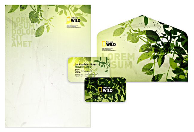
As in the last post, we mentioned the use of thematic colour. I have tested this out, with varying degrees of success.


I think of them all, my least favourite is the  purple. The borders around the images had to be changed a few times as often they appeared too feminine and clashed with the whole mining theme. Furthermore, we are catering for a mixed audience. 

I can't really see any that stand out as definites. The green I have becomes used to and so may be why the changes I am not rooting for. With Nottingham Council being green in their branding, I think we should continue this look. It ties in well and holds nicely in the design. 

These designs will be submitted to the client following our own image capture session. Hopefully the decisions will be approved - green and refined.

@

Friday 8 May 2009

Mining - Site map (content ideas)


The colourings highlight how we thought we could colour code each of the sections of the site. This thematic colouring helps a user in acknowledging where they are in a site, colour being a discreet but effective option. 

Update: Following a meeting with the client, it was made aware that the colours shouldn't be too blary or off putting. Instead, complimentary colours would be nice.

Fortunately too, the Council's official site uses this sort of design principle, with green being the key colour but then as seen below, an orangey colour for a different category. 


@

Thursday 7 May 2009

Mining - web layouts

For variation between the pages, we thought it beneficial to create multiple potential layouts.


We knew that large images were a good selling point for a site, after conducting research. Furthermore, web text functions best in manageable bite size chunks, so distinct blocks would be a good idea to pursue.

This first one is the look created for the homepage, and proved successful after being chosen by the client. It features a key design trend for 2009 - three column layouts, so we felt it has some credibility in terms of design.


(These will look better when filled with content, as here they seem a little obscure.)

Personal preference goes for established looks that are used commonly elsewhere online (this being the last one.)

Obviously the important factor is client preference. It will be important to reinforce the need for eye catching images and bite size chunks of text.

@

Saturday 2 May 2009

Beautiful typography

I'm increasingly becoming a typography fanboy. On looking at Smashing Magazine, a great resource for design inspiration of all sorts, whether it be tutorials, trends, technology I found this typography article.


Notably, our NTU Art&Design handbook has made it in. I knew Un.titled (sublime creative agency) were at the top of their game after perusing this book and their website portfolio.

However, there are so many other good examples on looking at the article. Stand-outs for me include the National Geographic - who would have thought it.


The orange contrasting with the varying shades of light, medium and deep green works as a great eye-catching device. The blocky typeface is strong and again proves a great constrast against the flowing, curvy natural leaves. Here, the tiger image which would normally have taken priority seems a lesser faction. In my opinion, the neon orange works better, yet I appreciate on inner pages of the brochure, this may prove too distracting/overwhelming. Nonetheless, as it is now, I would be very proud if I had created this.

And it doesn't stop there. Their stationary is even better, and I would be astounded should I ever receive something as distinct as this in the post.


Interestingly, the people behind this National Geographic design were also behind a logo I commented on (Bahamas) way back in the first year. Their talent is widespread.

--

This next example goes all out to capture your attention through it's use of pinky/reddy text and cramming the page with varying degrees of sized text.


In all reality, it doesn't appear to make that much sense and so could be criticised for failing to effectively impart information (one of the fundamentals of graphic design) yet this adds to it's alluring, interesting nature. The white space that uses diamonds to shape the letters is also unclear as to what it is showing, but again this difference proves to draw the eye into the space not covered with a barrage of red text.

One thing this article does show is that there is no end to the potential with the same 26 characters of our alphabet. Fundamentally, they form great pieces of eye candy and even better, sometimes serve as a superb mode for conveying information.

@