Wednesday 30 December 2009

2010 Web design trends

I always like these sorts of things - they're like go to ideas to help initiate a website design, but supposedly "in" for the year.

Here's 2010's web design trends. (Apparently).


I'm pleased to read that large headers, images and typography are amongst those. These three are personal favourites of mine to implement and see online.


An interesting one that I have often considered exploring is the perspective one. (see picture above) To have an image and then the web text slotted into the photo somewhere is quite inventive and it's uniqueness online draws the user's attention.


@

Monday 28 December 2009

Live client - hosting package #3

The last of the hosting packages I think suitable for my client comes from Catalyst2.


Advantages:

Price - again, with my client's company being a start up and with a limited customer-base, it would be appreciated if the cost for the hosting could be kept down. The small package on offer from Catalyst2 comes in at £12 a year. Very competitive.

For this, you get 250MB of storage space, and again, as the site will be largely HTML and with only a few images, it would be unlikely to exceed this amount.

There is database support, phone support and a popular, but useful web tool - online chat support.


Downsides:

Again this host fails to provide a service level agreement, declaring how much you can expect the service to be online. But for £12 you can't expect everything.

You would have to purchase a separate domain at an extra cost, but as previously acknowledged, these are quite cheap at around £5 or £6 for two years.

In terms of traffic, there is always the worry that the site could become oversubscribed, shutting down activity for the rest of that month. The Catalyst2 package provides 2GB of traffic, which is a feasible amount for a site of this sort. The PDFs would likely pull the most on the server, but as these in themselves will be optimised and condensed it should prove adequate.

---

Overall, Catalyst2 proves itself as another viable solution for Footworks by Sue. I will tender the 3 hosting packages I have blogged, to the client at our first meeting. The choice will then be taken and the online service purchased.

@

Tuesday 22 December 2009

Live client - hosting package #2

The next host I've looked up is OVH.co.uk. This information comes courtesy of .Net magazine which gives a phone number to purchase the packages.


On their '60gp' plan, my client would get a package that serves her needs adequately:

Price: £0.90 per month, working out to be £10.80 a year. For the domain: footworksbysue.com it is listed available at £4.99, likewise for the .co.uk. Total incurred price would be around £20 a year then.

Storage: The online server will hold 600MB (which is actually appropriate as she will not be hosting video or music etc) and can serve 20GB of traffic each month. Even with the PDF downloads, it will never come close to reaching the maximum limit.

Email: 5 accounts available. This again would prove enough for my client, who would at a push utilise two.

Elsewhere in the package, a database facility is provided - this will be a necessity in light of wanting to install Wordpress, requiring one database.

Support comes in the form of email and phone, along with a web control panel. Although not always necessary, this would come in as a handy safeguard should a FTP or WYSIWYG program be available.

Importantly however, OVH.co.uk fail to provide a service level agreement. Bearing in mind the type of site my client will be offering, this isn't too major a problem, yet it would be reassuring to know how well this host has performed in the past with their online and offline status.

@

Sunday 13 December 2009

Live client - hosting package #1


I found this hosting package out myself, about a year and a half ago, when searching for the package to serve my online portfolio.


Advantages -

- Price

There are three packages available. The cheapest offers 3GB of storage and for the first year including VAT works out to be an incredibly cheap £10.45.


Typically, .coms are expensive on their own, yet one.com will include these in the cheap first year fee. Repeat subscriptions for the following year is around £18. Still very cheap.

- Customer service

The support team online are available via a live chat format. Just as you would on MSN, you type in your question and within seconds a response comes.


This is much better than having to wait on a premium rate phone-line or awaiting responses via email which can take days at a time. There are several encouraging testimonials from customers all over Europe, featuring a wide range of clientele - personal, business.

- Reliability

In the time I have had the package I have not experienced any system failure. Saying that, with it being a global company, serving people across Europe and America, these could occur out of office hours for us in Britain? Nonetheless, a definite plus is that should it be down, you can just get live chat support straight away.


Drawbacks -

- You can only have one domain name on your account. You could always buy any other domains with another provider and choose to automatically forward all traffic through to the one.com site.

- One database. Some like to hold and organize a lot of data, so may rule out one.com as a suitable host provider. All is not lost however as by using table prefixes you can get around having just the one database. Wordpress, a likely user of a database fits fine though, only needing the one.

@

Thursday 10 December 2009

Live client project: Footworks by Sue

Over the next few months, the website requested by my live client is a reflexology and foot health site.


Footworks by Sue is a start up business, and so company branding, spanning from logo creation through to their online presence is required. A custom typeface will likely assist in developing a unique brand image, so implementing sIFR will be a consideration for presenting this online.

The site itself will be roughly 5 pages, consisting of the home page, about, contact, eBay, and services, all updatable by a CMS. The eBay feed will pull items from her existing shop and display a sample of what is on offer on her own site. The communication methods will be involve utilising a PHP contact form.

I intend to add Search Engine Optimisation so to give the site the best chances when launched, and also code in HTML 5, which offers an element of future-proofing when revisions are made in the future.

The first step from here will be sourcing and assessing various domain and host packages, finding something that is competitively price but caters for all of Footworks by Sue's needs.

@

Wednesday 2 December 2009

Testing for IE - no longer a problem*


On Vista and 7 in the least, once you upgrade your version of Internet Explorer to the latest, in this case, currently being IE8, you then lose the capability to have any other version installed. Sure, people have hacked it for XP to install previous versions such as IE5.5 and 6, but it doesn't answer the problem for all.


An alternative is browsershots, however anyone trying that will know that there is a lot of unticking boxes to specify what you want your site tested in, and also, it takes a long time to get the browser shots back. Sometimes, they don't come back at all!

Enter a great application I've found: IETester. Using the new Microsoft Ribbon style for the user interface, it allows you to view any site, through the eyes of IE 5.5, 6, 7, 8. You simply open a tab in whichever version you prefer and type in the address. Perfect.


*Although on testing in IE6 etc you then open up a whole new can of worms - IE's poor conformance to standards.


@

Friday 20 November 2009

CLIENT: I'm legit - background dev

I've been writing up the xhtml/css template and alongside trying out various ideas suggested in feedback and the tutorial session.

One good idea was to try and get a LCD screen as a backing.


These are all quite dominating when viewed fullscreen in the browser. My research showed that teens aren't adverse to distracting background images. However, looking at the screen does become a little jarring as the primary colours become blatant as this high level of zoom.

The following two veered off the LED pixel type image but used a stringy colour spectrum.


The colours are nice but perhaps a little too happy, particularly for teenagers.

Post your comments.

@

Thursday 19 November 2009

Getting started with a custom Wordpress


For the
external client project I mentioned before, another of the tasks was to get them set up and integrated with a custom Wordpress. Basically, Wordpress will be a free Content Management System.


There is almost a definitive set of pages on the Wordpress.org site, nicknamed Codex, but just looking at a page is enough to confuse a newcomer to the technology. It is very text heavy.


Fortunately, just two days ago, Webdesigner Wall posted a how-to guide. It goes through from start to finish, detailing how to get Wordpress up and running on your own server. Furthermore, it isn't just a slab of text. It has images and breaks the process up into steps.


Really handy should you ever need it in the future, for a free way to provide CMS for a client. View the tutorial.

@

Friday 13 November 2009

Icon stock image resource

One of the areas of interest for my PRP involves user interface (UI). About Face 3 has so far been a deep, detailed source of information for this.

A specific chapter covered the use of iconography. Personally, this is something I think that could prove helpful for my project, however after reading, I heed the recommendation of not utilising a purely image based navigation scheme, as a textual duplicate of the information is necessary too for beginner or brand new users of your site.


Today I found a great site called Icon Archive by mistake. It provides the stock imagery you would want when searching for a particular smaller sized image. Also, as far as I can see there are no fees, the icons I looked at seemed to be under a non-commercial licence


The images, transparent PNGS, are of a high quality and a reasonable size for icons (128x128).

Will definitely need to make a return trip when it comes to the artifacts stage of the research project.


@

Wednesday 11 November 2009

In the news: Xbox Live disconnects gamers


In the news today was this article from CNET, which proved quite an eye opener in light of what we've recently been hearing about how offenders may get punished for pirating media online, or they may have their broadband bandwidth reduced.

Almost two years ahead of schedule when ISPs will have to write to offenders, warn about a disconnection and then failure to respond will result in temporarily cutting off repeat pirates, Microsoft's XBOX Live have gone head first and cut off up to a reported 1 million gamers who are suspected to have installed mod chips so to allow pirate games. This is indefinitely too.

It may just be the shock tactic needed to make people follow the rules and do thing legitimately. Or, it may just makes the crooks smarter?

@

sIFR (dynamic typeface replacement) - the good, the bad & the ugly

Alongside Uni work, I've been busy with a client project for Nottingham creative agency Active Ingredient.


The task set was to updating their Flash site to something a bit more contemporary looking and power it using Wordpress, following a design already made. So far so good.

One of the challenges I experienced on the project was getting the typeface used in their design: Vag Standard to render on all browsers. Above Arial, Times, Georgia and Garamond there isn't that much more that displays on both Windows and Mac. And without going for the relatively simple and straightforward image with hotspot hyperlinks I had to find some alternatives.

Enter sIFR.


Using preformulated javascript and a Flash swf that cleverly exports your chosen font in place of the browser default, it seemed promising. And once it works, it really is quite cool. Lots of sites use it.


In short, I really had a struggle in getting it to implement and work correctly. I initially tried the v2.0 that is offered on all main links from Google. However, after reading of an update fixing bugs, I found the latest nightly build of 3.0 here.

The earliest problem I encountered was that there doesn't seem to be a well considered, user friendly tutorial immediately available. After some searching though I think this is the best introductory one I could find.

Sometimes the sIFR would not render at all. This was solved by having to play around with the CSS in the original stylesheet, a sIFR.css stylesheet and then also a js-config.js file. They basically all needing telling a variant of the same thing - font, colour, margins. Importantly, size is not an issue as the coding works this out from our original design.


The next problem was text wrapping onto another line. Randomly. In Chrome it would work and then Firefox would display two with multi-lined text. A refresh of the page would have only one with multi-line. Talk about odd.


After reading suggestions of altering the margins or the line-height, on the different stylesheets, this didn't work. It was only at the 11th hour that I found a forum thread which mentioned a coding error in the deluge of javascript.


A simple change and the sIFR renders correctly!

var AN=x.forceSingleLine===true;
var AS=x.preventWrap===true&&!AN;

to

var AN=true;
var AS=true;


Hoorah. Unfortunately, it still isn't perfect though. Due to the nature of the design - using five colours in navigation links, these all require a separate request from the server and for Flash to produce these five distinct colours. The effect can be either a blinking flash or delayed appearance on screen, sometimes appearing piece by piece. Nothing big, but something, nonetheless.


In all, I'm glad I'm on this side of the sIFR experience ladder and have sample code that I know to work. I certainly am looking at using sIFR again, as having custom typefaces on a site really is a boon and lends itself to creating more aesthetically pleasing designs. However, frustration was a key issue when trying to implement sIFR for the first time. It really does take perseverance. Be warned!

----

All of this dynamic text replacement just makes the adoption of CSS3 even more urgent. The ability to host a font online and specify a font-face in the CSS once will be so much simpler.
That's more or less all there is to it. I'm ready for simplicity!

@

Thursday 5 November 2009

From the computer screen to reality


http://gizmodo.com/5397696/os-calculator-concepts-look-cool-probably-wont-ever-get-made


Really liking these, good fun. It's odd to see computer items replicated in reality, nowadays its mostly things go the other way. I'd guess there's definitely a niche market for this kind of stuff.

@


Wednesday 4 November 2009

Mobile and internet data usage

After a bit of research for my PRP, I came across some quite amazing statistics. How sad, I really did just say that.


Can you guess at how many people in the world go online and use the internet?

You don't need to - it's (and this one came as quite a shock to me) 1.6Billion! Or in exact terms, 1,668,870,408. (Internet World Stats)


The number is quite mind boggling. Never before has an audience been so huge. 20million watching Eastenders in the 80s on Xmas day? That's around 0.01% of the web's current active users. Ha!

----

In terms of mobile, the audience is still HUGE and, importantly, growing. "Last month, more than 35.6 million people used Opera Mini (which is now serving over 500 million pageviews per day ... up 11.5% compared to August 2009 and more than 150% compared to September 2008." (TechCrunch)


This definitely helps with the notion of wanting and needing to establish a pleasant, efficient and successful mobile browsing experience, I believe, through design standards. The 35.6 million who are users of only one browser (and discounting the huge market the iPhone is driving with SafarI) prove quantifiable enough, surely?

@

Monday 2 November 2009

PRP - research introduction

Our PRP session found a neat little site from Thames Valley University that introduces the concepts of a research project, the likely research methods you can undertake and then proceeds to break these down so to aid understanding.


Reading through, so far, I think my research for mobile web design on touch screen devices will be:
  • analytical
  • qualitative
  • applied
If you don't know what that entails, then you better hit the link and find out!

@

Thursday 29 October 2009

Loving the tinyURLS and bit.ly's

Whilst writing my proposal, I found that URLs linking to my blog were often long and excessive.

In stepped these little link sites: tinyURL and bit.LY. The latter in particular features a modern interface that makes converting links so painfree.


Never had the time to appreciate their advantages. Now however, it seems to be a great little tool. Definitely useful.

Apparently http://bit.ly/Zh3c2 is the new google.com.

@

Tuesday 27 October 2009

Targetting market opinions through a questionnaire


The reason I felt the need to do a questionnaire is so that my own preference in design doesn't overtake which design is the most suitable/appropriate/effective for the target market.

The questionnaire asks the market directly, for example, are Leona, Lady Gaga and Dizzee Rascal artists that teens would know of and find appeal in? It is therefore another technique which will allow me to gauge if I have been on the right track so far.

So far I've only had a few of the questionnaire returned. However, importantly, suggestions made will be considered and implemented as the site creation takes place.

"Our surveys says..."

@

Monday 26 October 2009

Client - 3 designs formed

I'm surprised at how much I am liking the creations - I am not after all, a teenager anymore!

I started off thinking that because it was for younger people, I would have to shy away from sophisticated design and instead splash the screen with a rainbow of colours. I sort of did, but then found ways to refine the look and give it a qualitative feel.

--

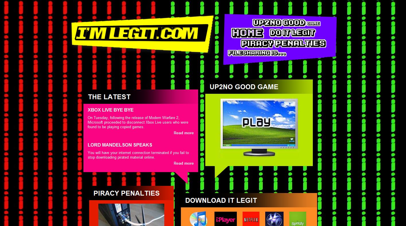
The first, I'mlegit.com definitely dons it's neon colourings and goes full out, with angular boxes, punchy typefaces (retro and game like) and images to explain straight away, rather than having just text. Perfect for teens who deem reading tiresome and uncool.

I also added in twitter like speech bubbles to each of the sectional boxes. It gives it a better look all round, I think and should tie in a contemporary feel with twitter being the newest of the social networking platforms.


I added in a film strip in the background to try and give the site some sort of identity. If it wasn't for this, the site could be for any content by merely changing the text. Hopefully now the film reel will show I'mlegit.com is media related.

--

The next design I had the most trouble with- I HEART legal

The typeface in the logo I think looks a little dishevelled but still bold and beautiful. Taking this as the main focal point the site initally ended up looking better suited to 20 something females, appreciating the red hearts and curly handwriting typeface.

However, I refocused my efforts and dulled down the simple white, black and red designs, inserting darker grey shades, and a predominant diagonal background. It may still appear a little boring though to the younger teens.


From FRANK, I learnt that by putting content in black boxing, it makes it noticeable. Here I think it remains the case. Text and image have a chunky black box, with it quite a modern design choice, as modelled over at Channel 4OD.

The content boxes in the homepage I gave curved edges to try and counter balance the very angular framework in the rest of the site. Again, speech bubbles help to reflect a twitter like design scheme.

I found through my research of popular youth sites that they liked a lot going on the screen - distracting backgrounds, bright eye catching colours, modular boxes with content and images. This site I think at first does that, with the contrasting black and white text boxes, the stripey diagonals and the bright red focal points all vying for your attention. I must admit though, I do like it.

--

PWR2DA PURCHASER


This site maximises on angular and eschewed boxes, with pointy black frames to emphasise their position on the vibrantly coloured background.

Everything here is all very legible courtesy of a black on white text scheme, and also, neon borders help section up the content. Links are blue, content contrastingly is orange. A whole series of these boxes down a page would not look out of place on myspace.

Of all the designs, I think this one would appeal most to the younger teens. The curvy funky writing is something they will find familiar through experience with CBBC and Cartoon Network - popular sites for the younger generation that has passed.

--

So now I intend to seek responses from some teenagers, by means of a quick questionnaire. All comments, ideas and suggestions are appreciated from us older people known as 20 somethings.

@

Diagonal backgrounds generator

It was around this stage in our group design process last time with Bestwood, that we noticed the background was lacking. It was then that we found the great pixelknete.


This time I wanted to add a little something to the backing for one of my copyright prevention society site designs. One or two sites associated with teenage users employ diagonals. They add some visual distraction in the background, and also add a tone to the overall feel of the site.


This time then a great generator I've located is stripe generator. It does what it says on the tin, but makes the diagonal stripe creation process automated and therefore easy.

Use it wisely.

@