Thursday 26 February 2009

Gaming social network sites - analysis/evaluation

Ugame


Of everything, I do have to compliment this site's creators for the large background image which blends between gaming imagery, whilst using transparency bars for the menu. It's my achilles heel after all. Using a three colour palette of black, blue and yellow, the latter is instantly recognisable and stands out, proving a good divider bar.

The site uses a traditional nav bar at the top, which is clear and easy to understand. Noticeably, the login function isn't behind a button, but instead close to the top of the main page.

The pages tend to hold a lot of information and using a smaller font adds to the information packed feel of the site. Likewise, the use of images, which aaccompany every bit of text, again make the site feel fuller.


In terms of the players list, they have gone for a look much like Facebook - a list. Along with the username, they add favourite games, and even a status update per brief display. It wouldn't be unexpected for this to be linked in with Facebook, as the layout and information seem so similar.


Raptr goes for a more information lead approach in regards profile information. The activity feed makes the page quite lengthy, whilst the profile picture, username and other brief stats are placed neatly in the top right hand corner. With the priority of the site being about gaming and what the user is playing, this seems a sensible choice. However, I would prefer the gamer information atop such information.


Oncemore, the game thumbnails are very small. The black, white and orange look is quite modern, but the use of capital italics is unusual for a site that you would expect to be in keeping with modern webdesign conventions. In fact, italics form a large part of the site's typography. It isn't something I am keen on, whilst important links in orange are not instantly easy to read.

However, I do like the quick access bar that can be opened by clicking at the bottom of the page. It holds all the links you would need in a clear, understandable way. The navigation bar at the top whilst being clear and succint, seems a little uninspriring with the rather plain orange header. This could be capitalised on with game images etc.


This site goes with a visual look I expected. The greens and black look is prioritised, but I welcome the transparency that is again used on the home page. Here, the search function takes priority allowing the user to find their favourite game. Everything seems a little boxy however, but not in the way that the console producers use it to section information neatly. The lines whereas useful in places, do seem a little too much, for example, the navigation bar at the top.

Images of games are larger are quite small, much like the previous two. This seems to be a contrasting decision compared with the Nintendo/Microsoft/Sony idea of what gaming websites are best like. Personally, I much prefer larger images. They have an impact.


In terms of user profile, the page does seem a little scattered. There is a gaming activity calendar, then the profile picture, GamerDNA traits, plus links all vying for attention. Plus, the background visuals vary, some being linear gradients, others radial, then images with transparency. It just seems to lack consistency: some text is green, white, underlined. Tidying this up would probably make for a more logical reading of the information.

I find the GamerDNA site the best of the three sites reviewed. It seems to fulfil what I expected of a gaming social network site visually, and data wise, rather than being a new Twitter.

--

Important things I can take from this - images are key, a cohesiveness with the visual design is important, a clear and logical structure is needed, the user information should have priority, and should be easy to navigate and find information.

@

more large background websites

http://blogof.francescomugnai.com/2008/10/70-beautiful-websites-with-a-large-background/

I think the StrawPoll one is good as such full type images, with a house and a field and a sky look familar in our mindset, similar to the cool blue youlove.us


Being able to reflect nature in a technical medium I think is good. The blue gradient of the night sky line here works really nicely on the eye.

Other nods must go to the sheep one, which does seem to make me think that websites (ones that aren't of a highly informative nature) could go the way of postcards - visuals being the key ingredient and pleasing the eye.

Take this one I found for example:


It sells the product straight away, or at least informs of the product. Unfortunately, the large image isn't spread throughout the site, which could be to do with load times, how legible text would be.

Meanwhile, here's another great effort:


Web really is just another medium that goes alongside newspapers, magazines, posters, postcards etc, so I like how he's tied that idea together here. It gives it a real scrap book feel, again linking into the idea of using older traditions and joining them with new.

@

Flash game production

Taking some key features from ping-pong, notably the walls, I set about creating a make-shift maze. 


This sample here goes on the principle that a right button push will move the ball 5 pixels to the right if it isn't not touching the right wall. The same is repeated for up, down and left. Note that I only have one type of left wall, one right etc.

Multiple 'left' walls will not acknowledge the ball, meaning it passes straight through. To tackle this would require having several walls all with their own unique instance names and respective line of code. In all, this would mean having a stream of largely repetitive code, and as this is advanced Flash, I am looking to implement short but succint code. 

Not wishing for unnecessary, lengthy code, I had to try another solution. After hours of searching online, I was presented with the option of swapping hitTestObject with hitTestPoint and setting the shape flag to true. This would mean that it is the actual shape that detects a hit, rather than a border surrounding the entire shape. I will use one shape that is construed into warying different angles and shapes.

Unfortunately, I met with problems again. As soon as I hit any part of the shape,  the coding stops keyboard presses being recognised, the key actions became locked. I have tackled this by making it so should the ball hit the wall, it rebounds it by 5 pixels, thereby allowing key presses afterwards.


I can already see improvements are needed. The pixel differences mean that the ball can intersect a little with the wall. This will need to be adjusted and is not difficult.

Furthermore, I am now going to need to focus on implementing a countdown clock, whilst adding in bonus score points. Most important will be the end of level point.

@

Wednesday 25 February 2009

The Flash game I will make

Taking on the strengths and weaknesses from the last post about Flash games, I have created my game.

The game itself will be similar to a Pacman like maze. You are required to remember the maze walls, as after a few seconds they will disappear. You then have to navigate your character around, trying to reach the 'finish' spot within a specified time. Along the way will be bonus items and death traps. If you finish within time, any seconds spare will be converted to additional points. There will be a 'reveal' button which can be used a limited amount of times should the user forget the map layout.


I believe it will be a success as I intend it to meet the following criteria: 
  • Have clear objectives / Sneeze says it all in it's name really, that is the main objective. Meanwhile, Big Battle was only understandable due to prior experience with it's genre, but I had no no-how on achieving the goals. This is needed for those unsure.
  • Be simple to play / Again, the controls for Sneeze are the standardised keys used in online gaming, spacebar for fire etc. There aren't superfluous buttons either whereas the weapons available in Big Battle demanded several keys to implement.
  • Have a countdown time feature so to increase pace but make the game feel manageable, i.e. the level will only last 30 seconds regardless / This I noticed was lacking from Sneeze, but was implemented in Doeo. In adds an intensity, which is good in games.
  • Have reward points, whether that be through achieving a quick time or by collecting bonus items / In the easy setting of Doeo, everything shot was worth the same, so it seemed a little bland. Where bonuses were available in Big Battle, they required a decision of whether it was worthing seeking at a cost to your health level, ammo stocks. This sort of decision is good in games, making them more complex in terms of strategy.
  • Have levels of progressive difficulty / It is expected in games that the first level gently introduces, but there needs to be caution of giving a false sense of security. The gradual difficulty increase in Sneeze I think is implemented nicely.
  • A challenge that requires thinking / Merely clicking the mouse doesn't require thinking, as is demonstrated in Doeo. The sense of achievement after having thought through an action and then successfully completed the level as a consequence is a major reason people are encouraged to continue playing.
On the other hand, I will be trying to avoid these downfalls:
  • Having instructions that are too wordy or complicated / Unfortunately, Sneeze fails in this respect. Online games are quick bursts of fun, so users will not want to spend 2 mins of their 5 reading up on how to play.
  • Consistently being too easy, or too difficult / If your users can't use the game, it fails. Extreme difficulty may indeed pose a challenge but the limit needs to be sensible, as I felt for the difficult setting in Doeo.
  • Poorly implemented controls / If it doesn't work, they won't stay around long as they haven't invested in the game financially. 
  • Uninspiring visuals / Although gameplay is fundamental to success, the visuals help make the piece. It helps with the user's perception of the game, whether it is quality or not.
In terms of the market, I think it will fit nicely within the edu-tainment sector that has gathered interest in the last few years. Brain Age on DS has become a multiple million seller, spawning Brain Age 2 which features more game like brain activites. My game could easily fit in here. 

Such games target a broad age demograph, nicknamed the Touch Generations, by Nintendo. Basically, anybody who is normally scared or deem videogames not for them should find the software interesting, useful, approachable and fun. Any age too, as the levels that increase with difficulty cater, in this respect. Younger users will enjoy the simpler, early stages whereas older, more advanced users getting to the difficult levels will find a challenge too.

@

Friday 20 February 2009

A few practitioners

http://www.webtemplatesblog.com/archives/2009/01/13/web-designers-and-their-websites/

My favourites are Christian Sparrow, plus the green emotionsalive which really catches the eye.

@

Tuesday 17 February 2009

Flash game that works/Flash game that doesn't

A game that WORKS - SNEEZE


The premise is you have a cold, and with only one sneeze, you have to infect the people around you. These people then sneeze, hopefully infecting more people. The more people infected, the more points.

I delved straight into the game and didn't read the instructions. These are the good points about the game, from a not reading instructions point of view:

  • The visual style is not the usual cutesy primary colours you might expect with a mini game. The graphics are tied in well and feed the sneeze theme.
  • The arrow keys are an expected way to move the character, likewise, the space bar is a usual input method for action/fire.
  • You can see the chain of events - when you sneeze on someone they become green. When that person sneezee, they infect with more green. This progressive nature keeps and maintains interest, visually.
  • The progress/score bar at the top is very easy to understand, particularly with a marker showing how much you must achieve each level.
  • The levels increase in difficulty, with the people being more spread out, and less densely populated. In addition, it doesn't get too difficult too quickly, which is good.
  • The option to turn sound off.
  • There are facts included within the game, which make for interesting reading in between levels. This restbite is quite useful, particularly if the game is at a very high difficulty.


However, there are a few downsides:

  • I expected there to be more than one sneeze available. When the likes of Space Invader etc has unlimited ammo, this rule could make or break the game. Should the player have a short attention span, and lose on the first round, they will likely ditch the game due to feeling under powered. However, on the otherhand, if they accept this fundamental rule, it could encourage the user to try again and adopt intelligence by using their sneeze wisely.
  • Whilst the levels do increase in difficulty, there is no time limit. I acted as if there was one, trying to sneeze in a very short time period once the game commences. This missed opportunity could make for a more intense game. However, it would rule out making more honed, strategic decisions. Some people like this aspect to a game.
  • The instructions at the start are useful, yet are too much. With little whitespace, it overwhelms and could put off reading.
  • You only get one chance. Get it wrong on the 7th level and you are taken right back to the start. The lack of a save facility could prove highly annoying later on in the advanced stages.


On a side, scoring actual points didn't seem as I played to be of a priority, although they are well described at the start of the game. Instead, I found my percentage of infection more useful, as it is this which dictates your progress through the game and indicates how successful you are being. - This variation on scoring could make for a more interesting game. For example, if you finish with 10 seconds to spare, throughout a number of levels, these extra seconds could add up and become your bonus help time on the final stage.

------

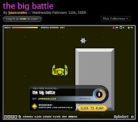
A game that isn't so good is the Big Battle.


A top down shoot 'em up game.

Straight away it is easy to note downfalls to this game:

  • You are launched straight into the game with no introduction or instruction. This is unexpected as most games either require you to view the instructions or at least put an option in the start menu should you wish to read them on your first play.
  • Where user directions are provided, at the bottom of the screen, they are incredibly small and so could go unnoticed for a long time.
  • As soon as you load the game, an enemy is attacking you. This isn't the best position to find yourself in when you are powerless. 
  • Furthermore, the objective of the game isn't made very clear at all. A little bar appears at the start informing the creator's name, difficulty level and then below it tells you to collect crystals. In the game, a key floats around and requires killing, however what you do with this key is unclear.
  • Once you manage to navigate around, the overhead camera becomes quite limiting and frustrating as it zooms in too much, making it feel highly restricted. Occasionally when you are moving across the level quickly the camera zooms out, and this larger point of view is far better.
  • Several 'items' within the game world are not instantly noticeable as to whether they are bad or good. Normally flames represent bad. Here, anything could kill you or help you. It's a case of finding out by taking a risk. Likewise, something that you presume good, i.e. the crystal, isn't obtainable by simply walking up to it.
  • The on screen weapons graphics are tiny and so require squinting to view. You normally find you have run out of a weapon by hitting the button numerous times and finding nothing is happening. 
  • Visually, I can see where the creator was going with the colour scheme, khaki etc, yet I find it a bit murky and not very appealing to the eye. 


However, there were a few positives that can be drawn from the game. 

  • There isn't background noise that plays alongside the game, instead little noises that activate when shooting bullets or hitting an object. Even these can be turned down, or completely off. 
  • The animations whilst you walk are nice and fluid, along with the design of the main character. 
---

Another game that DOESN'T WORK due to gameplay- Doeo


This game, although admittedly using very nice graphics, which are colourful and have character, falls down due to the gameplay being too repetitive. The premise is so simple that the instructions whiz on and off before the game starts and can be summed up in about 4 words - 'shoot the coloured squares'. Too brief an instruction perhaps could actually be described as a downfall to the game as if you aren't quick with reading, you'd miss what you were being told


Credit is due to the creators as they have created a bright, vibrant world for the game and have used imaginative ways to hide the doeos, behind the trunks of trees, for example, which move to reveal hidden doeos. The audio in the background again is lively, but to it's detriment and will definitely cause a lot to switch off their sound

Yet it is the repetitive clicking nature doesn't do this game justice. Once you've clicked ten times on the mouse in the space of three seconds, the game doesn't differ any further than that. You click, and then you click some more because you're not clicking fast enough in the first place.

Whilst whack-a-mole type gameplay is fun in the arcades, I don't feel it has translated so well to the screen. Within a few seconds your hand is tired from pressing the mouse so incessantly and it becomes off-putting. The face paced nature of the game makes for an intense and pulse-raising game, but again, it wasn't enough to make me want to continue. And  that was only on the easy setting. The difficult level I have tried and still not made it past level 1, which requires 200 points.  Insane difficulty is definitely a thing to be wary of

In between levels you'd at least expect a break to flex your fingers yet about two seconds is what you're given before the next hundred doeos appear and without choice.

Should this idea be taken onto the Wii and use the Wii-mote as a gun and that would be a different story (perhaps far more difficult). In fact, this game is really no different to arcade shooters which have been popular for decades.  However, here on the PC with the mouse, once you begin your clicking frenzy, it wasn't unusual for me clicking outside of the game with the browser content. Also, placement of the doeos, as they appear from one to the other meant dragging the mouse a little further than I felt happy with. If only they could change the constant clicking action of the game then this game would definitely have a lot going for it. Take away the shooting however and you wouldn't have a game at all.

Should the visuals have gone down a different direction they could have made the game more interesting with gorey blood splatters would prove comical when you shoot a doeo. I understand this would likely slow the game down by distracting the user into watching the animation and not shooting more pink squared faces.


Overall, I think this game is a great indicator that graphics, sound, timing, scoring etc are definitely contributors towards a great game. They in fact keep this game afloat. However, if the main game-play aspect isn't up to scratch, the game becomes un-fun (this principle being what Nintendo recognised as the priority for their Wii, whose success is blatantly clear.) There isn't that much sense of achievement in shooting a doeo as you are already clicking the next one, which in itself feels exactly the same as the previous fifty.

@

Sunday 15 February 2009

FWA - Honda Green Machine - online analysis

I'm usually all for Honda's advertising/marketing efforts however the latest offering, which OK is aimed at a Chinese(?) I think, market, doesn't seem to live up to expectations.


You control a 'green' character of choice, and using the arrow keys move it along a 2D platform. Visually it is very very basic, using simple green lines. You might almost say it is bland. This could be a clever reference to the simplicity of the Green Machine, however, I don't feel it. 

Whilst before I have really enjoyed large background images, I found that Honda didn't use them to effect. When you hit an object along the course of the 'game', it loads a full screen image that informs about part of the production process to make a green car. Some of the pictures loaded are obscure and quite dull.


However, on occasion they do use some visually appealing images, which due to the angle of the shots adds a dynamic feel providing interest.


Again though I feel they miss out on an opportunity even with the above shot. The one line of information is simple slapped on top. Perhaps it's to do with design conventions elsewhere in the world, but an example of design here use contrasting coloured boxes to encase the text. 4od styling being a perfect nod.

There were even times when I found that I'd exit one large screen image to then instantly be attacked by another item on the level which meant having to wait for that to load, only to be clicked off by myself.


The way I can see this being made better is to incorporate more objects within the level. What's more, there was a 'fun' occasion where I went around a loop-the-loop. Making the level more fast paced, and quickly passing by, much like Sonic games would make this far more interesting.


I understand that due to me being English, I could be missing something in regards to Chinese traditions/interests. The link bar at the top of the page could have been more useful to me should I be able to understand them, but these took you away from the green machine section of the site. I'm wondering why it got a FWA? Is Honda now instantly presumed to be award winning?

@

Tuesday 10 February 2009

Social Networking - visual themes/console site analysis

Jumping the gun perhaps but I like to frame in my mind how the site will be and often find that ideas spur off from this.

Being a gamertag/friendcode site, I thought it would be useful to look at how the consoles represent themselves.

Nintendo firstly goes with a site that is in keeping with their current mantra - simple, clean and white. Much like the Wii is all about the gaming, intentional or not, the brightly coloured images that represent the gaming catalogue stand out a mile and really attract the eye. In this respect, it really is about the gaming. I think this is clever.


The core colours of silver/white and neon light blue all go well together, and the ability to target important areas with a flash of the blue makes these imporant links etc easy to recognise. 

Information never seems overloaded, there seems to be ample white space and I think this targets thes non-gaming audience perfectly, perhaps the gaming audience too (they don't want to read, they want to play!) whilst still being able to maintain an interest of like from me, a Nintendo fanboy.

--

Xbox too seems to recognise the importance of dominating images, but this time focusing on the gamers. Using an image that fills perhaps 75-80% of the screen really means they can't do anything else but pay attention. One of the key Xbox selling points is it's successful online network, Xbox Live and so this again seems a straightforward, even idiot proof choice. 


On clicking through to the games section a flow animation comprising of large, impacting images of their software again instantly draws the eye. Sure there is content there should you want to read it but I am finding that visuals play a more important part - everything comes attached with an image!

---

Moving onto the Playstation site, they intertwine the two premises of games, and gamers by using large coloured themed headers to promote their games which often feature the logo and then shots of players having a blast. Interestingly, when the Flash header changes, so too does the outer background colour, the body of the page. This little touch gives the whole screen a more conducive, thematic feel. I like and think this works really well. 


Unfortunately, the altering themes are not transferred across the rest of the site. I can understand the reasons - load times, irritation. Yet even choosing one of those themes is better than what we see elsewhere in the site.Whereas Xbox and Wii were light coloured affairs, the Playstation site (at times, due to the changing exterior) seems to go for a darker look. 

The greys aren't light as with Xbox, they are much duller and in fact do feel a little depressive. Of the three, this site seems the more traditional in keeping with web values. The content boxes use black text on white backing, with red links that are never indistinguishable. I think of all three, this one could have some more work done on it so to make it more alike to that of the PS3. Lush, tonal blacks would have worked well.

--

Overall, the use of suave, sophisticated gradients and rich, vibrant images seems to be the apt thing to do in gaming sites. Noticeably though, whereas the neon light blue of Wii really helped content stand out, the lime green that Xbox use isn't as successful in comparison. Sure you see it, but it's harder to read in certain places. 

One useful thing I noticed is that each bit of information has it's own sectioned and titled box across the three sites. This makes the information seem more manageable, as the self contained information is sectioned within it's own area and these are all easy to determine. 

Furthermore, top nav bars were used, not left hand ones. This allowed for more content in the main area of the page, not hindered by a side bar.

@

Friday 6 February 2009

restaurant - updated design

OK, I decided to go with the table top design, as I thought it looked the most sophisticated of the three and would be a good piece to develop.

I aimed my focus on the logo. Verbal feedback showed that the font used for Antibo's was too simplistic. Having a play through the font file on Photoshop, I decided upon Market Deco, a custom font from dafont.com

Trajan Pro

Segoe Script


Market Deco

To me, the Market Deco font is quite Art Deco looking, has a resemblance to the Strada logo and seems quite strong, being a tall typeface. I admittedly do like the Trajan Pro font as I find it looks quite classy and refined, but it lacks the Italian element. OK, not all sites have to have a flag in the corner, as one of my feedback comments said, and on looking at my site, admittedly it could be for any type of food, but I think Market Deco should help steer it a little.

Notice too that I slightly altered the colouring in the background. The olive green of the top two just seems a little drab, so I went for a lighter saturation. Whereas the darker one is quite suave, the new green gives it a fresher feel.

After altering this, I decided that the table top was a bit too cheap looking. I want to create as realistic image as possible, so sourced several wood textures.


Taking the bottom left image, I again adapted in Photoshop so to have a lighter, less oaky/piny colouring. Noticeably, the tables in Antibo's are dark mahogany, yet an attempt at that didn't bode well with the rest of the fixtures. It seemed too overpowering, and just too dark!


Hence, this is the table top I have decided to go with-


I wasn't quite finished here, either. The content pages fill up the left hand side of the page when the user clicks on menus, restaurants etc, however going back to the homepage, it seemed to feel empty in comparison. 

I decided to put to use the tutorials I sourced the other day, and so made a nice shiny web 2.0 label. 


When looking at the site now, it seems to fit in and add finesse. Admittedly, this small screenshot kind of does it an injustice, in that the label appears quite large, and disproportioned. However, in the browser it works. I couldn't now remove the label, the lefthand side needs not look barren. 

Moving forward in this project, I intend to experiment in producing a printer friendly CSS sheet so that the 2 for 1 offer page provides the option to print out a coupon. Furthermore, I might try and use dynamic Google Maps on the Contact page, it's pretty much a standard feature nowadays, online.

@

Wednesday 4 February 2009

Photoshop Tutorials - web headers


I found this site great in providing tutorial on how to tweek skills in Photoshop and create superb results.


The other linked sections are really good too. Almost to the point where I started wondering whether items were made in Photoshop or ported from 3dMax?

And being a logo enthusiast, there's actually a whole blog for me devoted to them - logoblog.org


-Loving the sleek and interwined nature of NASA's 50 Years logo. Got a great Heroes feel to it, plus the obvious inclusion of the mysterious but beautifully enticing space. Importantly, this looks better smaller (enlargening it takes away the simplicity of the 5 and the '0') - just how a logo should be really - small, but significant.

@