I was initially annoyed at the fact that another new version of Flash, and the rest of the Creative Suite was being released. 'Just cashing in, another not really worthwhile update.' How wrong I was.
Feature wise, the new Flash looks like it's definitely heading in the direction it should. 3D directioning. Check. Bone structures. Check. Plus, what with being a Powerpoint pirate, I like the inclusion of motion presets.
These are all things that I had previously looked for, what with finding them in 3D Max and seeing their benefits. I think it's going to make using Flash an extra bit better... It just depends when we'll get a chance to use the new CS4!
@
Wednesday 29 October 2008
Tuesday 28 October 2008
DiSINey City
When I mentioned previously that I really liked the contrast that was implemented in the RICO TORRES images, I didn't quite think of other possibilities you could make with contrast.

As you can see, the contrast between gritty, malevolent Sin City, and then colourful, musical, family friendly Disney proves quite humorous.
There's the whole Disney Princess collection behind this link. Snow White in particular seems to have taken on her evil Stepmother's former role very well.
@
As you can see, the contrast between gritty, malevolent Sin City, and then colourful, musical, family friendly Disney proves quite humorous.
There's the whole Disney Princess collection behind this link. Snow White in particular seems to have taken on her evil Stepmother's former role very well.
@
Monday 27 October 2008
Personal contact providing creative opportunity
I'm a great believer in the line - it's not what you know, it's who you know. Whether that be for getting your first part time job, or finding someone who can do something for you, it's normally a friend of a friend.
The experience that I can recount is a bit of work experience this summer, that I gained through my sister. She worked doing a part time admin job for a small educational resource company. Through the grapevine, they found out that I was doing a Multimedia degree and so could turn my hand at creative, visual stuff.
OK, it still required the boss to look me up and check my online portfolio, but without my sister and that shared connection, I would never have thought of contacting such a company for some work, and probably likewise for them.
And the personal contact paid off, literally. My first flyer design I did for free, a tester, but since then, I've done a video montage package for them, chopping together footage, images, sound, and there's more to come. I'd still do it for free, but it's nice to be paid, nonetheless!
Furthermore, the great thing is, doing work for them means they then share my name with their other associates, and I could also ask, using their contacts for more work / experience.
Friday 24 October 2008
OEP Website Dev - Art that inspires #2 - Research Task
I think I sort of got the wrong end of the stick last time in terms of why we were doing it. Don't get me wrong, I like the offerings of the two photographers, but to use them as inspiration to make a three page website I would admittedly come a little short.


This time however, after going through several batches of previous Computer Arts magazines dating back to '99, I think I'm onto something a little better.
Firstly, I found a lot of inspiring stuff. Here are a few, of which I liked, and believe something could be done with them.
I really liked the interesting pattern Lane created here. It is very demure, perhaps even with a burlesque feeling to it what with the purple/pink hue used. On the flip side, it does seem quite ornate in it's patterning, a classy piece perhaps? Whilst looking at the intricate pattern, my eyes start forming shapes, as in, is that a creature in the centre? - Such questioning only requires the user to look and pay attention even more, something which I think is good.
In terms of potential, what's not to stop me making a site that focuses around trying to look for things within an image. It's like a gallery, but with a much more honed purpose, almost like a challenge to find the hidden content. This is exactly what I've always liked doing in books - magic eye art or optical illusions, where you have to cast your sight in a specific way to see the image. I can definitely see a well made, good looking version of such a site having a niche online. It wouldn't just be art to look at, it'd be art that you really have to look at.
In terms of expansion, user-submitted content, feedback comments, competitions/eye tests are all possible avenues - it definitely has potential to go somewhere.
Matt Pyke

I am always attracted to bold, striking pieces of work. Make it bold and striking by means of bright colours, particularly like this one of Matt Pyke's work, with the full spectrum of colour, and it's even harder for me to ignore. What maintained my attention afterwards though was his cubic shaped explosion. The use of geometric shapes give it a digital feel, and so almost a futuristic feel. What's more, the cubes sort of point out of the picture as a result of the angle they are positioned. Cleverly, I can note a few techniques employed here which draw the eye - the colours contrasting upon a black background, the thin wavy lines where the shape originates, plus, the diagonal red on green lines, which all command your attention. For me however, the use of stark, strong, vibrant colour is what I support Pyke for.
The majority of good websites nowadays opt for a colour palette and stick to it. This is good practice; it's consistency appeases the audience and imparts information efficiently. I agree if a website is purposed to inform, then the 10 design principles should be strongly adhered to. However, why not go the opposite way and make an all out, fully fledged, multi-coloured, 'art' inspired website? It could be tasteful, as is Pyke's. What's stopping a website, itself, being the visual piece of art?
Developing the idea, it could have themes, where a particular colour and all of it's tonal qualities dominate the site. All out orange? Raunchy, racy red?
--
What stopped my search for inspiration however was when Rico Torres showed up on the page, a photographer, who of everything, shot these pictures...
Firstly, I think the images are very striking, particularly this latter one. The character is looking you right in the eye. Added to this is the strong emphasis created by a high contrast - the blacks are very black, the whites are very white. When you think about it, there are only a few colours actually involved here: black, white, skin tone and red. Such a simple colour palette reminds me of another website that had opted for, and which I praised.
This piece of work clearly swings to the other end of the spectrum that I mentioned above with Pyke, but this time, it's the lack of multiple colour etc that proves as equally striking and vivid, to the viewer.
The faces/skin appear to glow, due to the lighting and furthermore, the amount of foreboding black makes the actual colour in use, appear really strong and absorbed. The mid-action shot of photo one is great too. It gives over the feeling of a dynamic action being caught in the moment, I really like this, kind of like a well chozen freeze-frame.
The splatter effect that has been applied to the pictures too help make it. Paint splatters, scratches, ageing, whatever you want to call it, it certainly doesn't take away from the photograph. It feeds into the edgy/gritty feel of the pictures.
--
It was the graphic novel/comic book of Frank Miller's that provided the inspiration for Sin City the movie. The look of black, white and perhaps one other colour is a distinct visual reference I picked up on and so it's unlikely Rico Torres didn't want to exploit such an opportunity here either.
Using this line of thought, I can see a graphic novel style website forming. Not necessarily just comic book content either. A fully blown visual look too, would prove highly striking I think. Like the FWA review I mentioned above, the simple use of black, white and yellow there proved really aesthetically pleasing. Why have something boring, when you can mix it up. Admittedly, I've never seen a comic book visual theme for a site. That could be a bad sign though I suppose?
It could be organised in a way that the navigating to another page actually executes like an actual page turn? Kinda like this. Or, the individual story frames could link to another page. Advancing on that, these individual comic frames could feature the interactive Flash pieces, so that on scrolling over, they come alive and play out a part of a story? The strong contrasted images would work nicely on the eye, whilst perhaps using an extra shot of colour would pay a nice homage to Frank Miller's creation.
Obviously I would have to be aware of ramming the page with too much stuff, so the user just feels overwhelmed and doesn't know what to make of it, or what to do.
In my head, I'm excited.
@
Wednesday 22 October 2008
Google Chrome
There were a few utterances in our Web Design session about Google Chrome. My first reaction was what? Another Google application, but for what, I didn't have a clue. The name doesn't really give it away as much as Google Earth, or Google Mail. Nor does it's logo, pokeball anyone?

Well I looked into it, and at first though, 'Oh, just a browser.' But since, I have downloaded and I'm suitably impressed! What it has to offer is good, being Open Source means there'll surely be advances from all over.
It's quick, quicker than what I've experienced with IE7, Firefox! Furthermore, I really like it's integrated URL/search box. You type what you want and it brings up the address if you've previously entered it, or shows some of the Google search results. Intuitive. (That's the second time I've said that today!)
Unforunately it isn't available for you Mac Monkies yet, so you'll have to trust me. I think it is a nice addition to the browser wars. It feels sturdy.
If you've got Windows, (or even a Windows partition ;D) give it a try. You can't go wrong, it's FREE!
@
The future isn't HD...
As with all technology, the new product comes out, you pay the price for a cutting edge piece of kit, enjoy what it has to offer and then, but a few weeks later... you're told that a new offering is already in the works. Frustrating I know.
HD, which I haven't really been convinced by yet (I've not seen a full 1080p TV working) is to be replaced. You can probably guess by what... Super HD, or something to that effect.
More information can be seen in a video in this link, BBC Technology.
HD, which I haven't really been convinced by yet (I've not seen a full 1080p TV working) is to be replaced. You can probably guess by what... Super HD, or something to that effect.
More information can be seen in a video in this link, BBC Technology.
Self directed study - FWA offerings, design and philosophy
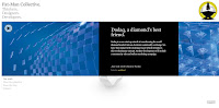
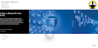
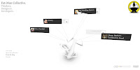
Part two of the 'examine a website' task, so here are the two that caught my eye from the FWA: XM Satellite radio and Fat-Man Collective (a design company).
What does it look like?
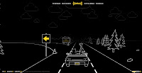
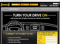
XM: A very distinctive black and white, line drawing. It is inverted so that black is the main colour, and white makes up the detailed images. Apart from the yellow of the XM logo (and use for the volume control), no other colour features. Needless to say, it doesn't make it boring. Far from it. It's so distinctive using the hand drawn graphics that it's more interesting, the more you go on.
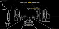
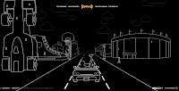
How the site is presented to us, is like you're in a car on a journey, so you are travelling down a road. Either side of the road are different type buildings, characters, billboards etc. You even get weather coming towards you. I experienced snow!
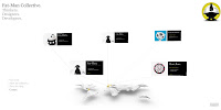
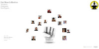
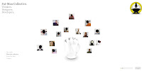
Fat-Man: A modern minimalist look. The typeface used reinforces a contemporary, stylish design company. The links can be found in the bottom left, just simple gray scale text.
The rest of the site is white, but this gives it a light, airyness to it. Interesting 3D shapes catch the eye, along with business cards, which you can click for more information or content. These sit on the page in the form of a spider diagram type thing, the 3D object being the nucleus of the content.

How easy is it to use?
XM: Very easy. It has a feel of Grand Theft Auto for some reason, to me. You are in control of the car and shift it from lane to lane using the arrow keys, whilst speeding up and slowing down. Whilst in the city this doesn't play that important a part, but once you get on a motorway type road, there are slip roads, which if you steer down, take you to a certain section of the site, for example, Help the Hippo, a game. These games have a brief tutorial which show you clearly and in an understandable manner, the instructions. Very informative in that regard.
Just in case the user doesn't want to sit around driving to the slip roads, there are small links in the top centre of the page which take you to all the fun stuff associated with the site. Other, more business minded/informative links, can be found in the bottom left of the screen. Being highlighted in yellow, and contrasted against the black means they are easy to find.
Fat-Man: Initially a straightforward navigation scheme is in use, the links you click and they bring up the content. Thereafter you are allowed access to a more 3D realm, as the spider diagram content is fully rotatable, and so you can swivel it around, look at it from different angles. It makes it interactive, and askew from the norm.
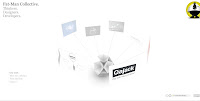
Once you click on your desired content, it brings up an almost paperbased like flyer/pamphlet. They appear to be exactly like the physical pamphlets you'd receive should you attend a design function or something. I really like the grab and drag option, which lets you scroll across the pamphlet. It is a natural movement. Once you are done looking, you just click back into the background and it swings all the other content back on screen, very intuitive and perfect nanavigation scheme.
How relevant is the content of the site?
XM: You could question the whole visual design of the site. The only reference that can be drawn is that you can listen to XM Satellite radio in your car, whilst going on a journey, and that is indeed what you do on the site - quite clever really. It sort of lures you in as a false sense of security!
The Frogger inspired Help the Hippo game is a bit of fun, but these are even used to reinforce the message of having their satellite radio in your car, by means of the aims of the game - help the Hippo to her car so she can listen to XM Radio.
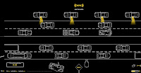
They have a section where, like the Americans, you drive in, and watch a film. The films on the site showcase the type of music available to XM listeners, so again, a marketing scheme!
Fat-Man: All that you would expect is presented, Content, The Staff, Contact, even a Blog link showing they keep up with the current day requisites. It seems to have got just the right amount of content, rather than being too sparse, or inundated with things.
You can guage their sense of humour by means of the business card titles they have given for each other on the Contacts page! Also, for their Staff page, not only do you get a frontwards facing, normal photograph, but because it allows you to span the third dimension, you also get a back picture of their head, which I found quite funny.
How clearly is the content organised?
XM: It is quite random, but the main Flash part of the site is logical and understandable when you meet it. The business side is hidden away on the links and these brings up the more recognisable sales, information type site. The linear drawing design is still used though for some continuity.
Fat-Man: Clearly and well. You even get the option to optimise what you view, by selecting a category so for example, if I wanted web design staff, I'd choose that category and it would amend the content on screen removing the artists, or managers etc!

I do think that they might have missed an opportunity with the labels under the main title of the page. I thought and expected these to be clickable, but they weren't. It wouldn't have to even provide access to new or extra content, but reroute through to one of the sections. Doing that would make it just that bit more user friendly.
What does it look like?
XM: A very distinctive black and white, line drawing. It is inverted so that black is the main colour, and white makes up the detailed images. Apart from the yellow of the XM logo (and use for the volume control), no other colour features. Needless to say, it doesn't make it boring. Far from it. It's so distinctive using the hand drawn graphics that it's more interesting, the more you go on.


How the site is presented to us, is like you're in a car on a journey, so you are travelling down a road. Either side of the road are different type buildings, characters, billboards etc. You even get weather coming towards you. I experienced snow!
Fat-Man: A modern minimalist look. The typeface used reinforces a contemporary, stylish design company. The links can be found in the bottom left, just simple gray scale text.
The rest of the site is white, but this gives it a light, airyness to it. Interesting 3D shapes catch the eye, along with business cards, which you can click for more information or content. These sit on the page in the form of a spider diagram type thing, the 3D object being the nucleus of the content.

How easy is it to use?
XM: Very easy. It has a feel of Grand Theft Auto for some reason, to me. You are in control of the car and shift it from lane to lane using the arrow keys, whilst speeding up and slowing down. Whilst in the city this doesn't play that important a part, but once you get on a motorway type road, there are slip roads, which if you steer down, take you to a certain section of the site, for example, Help the Hippo, a game. These games have a brief tutorial which show you clearly and in an understandable manner, the instructions. Very informative in that regard.

Just in case the user doesn't want to sit around driving to the slip roads, there are small links in the top centre of the page which take you to all the fun stuff associated with the site. Other, more business minded/informative links, can be found in the bottom left of the screen. Being highlighted in yellow, and contrasted against the black means they are easy to find.
Fat-Man: Initially a straightforward navigation scheme is in use, the links you click and they bring up the content. Thereafter you are allowed access to a more 3D realm, as the spider diagram content is fully rotatable, and so you can swivel it around, look at it from different angles. It makes it interactive, and askew from the norm.

Once you click on your desired content, it brings up an almost paperbased like flyer/pamphlet. They appear to be exactly like the physical pamphlets you'd receive should you attend a design function or something. I really like the grab and drag option, which lets you scroll across the pamphlet. It is a natural movement. Once you are done looking, you just click back into the background and it swings all the other content back on screen, very intuitive and perfect nanavigation scheme.


How relevant is the content of the site?
XM: You could question the whole visual design of the site. The only reference that can be drawn is that you can listen to XM Satellite radio in your car, whilst going on a journey, and that is indeed what you do on the site - quite clever really. It sort of lures you in as a false sense of security!
The Frogger inspired Help the Hippo game is a bit of fun, but these are even used to reinforce the message of having their satellite radio in your car, by means of the aims of the game - help the Hippo to her car so she can listen to XM Radio.

They have a section where, like the Americans, you drive in, and watch a film. The films on the site showcase the type of music available to XM listeners, so again, a marketing scheme!
Fat-Man: All that you would expect is presented, Content, The Staff, Contact, even a Blog link showing they keep up with the current day requisites. It seems to have got just the right amount of content, rather than being too sparse, or inundated with things.

You can guage their sense of humour by means of the business card titles they have given for each other on the Contacts page! Also, for their Staff page, not only do you get a frontwards facing, normal photograph, but because it allows you to span the third dimension, you also get a back picture of their head, which I found quite funny.


How clearly is the content organised?
XM: It is quite random, but the main Flash part of the site is logical and understandable when you meet it. The business side is hidden away on the links and these brings up the more recognisable sales, information type site. The linear drawing design is still used though for some continuity.

Fat-Man: Clearly and well. You even get the option to optimise what you view, by selecting a category so for example, if I wanted web design staff, I'd choose that category and it would amend the content on screen removing the artists, or managers etc!

I do think that they might have missed an opportunity with the labels under the main title of the page. I thought and expected these to be clickable, but they weren't. It wouldn't have to even provide access to new or extra content, but reroute through to one of the sections. Doing that would make it just that bit more user friendly.
Tuesday 21 October 2008
Self directed study: Design philosophy - IDEO, Sony, Apple, NOW
Thinking about a range of issues as per the design and it's philosophy:
What does it look like?
IDEO: The homepage has gone for an out of the norm approach. Pink tinted images of pages fill the majority of the homepage and some are just visual images, with no extra function, whereas the slogan pages, 'What we do, What we can do for you, What we have done lately' move across and show you a span of the pages to do with that sector.
The traditional navigation links are then found at the bottom of the page after having scrolled down. The bottom of the page links are a continuous scheme employed throughout the whole site.
Once you click onto one of the pages, they do seem to have a sort of scientific jotter, or blog feel/look. Personally I'm not into the typefaces they've used. They don't seem as professional as I'd expect for such a company and in fact, seem to be a step back in terms of design, rather than the stylish CSS pages we're currently being treated to, on other sites.
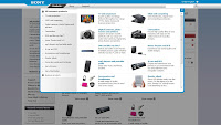
SONY: A traditional webpage, but enhanced with Flash pieces, nice CSS style and colour specific link boxes. The predominant colour is white, so could be deemed a little bland. Once you click on a section, the design does vary a little, dependent upon product, but it is all clear, and legible. Some of the pages do have a catalogue feel to them, as in, the products are all laid out for you to buy.

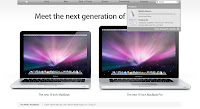
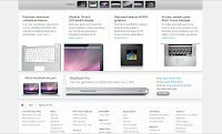
APPLE: With Apple being the corp who initated the clean, white glossy look, it's very clean, simple and attractive. You get nice big shiny images of the products, along with aesthetically pleasing typefaces. Furthermore, it has a tabular structure, i.e. nothing seems unaligned, instead appearing quite neat.


NOW: The University colour scheme of navy blue and white are employed in the top banner to reinforce an aspect of identity. However, the main content adopts a softer blue and white scheme, which does make it seem less striking, and instead rather sensible. After all it is an educational piece. It is very boxy, with a different box catering for a different category.

How easy is it to use?
IDEO: The initial pink pages link, but you cannot tell very easily what you are clicking onto so it really is a gamble with what you'll end up with. Once you reach the page, there are Top News and Most Viewed links posted right at the very top. This isn't what you expect in regards to meeting modern conventions. You don't choose a link to then be offered more links before even reaching what you wanted in the first place! However once you become familiar with the site, these would work to your advantage.
The odd setup for the links at the bottom also could confuse. I use a high resolution (1440x900) and that still required a little scrolling. Others may struggle to find the links at all! However, to their merit, not only do they have the staple content links, i.e. News, Contacts, they also have listed the options that you would find on clicking through to these pages. Although odd at first, this is a good idea, making navigation quicker and more direct.
Importantly, they have a great Search button, ever present at the top of the page. Once you've typed in a few letters from your word the site finds relevant content from that word and lists the options without you even having to push go.
SONY: As a traditional web setup, you know where to expect the links, this time being predominantly on the left hand banner. Specific links can be found under coloured sections on the right hand side. This works as the colours distinguish better to the eye.
Importantly, they've made their Support section easy to find. It is expected now that with sales does come the need for after sales support too. However if you click on such top bar links, they don't instantly take you to a page, instead they open up another window on top of what you're viewing, which then provides you the link through to the correct page. This feels discontinuous to the rest of the site and doesn't really fit in.
APPLE: By far one of the easiest sites to navigate. Big links are consistently at the top of the page and everything is labelled. Making the hyperlinks a light blue, and buttons grey means they are distinguishable, meaning it is easy to know what you can and should click.
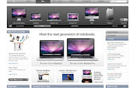
What I would like to comment on is displaying their products centre page with images, but then, perhaps craftily, using categories, such as 'New' or 'Top Sellers' on the outer left and right borders of the page, so they have doubled the amount of links. Obviously this means more chance of getting the customer to find the product and buy the product, but as I've said before, too much info can seem overwhelming, as well as hindering the aesthetics.
Apple too have a good Search button at the top of every page. This goes one better than IDEO because along with suggestions from the letters you have entered, it provides images of that suggestion too.
NOW: The site in itself is fairly easy to use - click the link, it takes you to the place where your information (hopefully) is. Main links line the top banner, although they could be considered too small. Currently it feels as if the NOW isn't fluent as it will come to be. For now, the information is just dotted here and there.
How relevant is the content of the site?
IDEO: Their content is quite extensive, and so there is a lot to see and read. You get the feel that they have been established for a number of years. Obviously their target market would be looking for all these things. The titles of the links they use are a little unordinary and perhaps could be more precise, an example being 20 Questions, under the Culture section. Normally this would be called FAQ, a popular and understood acronym.
SONY: Obviously being a product selling company, the site is full of their products, so people can find what they are looking for under the SONY brand. Furthermore, the advert campaigns that go with specific products are available too. The key principle here is to reinforce sales. Obviously it would probably be going a little too far to list every item they have ever made but there should be a sizeable amount online available, in my opinion.
APPLE: As with Sony, Apple are here to sell, so a lot of products are listed and available. Likewise, Support is easy to find. The videos are helpful and informative, but again, persuasive, to encourage sales.
NOW: Everything on offer on the NOW can be put to use, but how it has been prioritised I don't think is quite correct. Yes, competitions are suitable for students, but probably not important enough to take up a main, first to be seen, slot on the home page.
How clearly is the content organised?
IDEO: Once you've navigated to a specific page, the content is organised in an acceptable manner, but not one that I prefer. As an example, the News and Most Visited sections that appear at the top of the page would be better suited at the bottom of the article. There are however some nice Flash bits, for example when flicking through photographs, it is actually represented as if you're moving through a deck of physical pictures. This works nicely and I haven't seen it in use elsewhere on the web... yet.

SONY: On a specific item section, they do use a tab structure, to make the viewing of information seem more manageable whilst taking up less space. However, on some pages it can feel like there is too much information vying for you attention, what with the adverts, the loaders, the buttons to press, the text (of varying colours and emphasis) and the images.

APPLE: Perhaps personal taste, but by using a rigid structure, with everything neatly aligned it just feels more clear when you're taking the information in whilst trying to find things. With pictures making up a large proportion of the content, Apple seem to have gone for a visually lead approach, rather than textual. I believe this to be because the connection with images is instant, rather than having to read the text first to find out what is being presented to you.
NOW: The organisation of the site I would say is confusing. In the main hold of the page you are presented with boxes which house links. Once you click this link it takes you through and provides more boxes with some relevant content, i.e. reading list books. However, the most important information, such as module Content is offered in a tiny link on the upper banner. Definitely not where you're looking and so small so you don't notice it being there.
 (Can you find it?)
The main boxes obviously contain applications or links that you'll find useful, but I don't necessarily think they should be presented first on the main page. Library stuff should be found under a library link. Likewise, SPP2 should house a link to take you to that section, where the boxes cover and cater for all the content, not small links.
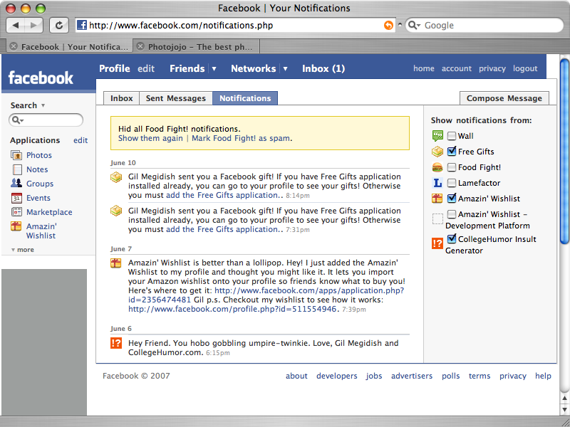
Furthermore, the storing away of information under a link wouldn't necessarily have to mean that you aren't aware of updates. Facebook puts a little number next to your inbox link to let you know you've got mail. Or otherwise, there is a special notifications list. This could cover all aspects of the NOW - out of date library book, new assignment etc each time you login.
- How you'd do that though? I guess that's why I'm still a student!
What does it look like?
IDEO: The homepage has gone for an out of the norm approach. Pink tinted images of pages fill the majority of the homepage and some are just visual images, with no extra function, whereas the slogan pages, 'What we do, What we can do for you, What we have done lately' move across and show you a span of the pages to do with that sector.
The traditional navigation links are then found at the bottom of the page after having scrolled down. The bottom of the page links are a continuous scheme employed throughout the whole site.

Once you click onto one of the pages, they do seem to have a sort of scientific jotter, or blog feel/look. Personally I'm not into the typefaces they've used. They don't seem as professional as I'd expect for such a company and in fact, seem to be a step back in terms of design, rather than the stylish CSS pages we're currently being treated to, on other sites.

SONY: A traditional webpage, but enhanced with Flash pieces, nice CSS style and colour specific link boxes. The predominant colour is white, so could be deemed a little bland. Once you click on a section, the design does vary a little, dependent upon product, but it is all clear, and legible. Some of the pages do have a catalogue feel to them, as in, the products are all laid out for you to buy.


APPLE: With Apple being the corp who initated the clean, white glossy look, it's very clean, simple and attractive. You get nice big shiny images of the products, along with aesthetically pleasing typefaces. Furthermore, it has a tabular structure, i.e. nothing seems unaligned, instead appearing quite neat.


NOW: The University colour scheme of navy blue and white are employed in the top banner to reinforce an aspect of identity. However, the main content adopts a softer blue and white scheme, which does make it seem less striking, and instead rather sensible. After all it is an educational piece. It is very boxy, with a different box catering for a different category.

How easy is it to use?
IDEO: The initial pink pages link, but you cannot tell very easily what you are clicking onto so it really is a gamble with what you'll end up with. Once you reach the page, there are Top News and Most Viewed links posted right at the very top. This isn't what you expect in regards to meeting modern conventions. You don't choose a link to then be offered more links before even reaching what you wanted in the first place! However once you become familiar with the site, these would work to your advantage.
The odd setup for the links at the bottom also could confuse. I use a high resolution (1440x900) and that still required a little scrolling. Others may struggle to find the links at all! However, to their merit, not only do they have the staple content links, i.e. News, Contacts, they also have listed the options that you would find on clicking through to these pages. Although odd at first, this is a good idea, making navigation quicker and more direct.

Importantly, they have a great Search button, ever present at the top of the page. Once you've typed in a few letters from your word the site finds relevant content from that word and lists the options without you even having to push go.
SONY: As a traditional web setup, you know where to expect the links, this time being predominantly on the left hand banner. Specific links can be found under coloured sections on the right hand side. This works as the colours distinguish better to the eye.
Importantly, they've made their Support section easy to find. It is expected now that with sales does come the need for after sales support too. However if you click on such top bar links, they don't instantly take you to a page, instead they open up another window on top of what you're viewing, which then provides you the link through to the correct page. This feels discontinuous to the rest of the site and doesn't really fit in.

APPLE: By far one of the easiest sites to navigate. Big links are consistently at the top of the page and everything is labelled. Making the hyperlinks a light blue, and buttons grey means they are distinguishable, meaning it is easy to know what you can and should click.

What I would like to comment on is displaying their products centre page with images, but then, perhaps craftily, using categories, such as 'New' or 'Top Sellers' on the outer left and right borders of the page, so they have doubled the amount of links. Obviously this means more chance of getting the customer to find the product and buy the product, but as I've said before, too much info can seem overwhelming, as well as hindering the aesthetics.
Apple too have a good Search button at the top of every page. This goes one better than IDEO because along with suggestions from the letters you have entered, it provides images of that suggestion too.

NOW: The site in itself is fairly easy to use - click the link, it takes you to the place where your information (hopefully) is. Main links line the top banner, although they could be considered too small. Currently it feels as if the NOW isn't fluent as it will come to be. For now, the information is just dotted here and there.
How relevant is the content of the site?
IDEO: Their content is quite extensive, and so there is a lot to see and read. You get the feel that they have been established for a number of years. Obviously their target market would be looking for all these things. The titles of the links they use are a little unordinary and perhaps could be more precise, an example being 20 Questions, under the Culture section. Normally this would be called FAQ, a popular and understood acronym.
SONY: Obviously being a product selling company, the site is full of their products, so people can find what they are looking for under the SONY brand. Furthermore, the advert campaigns that go with specific products are available too. The key principle here is to reinforce sales. Obviously it would probably be going a little too far to list every item they have ever made but there should be a sizeable amount online available, in my opinion.
APPLE: As with Sony, Apple are here to sell, so a lot of products are listed and available. Likewise, Support is easy to find. The videos are helpful and informative, but again, persuasive, to encourage sales.
NOW: Everything on offer on the NOW can be put to use, but how it has been prioritised I don't think is quite correct. Yes, competitions are suitable for students, but probably not important enough to take up a main, first to be seen, slot on the home page.
How clearly is the content organised?
IDEO: Once you've navigated to a specific page, the content is organised in an acceptable manner, but not one that I prefer. As an example, the News and Most Visited sections that appear at the top of the page would be better suited at the bottom of the article. There are however some nice Flash bits, for example when flicking through photographs, it is actually represented as if you're moving through a deck of physical pictures. This works nicely and I haven't seen it in use elsewhere on the web... yet.


SONY: On a specific item section, they do use a tab structure, to make the viewing of information seem more manageable whilst taking up less space. However, on some pages it can feel like there is too much information vying for you attention, what with the adverts, the loaders, the buttons to press, the text (of varying colours and emphasis) and the images.

APPLE: Perhaps personal taste, but by using a rigid structure, with everything neatly aligned it just feels more clear when you're taking the information in whilst trying to find things. With pictures making up a large proportion of the content, Apple seem to have gone for a visually lead approach, rather than textual. I believe this to be because the connection with images is instant, rather than having to read the text first to find out what is being presented to you.

NOW: The organisation of the site I would say is confusing. In the main hold of the page you are presented with boxes which house links. Once you click this link it takes you through and provides more boxes with some relevant content, i.e. reading list books. However, the most important information, such as module Content is offered in a tiny link on the upper banner. Definitely not where you're looking and so small so you don't notice it being there.
 (Can you find it?)
The main boxes obviously contain applications or links that you'll find useful, but I don't necessarily think they should be presented first on the main page. Library stuff should be found under a library link. Likewise, SPP2 should house a link to take you to that section, where the boxes cover and cater for all the content, not small links.
Furthermore, the storing away of information under a link wouldn't necessarily have to mean that you aren't aware of updates. Facebook puts a little number next to your inbox link to let you know you've got mail. Or otherwise, there is a special notifications list. This could cover all aspects of the NOW - out of date library book, new assignment etc each time you login.
- How you'd do that though? I guess that's why I'm still a student!
Sunday 19 October 2008
Take a Stance
"The essential point of networking is human contact. Business has killed networking by making it something for the career oriented person." (Jools, 2008) DISCUSS.
The statement is true when it opens and makes it clear the essential point of networking is human contact, i.e. it is simply human to human, person to person contact. Joe Bloggs is capable of conversing, it wouldn't necessarily have to be even face to face. Joe could network by the phone, or in a written form: emails, forums - all human to human contact, and so all a form of networking. From this he'd gain knowledge, incite and also some useful contacts.
However, the statement continues saying business has killed networking by making it something for the career oriented person. If we were to invert the statement to business has taken networking away from everyday people, ordinary and average Joe Bloggs, able to read, write and talk to people, is no longer allowed, because he isn't 'career oriented', i.e. he doesn't have certain letters/qualifications to his name, or a certain company on his C.V to prove his worth.
To join a network and share in the positives, you need a presence in business, or at least a foot in the door. That foot in the door you would normally get by having some experience. And to gain experience you need to firstly network, and use 'contacts' - here ensues the viscious circle. So to say that networking is now for the elite and experienced only would be true. Concurrently this would also mean I agree with what the statement states.
Importantly, I can see a loophole through. Being a University student has strong likenesses with being 'career oriented'. You may not yet have the experience or qualifications, but are going through three years of extra education, learning new skills, strengthening your preexisting skills, acquiring the know how and awareness to launch yourself into the pathway of your industry. All this takes effort and endevour and that to me thereby shows you as being career oriented.
Fortunately, 'everyone' nowadays has a right to education... according to Tony Blair and the Labour Government, with their key focus of 'Education, education, education'.
So it seems there is some hope for 'average guy' Joe Bloggs, after all.
OEP Web Dev - Art(ist) that inspires
Right, I'm not so into painted art, although some examples that bend the definition are, I must admit, interesting. I am more into photography, and one guy who I find captures our modern world with great humour, is Matt Stuart. He has a really good eye for picking out background detail and then turning the entire photo from something quite ordinary, to something quite funny. It is sort of like what Harry Hill does on TV Burp. Admittedly, there are some photos where I don't get it, but most of the time, it can be right under your nose!
We were asked to find an element of that artists' site that we liked. Matt Stuart doesn't really have that much out of the ordinary going on in his site, the only stand out thing I could notice was that repeated typewriter effect for the title which appears on every page.
Sooo, I set off looking at some other cool photographers. Carl Warner being one. He makes 'sets' for his images out of food, fusing real time images with loafs of bread, and so on! It has that fairytale, Hansel & Gretal feel to it. The element that I particularly liked out of the whole site (and you'll probably think I'm being OTT) is the loading bar. Blink and you might miss it. But the size and minimalism about it is what I really like. It is so simple, being about one pixel wide, but it has a very futuristic feel. The effect on the eye whilst it loads I think makes it as well - it's sleekness.
You get a whole variety of loaders nowadays, whether it be the blue Apple bar, the green Windows bar, or a motion clip revolving circle.


But this simple 1 pixel line, I think, still has a place amongst them. The only downside I can see is that you can't really associate any connection with the brand, for example, the green blocky loader people would know is Windows, possibly even narrowing down to XP.
Another thing I noticed about Warner's site is the colour co-ordination he employs for the main menu section options. It makes it more themeatic by including the specified colour scheme. You want Locations, which he has chosen as yellow, and when you click through, the outlines of the images, along with the text are yellow too. I've learnt that this is a technique often used in web design, to familiarise content with the user. What I would comment on though is that the chosen colours don't necessarily correspond with their content: purple... for people?
@
We were asked to find an element of that artists' site that we liked. Matt Stuart doesn't really have that much out of the ordinary going on in his site, the only stand out thing I could notice was that repeated typewriter effect for the title which appears on every page.
Sooo, I set off looking at some other cool photographers. Carl Warner being one. He makes 'sets' for his images out of food, fusing real time images with loafs of bread, and so on! It has that fairytale, Hansel & Gretal feel to it. The element that I particularly liked out of the whole site (and you'll probably think I'm being OTT) is the loading bar. Blink and you might miss it. But the size and minimalism about it is what I really like. It is so simple, being about one pixel wide, but it has a very futuristic feel. The effect on the eye whilst it loads I think makes it as well - it's sleekness.
You get a whole variety of loaders nowadays, whether it be the blue Apple bar, the green Windows bar, or a motion clip revolving circle.
But this simple 1 pixel line, I think, still has a place amongst them. The only downside I can see is that you can't really associate any connection with the brand, for example, the green blocky loader people would know is Windows, possibly even narrowing down to XP.
Another thing I noticed about Warner's site is the colour co-ordination he employs for the main menu section options. It makes it more themeatic by including the specified colour scheme. You want Locations, which he has chosen as yellow, and when you click through, the outlines of the images, along with the text are yellow too. I've learnt that this is a technique often used in web design, to familiarise content with the user. What I would comment on though is that the chosen colours don't necessarily correspond with their content: purple... for people?
@
Friday 17 October 2008
Self directed study - web designer's interviews
From the Web Designer's Interviews site, the first port of call is with Dan Saffer and he discusses the pros and cons of taught education versus self study.
One thing that I would like to comment on is that he mentions two key principles he believes he couldn't have done without tuition: Interaction Design Theory and Typography.

I can understand the first, but the second, to do with the layout, size, colour of text etc I think can to some extent be acquired by having a good eye for design, naturally. True, what I think looks good may not necessarily follow the golden rules of type and fit in with industry recognised principles, but then again, isn't design and whether it's any good or not, a matter of opinion? Needless to say, his comment that the constant variations he was made to apply put him in good set for the future, where the more designs, with more variation mean you ultimately have more to work with, ultimating in a better final product. He later puts, it's hard, but sometimes you do have to 'kill your babies'. I think this is very true - because you thought of it first doesn't necessarily mean it's the one and only design scheme to go with.
Further down he promotes the use of acquiring additional, extra curricular knowledge: 'film making, psychology'. This again, I think is very true. The more informed you are, the more aware and successful you can make your work. You sort of succeed on a number of levels rather than just your one discipline. And I think the only way to acquire this broad knowledge is to get involved, in general, with what the world around you has to offer. Sure work experience in _______ field will make the employers take note, but an off key job here (which people might turn their nose up at) could well reap benefits when applied to something in the future. Basically, absorb as much as you can, from whatever you can. He mentions the simplest thing such as reading other creatives RSS feeds. This again is very true, you see what others are doing and it can inspire you and give you that spark you need.

Three points that will form a triangle of importance for me, in Interaction Design, will be Usability, Usefulness and Desirability. I am confident in achieving desirability (making it look nice, smart and suitable for it's context) along with Usability (making it simple and straightforward to understand, whilst making sure everything does as it should, so not to lose the user.) However, when you are set the task, 'make a site, any site' this is where I often question it's Usefulness. Sure, at University, it's the doing that enables you to acquire the skills but sometimes our creations can seem a little pointless? I suppose when working in the industry though, you will be making something that will definitely be of use, as their clients want it.
Lastly I really like his final life motto. Yes, we may find AS3 or php confusing and hard, but then 'if it was easy, everybody would be doing it'.
--
The second article 'I'm into minimalistic clean design' I found to entail things close to home, or close to my preferences anyway.
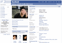
Out of preference, I have come to like / admire what I call the 'empty look', Schafer calls it 'clean design'. Basically, a site that isn't crammed with loads of different items seeking your attention. My key example would be the old Facebook: you had applications galore, a wall that stretched miles, adverts flashing, photos and videos dotted around the page.
Now though, they've refined everything under seperate tabs, meaning it just feels a lot neater. Not everyone is pleased though.
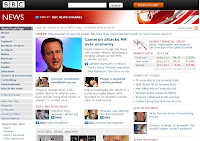
I much prefer section links which send you to a different section of the site, where you can then find what you seek. Obviously this wouldn't work for the likes of BBC News, as I think that tends to replicate what the newspaper has done for hundreds of years - give you all the information, on a priority basis. For such a site, you want to know the headlines, and often, there is more than one important thing going on each day.
Elsewhere in the interview, Schafer's notation that he likes a grayscale along with another colour... well, my portfolio seems to indicate this too.
I found his recommendations to newbies to me helpful. It's the stuff I've mostly been doing anyway, particularly the number one tip of a trip to the FWA. We were asked to do it for an online task last year for Identities, but I've pretty much kept up and carried on with reviews of sites I like . Just seeing what other people do can spur you on, make you competitive, or even just make you aware of nice design effects that you could implement.
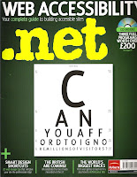
His last bit of advice: get a design magazine, well, I'm on the verge of subscribing to .net. I've seen it before, been really interested, but never bought a copy because I thought it just one step away from my skill set. However, I like the variety of what they put out, their tips, and it has a real focus for nice aesthetics, so I'm joining after Schafer's recommendation.
One thing that I would like to comment on is that he mentions two key principles he believes he couldn't have done without tuition: Interaction Design Theory and Typography.
I can understand the first, but the second, to do with the layout, size, colour of text etc I think can to some extent be acquired by having a good eye for design, naturally. True, what I think looks good may not necessarily follow the golden rules of type and fit in with industry recognised principles, but then again, isn't design and whether it's any good or not, a matter of opinion? Needless to say, his comment that the constant variations he was made to apply put him in good set for the future, where the more designs, with more variation mean you ultimately have more to work with, ultimating in a better final product. He later puts, it's hard, but sometimes you do have to 'kill your babies'. I think this is very true - because you thought of it first doesn't necessarily mean it's the one and only design scheme to go with.
Further down he promotes the use of acquiring additional, extra curricular knowledge: 'film making, psychology'. This again, I think is very true. The more informed you are, the more aware and successful you can make your work. You sort of succeed on a number of levels rather than just your one discipline. And I think the only way to acquire this broad knowledge is to get involved, in general, with what the world around you has to offer. Sure work experience in _______ field will make the employers take note, but an off key job here (which people might turn their nose up at) could well reap benefits when applied to something in the future. Basically, absorb as much as you can, from whatever you can. He mentions the simplest thing such as reading other creatives RSS feeds. This again is very true, you see what others are doing and it can inspire you and give you that spark you need.
Three points that will form a triangle of importance for me, in Interaction Design, will be Usability, Usefulness and Desirability. I am confident in achieving desirability (making it look nice, smart and suitable for it's context) along with Usability (making it simple and straightforward to understand, whilst making sure everything does as it should, so not to lose the user.) However, when you are set the task, 'make a site, any site' this is where I often question it's Usefulness. Sure, at University, it's the doing that enables you to acquire the skills but sometimes our creations can seem a little pointless? I suppose when working in the industry though, you will be making something that will definitely be of use, as their clients want it.
Lastly I really like his final life motto. Yes, we may find AS3 or php confusing and hard, but then 'if it was easy, everybody would be doing it'.
--
The second article 'I'm into minimalistic clean design' I found to entail things close to home, or close to my preferences anyway.
Out of preference, I have come to like / admire what I call the 'empty look', Schafer calls it 'clean design'. Basically, a site that isn't crammed with loads of different items seeking your attention. My key example would be the old Facebook: you had applications galore, a wall that stretched miles, adverts flashing, photos and videos dotted around the page.

Now though, they've refined everything under seperate tabs, meaning it just feels a lot neater. Not everyone is pleased though.
I much prefer section links which send you to a different section of the site, where you can then find what you seek. Obviously this wouldn't work for the likes of BBC News, as I think that tends to replicate what the newspaper has done for hundreds of years - give you all the information, on a priority basis. For such a site, you want to know the headlines, and often, there is more than one important thing going on each day.

Elsewhere in the interview, Schafer's notation that he likes a grayscale along with another colour... well, my portfolio seems to indicate this too.
I found his recommendations to newbies to me helpful. It's the stuff I've mostly been doing anyway, particularly the number one tip of a trip to the FWA. We were asked to do it for an online task last year for Identities, but I've pretty much kept up and carried on with reviews of sites I like . Just seeing what other people do can spur you on, make you competitive, or even just make you aware of nice design effects that you could implement.
His last bit of advice: get a design magazine, well, I'm on the verge of subscribing to .net. I've seen it before, been really interested, but never bought a copy because I thought it just one step away from my skill set. However, I like the variety of what they put out, their tips, and it has a real focus for nice aesthetics, so I'm joining after Schafer's recommendation.

Wednesday 15 October 2008
ONY - creative studio
I came across this site courtesy of the good old FWA: Ony (and no, that's not a typo, they're Russian.)
To be short, you can see instantly that the site is different and I typically infer that to mean good, as you are greeted by a large (almost two thirds of the page), high vis preloader. It draws the eye due to the scale at which you view the loader, plus it's written and isn't numeric, a break from the norm oncemore.
Something that always earns brownie points from me is including a fancy animation/video. Ony open their site up using an interesting coloured cloud effect. Again, the size and large positing on the page means you are instantly drawn to it.
However, my favourite piece of the site is definitely the navigation menu. No boring menu bar permanently fixed at the top, or left hand side for these guys. Instead you hover over the arrows situated at the top left of the screen and the menu appears on top of your loaded content. This is good because you can still see what's going on underneath. The typeface used is a large, clear, rigid font and when you scroll up and down the names, it changes colour and the menu moves with the mouse, flowing and looking very nice.
The interesting use of the flip effect to get more information, as if you were flipping the respective company portfolios over on a piece of paper, or even a business card (ingenuis use) is something I've not seen, or thought of before.
Anyway, enjoy. Meanwhile I'm left wondering what else will people come up with... what else can I come up with?!
@
To be short, you can see instantly that the site is different and I typically infer that to mean good, as you are greeted by a large (almost two thirds of the page), high vis preloader. It draws the eye due to the scale at which you view the loader, plus it's written and isn't numeric, a break from the norm oncemore.

Something that always earns brownie points from me is including a fancy animation/video. Ony open their site up using an interesting coloured cloud effect. Again, the size and large positing on the page means you are instantly drawn to it.

However, my favourite piece of the site is definitely the navigation menu. No boring menu bar permanently fixed at the top, or left hand side for these guys. Instead you hover over the arrows situated at the top left of the screen and the menu appears on top of your loaded content. This is good because you can still see what's going on underneath. The typeface used is a large, clear, rigid font and when you scroll up and down the names, it changes colour and the menu moves with the mouse, flowing and looking very nice.

The interesting use of the flip effect to get more information, as if you were flipping the respective company portfolios over on a piece of paper, or even a business card (ingenuis use) is something I've not seen, or thought of before.
Anyway, enjoy. Meanwhile I'm left wondering what else will people come up with... what else can I come up with?!
@
Thursday 2 October 2008
Fonejacker - DIY
Last year I tried (unsuccessfully!) to make a video piece, a homage to Fonejacker.
Perhaps one of the reasons I was unsuccessful was because Powerpoint was my program of choice, and the timelines, effects in there can be incredibly tedious if you want precision, particularly when trying to get a character to mime in time with the vocals.
One year on, and surprise surprise, (or not, really) you can get a DIY one on the e4 Fonejacker website.
It lets you customise your photograph to incorporate the correct faceshape, then get the mouth open and shut action. Plus, as with most things nowadays, you can embed it all over the place: here, Facebook, Bebo.
So without further ado, here's the one I created, 'the Internet Service Providings man'.
I wish I could have done that!
@
Subscribe to:
Posts (Atom)