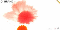
To be short, you can see instantly that the site is different and I typically infer that to mean good, as you are greeted by a large (almost two thirds of the page), high vis preloader. It draws the eye due to the scale at which you view the loader, plus it's written and isn't numeric, a break from the norm oncemore.

Something that always earns brownie points from me is including a fancy animation/video. Ony open their site up using an interesting coloured cloud effect. Again, the size and large positing on the page means you are instantly drawn to it.

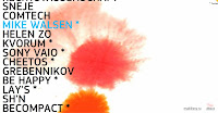
However, my favourite piece of the site is definitely the navigation menu. No boring menu bar permanently fixed at the top, or left hand side for these guys. Instead you hover over the arrows situated at the top left of the screen and the menu appears on top of your loaded content. This is good because you can still see what's going on underneath. The typeface used is a large, clear, rigid font and when you scroll up and down the names, it changes colour and the menu moves with the mouse, flowing and looking very nice.

The interesting use of the flip effect to get more information, as if you were flipping the respective company portfolios over on a piece of paper, or even a business card (ingenuis use) is something I've not seen, or thought of before.
Anyway, enjoy. Meanwhile I'm left wondering what else will people come up with... what else can I come up with?!
@

No comments:
Post a Comment