What does it look like?
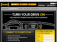
XM: A very distinctive black and white, line drawing. It is inverted so that black is the main colour, and white makes up the detailed images. Apart from the yellow of the XM logo (and use for the volume control), no other colour features. Needless to say, it doesn't make it boring. Far from it. It's so distinctive using the hand drawn graphics that it's more interesting, the more you go on.

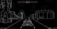
How the site is presented to us, is like you're in a car on a journey, so you are travelling down a road. Either side of the road are different type buildings, characters, billboards etc. You even get weather coming towards you. I experienced snow!
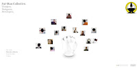
Fat-Man: A modern minimalist look. The typeface used reinforces a contemporary, stylish design company. The links can be found in the bottom left, just simple gray scale text.
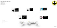
The rest of the site is white, but this gives it a light, airyness to it. Interesting 3D shapes catch the eye, along with business cards, which you can click for more information or content. These sit on the page in the form of a spider diagram type thing, the 3D object being the nucleus of the content.

How easy is it to use?
XM: Very easy. It has a feel of Grand Theft Auto for some reason, to me. You are in control of the car and shift it from lane to lane using the arrow keys, whilst speeding up and slowing down. Whilst in the city this doesn't play that important a part, but once you get on a motorway type road, there are slip roads, which if you steer down, take you to a certain section of the site, for example, Help the Hippo, a game. These games have a brief tutorial which show you clearly and in an understandable manner, the instructions. Very informative in that regard.
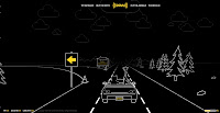
Just in case the user doesn't want to sit around driving to the slip roads, there are small links in the top centre of the page which take you to all the fun stuff associated with the site. Other, more business minded/informative links, can be found in the bottom left of the screen. Being highlighted in yellow, and contrasted against the black means they are easy to find.
Fat-Man: Initially a straightforward navigation scheme is in use, the links you click and they bring up the content. Thereafter you are allowed access to a more 3D realm, as the spider diagram content is fully rotatable, and so you can swivel it around, look at it from different angles. It makes it interactive, and askew from the norm.
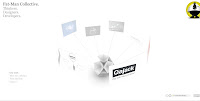
Once you click on your desired content, it brings up an almost paperbased like flyer/pamphlet. They appear to be exactly like the physical pamphlets you'd receive should you attend a design function or something. I really like the grab and drag option, which lets you scroll across the pamphlet. It is a natural movement. Once you are done looking, you just click back into the background and it swings all the other content back on screen, very intuitive and perfect nanavigation scheme.


How relevant is the content of the site?
XM: You could question the whole visual design of the site. The only reference that can be drawn is that you can listen to XM Satellite radio in your car, whilst going on a journey, and that is indeed what you do on the site - quite clever really. It sort of lures you in as a false sense of security!
The Frogger inspired Help the Hippo game is a bit of fun, but these are even used to reinforce the message of having their satellite radio in your car, by means of the aims of the game - help the Hippo to her car so she can listen to XM Radio.
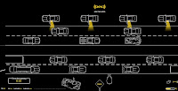
They have a section where, like the Americans, you drive in, and watch a film. The films on the site showcase the type of music available to XM listeners, so again, a marketing scheme!
Fat-Man: All that you would expect is presented, Content, The Staff, Contact, even a Blog link showing they keep up with the current day requisites. It seems to have got just the right amount of content, rather than being too sparse, or inundated with things.
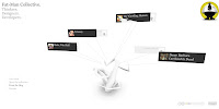
You can guage their sense of humour by means of the business card titles they have given for each other on the Contacts page! Also, for their Staff page, not only do you get a frontwards facing, normal photograph, but because it allows you to span the third dimension, you also get a back picture of their head, which I found quite funny.

How clearly is the content organised?
XM: It is quite random, but the main Flash part of the site is logical and understandable when you meet it. The business side is hidden away on the links and these brings up the more recognisable sales, information type site. The linear drawing design is still used though for some continuity.
Fat-Man: Clearly and well. You even get the option to optimise what you view, by selecting a category so for example, if I wanted web design staff, I'd choose that category and it would amend the content on screen removing the artists, or managers etc!

I do think that they might have missed an opportunity with the labels under the main title of the page. I thought and expected these to be clickable, but they weren't. It wouldn't have to even provide access to new or extra content, but reroute through to one of the sections. Doing that would make it just that bit more user friendly.

No comments:
Post a Comment