What does it look like?
IDEO: The homepage has gone for an out of the norm approach. Pink tinted images of pages fill the majority of the homepage and some are just visual images, with no extra function, whereas the slogan pages, 'What we do, What we can do for you, What we have done lately' move across and show you a span of the pages to do with that sector.
The traditional navigation links are then found at the bottom of the page after having scrolled down. The bottom of the page links are a continuous scheme employed throughout the whole site.

Once you click onto one of the pages, they do seem to have a sort of scientific jotter, or blog feel/look. Personally I'm not into the typefaces they've used. They don't seem as professional as I'd expect for such a company and in fact, seem to be a step back in terms of design, rather than the stylish CSS pages we're currently being treated to, on other sites.

SONY: A traditional webpage, but enhanced with Flash pieces, nice CSS style and colour specific link boxes. The predominant colour is white, so could be deemed a little bland. Once you click on a section, the design does vary a little, dependent upon product, but it is all clear, and legible. Some of the pages do have a catalogue feel to them, as in, the products are all laid out for you to buy.


APPLE: With Apple being the corp who initated the clean, white glossy look, it's very clean, simple and attractive. You get nice big shiny images of the products, along with aesthetically pleasing typefaces. Furthermore, it has a tabular structure, i.e. nothing seems unaligned, instead appearing quite neat.


NOW: The University colour scheme of navy blue and white are employed in the top banner to reinforce an aspect of identity. However, the main content adopts a softer blue and white scheme, which does make it seem less striking, and instead rather sensible. After all it is an educational piece. It is very boxy, with a different box catering for a different category.

How easy is it to use?
IDEO: The initial pink pages link, but you cannot tell very easily what you are clicking onto so it really is a gamble with what you'll end up with. Once you reach the page, there are Top News and Most Viewed links posted right at the very top. This isn't what you expect in regards to meeting modern conventions. You don't choose a link to then be offered more links before even reaching what you wanted in the first place! However once you become familiar with the site, these would work to your advantage.
The odd setup for the links at the bottom also could confuse. I use a high resolution (1440x900) and that still required a little scrolling. Others may struggle to find the links at all! However, to their merit, not only do they have the staple content links, i.e. News, Contacts, they also have listed the options that you would find on clicking through to these pages. Although odd at first, this is a good idea, making navigation quicker and more direct.

Importantly, they have a great Search button, ever present at the top of the page. Once you've typed in a few letters from your word the site finds relevant content from that word and lists the options without you even having to push go.
SONY: As a traditional web setup, you know where to expect the links, this time being predominantly on the left hand banner. Specific links can be found under coloured sections on the right hand side. This works as the colours distinguish better to the eye.
Importantly, they've made their Support section easy to find. It is expected now that with sales does come the need for after sales support too. However if you click on such top bar links, they don't instantly take you to a page, instead they open up another window on top of what you're viewing, which then provides you the link through to the correct page. This feels discontinuous to the rest of the site and doesn't really fit in.

APPLE: By far one of the easiest sites to navigate. Big links are consistently at the top of the page and everything is labelled. Making the hyperlinks a light blue, and buttons grey means they are distinguishable, meaning it is easy to know what you can and should click.

What I would like to comment on is displaying their products centre page with images, but then, perhaps craftily, using categories, such as 'New' or 'Top Sellers' on the outer left and right borders of the page, so they have doubled the amount of links. Obviously this means more chance of getting the customer to find the product and buy the product, but as I've said before, too much info can seem overwhelming, as well as hindering the aesthetics.
Apple too have a good Search button at the top of every page. This goes one better than IDEO because along with suggestions from the letters you have entered, it provides images of that suggestion too.

NOW: The site in itself is fairly easy to use - click the link, it takes you to the place where your information (hopefully) is. Main links line the top banner, although they could be considered too small. Currently it feels as if the NOW isn't fluent as it will come to be. For now, the information is just dotted here and there.
How relevant is the content of the site?
IDEO: Their content is quite extensive, and so there is a lot to see and read. You get the feel that they have been established for a number of years. Obviously their target market would be looking for all these things. The titles of the links they use are a little unordinary and perhaps could be more precise, an example being 20 Questions, under the Culture section. Normally this would be called FAQ, a popular and understood acronym.
SONY: Obviously being a product selling company, the site is full of their products, so people can find what they are looking for under the SONY brand. Furthermore, the advert campaigns that go with specific products are available too. The key principle here is to reinforce sales. Obviously it would probably be going a little too far to list every item they have ever made but there should be a sizeable amount online available, in my opinion.
APPLE: As with Sony, Apple are here to sell, so a lot of products are listed and available. Likewise, Support is easy to find. The videos are helpful and informative, but again, persuasive, to encourage sales.
NOW: Everything on offer on the NOW can be put to use, but how it has been prioritised I don't think is quite correct. Yes, competitions are suitable for students, but probably not important enough to take up a main, first to be seen, slot on the home page.
How clearly is the content organised?
IDEO: Once you've navigated to a specific page, the content is organised in an acceptable manner, but not one that I prefer. As an example, the News and Most Visited sections that appear at the top of the page would be better suited at the bottom of the article. There are however some nice Flash bits, for example when flicking through photographs, it is actually represented as if you're moving through a deck of physical pictures. This works nicely and I haven't seen it in use elsewhere on the web... yet.


SONY: On a specific item section, they do use a tab structure, to make the viewing of information seem more manageable whilst taking up less space. However, on some pages it can feel like there is too much information vying for you attention, what with the adverts, the loaders, the buttons to press, the text (of varying colours and emphasis) and the images.

APPLE: Perhaps personal taste, but by using a rigid structure, with everything neatly aligned it just feels more clear when you're taking the information in whilst trying to find things. With pictures making up a large proportion of the content, Apple seem to have gone for a visually lead approach, rather than textual. I believe this to be because the connection with images is instant, rather than having to read the text first to find out what is being presented to you.

NOW: The organisation of the site I would say is confusing. In the main hold of the page you are presented with boxes which house links. Once you click this link it takes you through and provides more boxes with some relevant content, i.e. reading list books. However, the most important information, such as module Content is offered in a tiny link on the upper banner. Definitely not where you're looking and so small so you don't notice it being there.
 (Can you find it?)
The main boxes obviously contain applications or links that you'll find useful, but I don't necessarily think they should be presented first on the main page. Library stuff should be found under a library link. Likewise, SPP2 should house a link to take you to that section, where the boxes cover and cater for all the content, not small links.
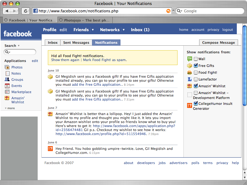
Furthermore, the storing away of information under a link wouldn't necessarily have to mean that you aren't aware of updates. Facebook puts a little number next to your inbox link to let you know you've got mail. Or otherwise, there is a special notifications list. This could cover all aspects of the NOW - out of date library book, new assignment etc each time you login.
- How you'd do that though? I guess that's why I'm still a student!
No comments:
Post a Comment