The first, ZigiMe, seemed to put over a very stripped back computer techy feel from the start, noted through it's visuals. To me, the use of green upon black reminds me of the very old school computer days, or the Matrix code.
Clicking through to some of the sections, such as Browse, for instance, alters the green to red. Yet, the boxy/rigid look still remains. What comes as a surprise is the type of people using the site - it almost seems unexpected. Normal people! The rainbow use throughout the site does provide a little life, however I am not really into the boxy line look. It seems almost amateurish or for an era goneby.
--
Then there's Google not so known effort - orkut. Apparently this didn't pan out too well, apart from Brazil.
What I really like is that the photos of friends are are displayed on one side of the page, you don't need to click through several links to find the folder you want - I suppose this mimics myspace pretty well. This is something Facebook seem to have distanced themselves from, along with moving everything everything else to a set place, behind a tabbed menu option. I also like how the options are really clearly displayed on the left handside, they don't seem ambiguous which is another problem I found with Facebook - I knew what I wanted, but had to search through several menu tabs to find it.
Unfortunately however, with applications like iFan and the ability to share photographs, Orkut just joins the list of social networking sites, as in, it doesn't seem to do anything different or specialise in a particular area/way. Perhaps being simple and clear counts?
--
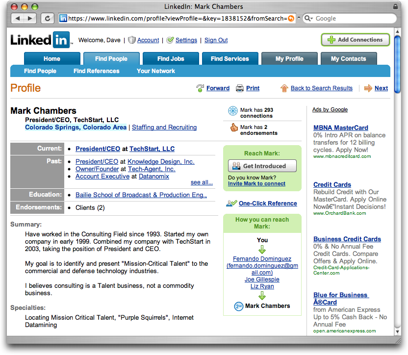
It advertises itself very much in the same vein as all the others (FriendsReunited, Facebook etc) but then also has a section for finding yourself a job/careers advice through professional contacts. Interesting. And that was actually enough to get me to consider signing up! - Job done you might say in terms of the successfulness of a social networking site - the more members, the supposedly more popular it is.
In terms of looks I do find it to appear quite like a price comparison site, or on thinking about it - Play.com? I think that may be down to using the same coloured links for Adverts (right hand side) as well as internal links all in a similar blue. If those GoogleAds weren't dotted around the site, it perhaps wouldn't seem so overloaded with textual information - not enough whitespace for my liking.
It is clearly sectioned at the top - find friends, find jobs etc so the user wouldn't be confused in terms of where they should click. I suppose being business minded it doesn't wish to emphasise a fun/playful character, hence the more formal look.
--
Soooo, just from looking at those three examples it has helped me recognise what my expectations of a social network site are, what I like in a site and more importantly what I don't. - Focusing on the social side, I wish my site to not be too formal, or serious. I want it to be simple to understand, but have a nice modern, shiny, visual aesthetic.
@


No comments:
Post a Comment