
http://www.nokia.co.uk/e71


Firstly, I like the thinking for the navigation. As you would navigate on the phone using the joystiq, they have created a version here. I tend to think in this sort of way, for example, the restaurant website made recently. Literal thinking. Notably, they haven't hid a smaller menu with the options in a corner to appease user's more traditional expectations of navigation. Then again, the content and theme they have chosen perhaps wouldn't appease the more traditional web user anyway.
I can see that there is a consistency with the visual branding - the animations flow on nicely, and the colourful nature of the advert is referenced again well. Even subtle hints are available straight away as the logo features a blend of colours.

Rather than going for a 'the phone has this feature' this marketing seems to follow a more abstract way of thinking.
Clicking left on the phone joystick allows you to create user generated multimedia. User submitted media seems to be very popular nowadays. Everyone wants to put their stamp on something, represent themselves in some way.

As with the fluid animations in the TV advert, they are demonstrated here in abundance. Again, they capitalise on current trends by providing user generated content for the animations. I really like the graphics that appear on mouse_over for a particular section of the navigation. In particular, this colourful one is punchy, and vibrant. It goes nicely against the modern silvers that represent the actual phone.


I do feel that they miss out what users may expect in regards to information about the phone. Previous experience with phone sites set up the expectation of being information/fact laden. However, as this site deals with the abstract side of things, the hyperlink to the typical Nokia site seems somewhat redeemable.

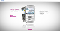
In all, the site is more of a visual feast, rather than informative marketing piece. Perhaps it's personal taste. The Web 2.0 reflection is a subtle touch, which I only really noticed when casting an analytical eye. Such a technique adds a sleekness and modernity, feeding the modern, contemporary feel of the overall visuals. Alongside this is the softly diffused grey and white background, again, something quite atypical with minimalist, modern efforts elsewhere online.
If I were to choose, I still prefer the TV ad. It fits together and flows very well, and I seem to buy into that sort of abstract idea on the TV, whereas I found this user generated content qualititative indeed, but a little cliche now for web. The literal thinking for the navigation was a clever effect, which I believe almost all mobile phone users (so pretty much all people) will get and agree with.
@
No comments:
Post a Comment