A great starting point was to look through 500 Essential Graphic Novels: The Ultimate Guide, by Gene Kannenberg Jnr.
Obviously by it's title, you can guess that flicking through here provided me with page after page of various layout schemes.
Here are a few* of the key ones that are used often throughout the genre:


Obviously these layouts all work around the amount of content they need to display. This last one, for example, would only be able to hold 3 indiviudal parts, yet this isn't necessarily going to rule it out as our website isn't 50 pages. In fact, I actually like the diagonal boxed one, it doesn't seem as square (because it isn't!) and appears a bit more dynamic.
--
Elsewhere, the 500 Essential Graphic Novels book proved a good source for the type of look I was wanting to achieve. Obviously you can use the noir style title, but what components make up that look visually? This framework helped me in my exploration of the comics available, and I found some great examples of goody/baddy comics. Brooding blacks a go go!
Sin City (Dark Horse) - Needs no introduction really. Noir at it's comic book best in my opinion; high contrast black and white, shadowy making the images appear striking, dramatic. Sometimes the use of red/yellow is used for emphasis/character personalisation.
The Fixer (Drawn & Quarterly, 2005) - These images caught my attention due to having a high attention to detail, but also content in the images. Some comics are the simplest line drawings on the page, whereas this could have any section of it's illustrations cropped and still you would have something to look at and explore.
Judge Dredd: The Complete Case Files 01 (Rebellion, 2005) - One of the many comic books that go for a white on black, rather than black on white look. It gives it a different feel, a villainous, evil feel, I think.
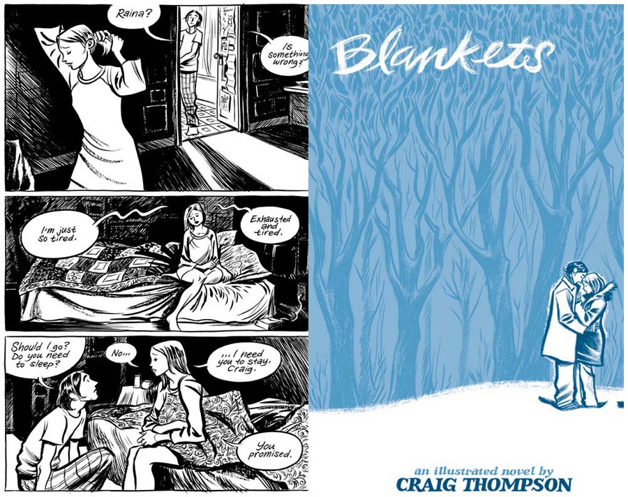
Blankets (Top Shelf Productions, 2003) - Although not a book about good vs evil, I liked Blankets for it's use of strong black lines for emphasis.
Zorro (Dynamite Entertainment) - The blacks contrast strongly against the white in the Zorro comic books. The exacerbated contrasting, along with much shadow is one of the effects that I intend to put into action.
Road to Perdition (Paradox Press) - I think this one caught my eye due to the realism of the illustrations, particularly the characters. Of all the graphic novels I looked through, this one seemed to most represent photo-like comic book illutsrations.
This genre analysis proved worthwhile, as it has opened my eyes to what others have done in the field. The techniques are becoming quite clear for what I need to do to achieve a realistic interpretation. Furthermore, it has spurred me on with some great ideas for content.
Although I can't draw, my camera buddying up with Photoshop can make illustration-like images. Perfect. This is where I'm heading next.
@


1 comment:
thanks, this is very helpfull
Post a Comment