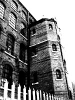
I've been out taking pictures of typical 'evil' buildings, streets, and also, the characters I am going to include in Villains.
Sean's lecture about design variations showed us how many more options were opened up through varying something. I too have tried to see what possibilites I have for my images, utilising the filter effects in Photoshop. Obviously I couldn't really try altering colour cos Villains is black and white!
1. Original 2. Strong contrast
3. Glow effect 4. Pencil drawing
5. Inverted 6. Wire-line glow
7. Contast and rain effect
Of them all, I particularly find the inverted one and the added rain effect work well.
The inverted image makes ordinary things more noticeable, particularly the windows - seeing that image for the first time, you would definitely wonder what is in those windows? The prevalence of black over white also makes it far more brooding. I think I may have been subliminally persuaded by the white on black comics I found previously.
Meanwhile the rain effect is very much in the vein of Sin City, as you often find rain and darkened weather populating Frank Miller's images. Again, it enhances the sense of danger. The whitest whites and the blackest blacks, with all the strengths in between can be found here - another feature I noted about his work.
I dismissed the others for different reasons. Some are too blurry, i.e. you might not be able to know what the image is. A comic book is a visual story, so not knowing would make it worthless. Furthermore, the pencil drawing filter effect just doesn't seem polished, or sophisticated enough, in my opinion. I want a classy piece.
Soooo, following this decision, I opted for the Sin City look. I'm making a Sin City inspired piece so it felt a natural decision.
With Photoshop there are a multitude of options that can be tweaked, and so I set about further variating that specific look. Choosing strength 2, instead of 3 sometimes can make the world of difference.
I think the rain goes a little too far in this first one, so I reduced how it's distance in the second, but find the whole composition a bit too dark. It needs punchier whites.
These last two I am most pleased with. The window shot looks very much like a comic type image to me, whereas the other captures the strong shadow and contrast look that is employed frequently in baddy comics.
I need to find a happy balance between the two now, then I'll be ready to insert them in the html. I mentioned before that I would try sampling adding a single colour, perhaps red or yellow like Miller did in Sin City. I have chosen to keep that styling for the character shots, as red, juicy lips in particular look really great and stand out a mile against chilly black and white.
@


No comments:
Post a Comment