
However, with the introduction of the snazzy iPad, it seems that web design may have a new resurgence. Although apps are hugely popular on the iPhone, surfing the net is one of the iPad's key selling points. Fortunately, it isn't going to be too difficult a job to achieve. For one, Mobile Safari is pro HTML5 and CSS3. For two, it isn't Internet Explorer!!
This article is good for introducing the key concepts for designing on the new touch screen slate.

For one, we have gotten increasingly used to people's screen resolutions increasing. Although a lot larger than the iPhone's 320x460, the iPad has a portrait aspect of 768x1024 (not including browser chrome).
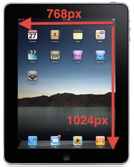
The device is meant to be workable in any orientation though so it would be wise to consider using more fluid layouts, or limiting the master div to 768px. Again, compared to the 1000 pixels we're able to work with nowadays, it is a step down, but its still workable.
@
No comments:
Post a Comment