Tuesday 25 November 2008

Bannerblog examples

Kind of like an FWA for banners, bannerblog documents all online advertisements that companies are employing agencies to make. 

I think this first banner is ingenius. 


It is so simple in premise but also technically quite simple - and yet it does it's job well. There is humour, there is likeability in the pig and there is a degree of interaction. Some might see it as too simple a creation, but I think it gets it's message across well. The only downside is that I didn't initially notice the plug - it's not as clear as it could be hidden in the grass.

--

This next one to promote the Da Vinci Code movie actually helped me choose one of the banners from my designs, and shows it could work and be effective. 


The use of the eyes at the start is quite malicious, definitely being quite creepy/scary. This is exactly the sort of tone I want to set for my banners. Henceforth, I'll be using my twitching eye design!

--

Film 4 (or agency Profero) surprised me with their attempt at a banner. 


It succeeds on every level. It is eye catching due to the initial back and white setting, it is dynamic when it snaps to colour along with the movement and explosion in the scene. It breaks the boundaries when the car skids outside the banner area, almost proceeds to hit us but then quickly swerves to reveal a wipe on effect for the Film 4 content - this being the informational/promotion side to the banner. The best one I may have seen, it seems to tick all the boxes for a successful, interesting banner.

--

Last but not least, I thought this ITV Rugby cleverly mixes video with graphics (video being an area I think more and more banners will be heading towards). 


This, like the Film 4 one, represents thinking outside of the box (OK, I know, another pun!) by literally breaking out of the boxed boundaries. I'm sure I'd be able to make something like that too.

@

OEP Web dev - Banner designs

I've been brainstorming and sticking all the ideas I could, down on paper. 

Some were easy to think of, whereas others required a little more effort to try and recall the sorts of scenes and their elementry baddies that we are presented with in programmes / movies I love, such as Heroes, or Batman, Superman, X Men. 


Of these, the three front runners currently stand as being the typewriter one for the pop up, the eyes one for page one banner and then the push the button in the panel on page3. I think this last one is a typical comic book like gag pulled by a baddy.

Now it's off to collecting materials.

@

Monday 24 November 2008

OEP Web dev - Images

It's starten to quicken in terms of getting through the to-do list. 

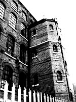
I've been out taking pictures of typical 'evil' buildings, streets, and also, the characters I am going to include in Villains.

Sean's lecture about design variations showed us how many more options were opened up through varying something. I too have tried to see what possibilites I have for my images, utilising the filter effects in Photoshop. Obviously I couldn't really try altering colour cos Villains is black and white!

1. Original 2. Strong contrast

3. Glow effect 4. Pencil drawing

5. Inverted 6Wire-line glow 


7. Contast and rain effect

Of them all, I particularly find the inverted one and the added rain effect work well. 

The inverted image makes ordinary things more noticeable, particularly the windows - seeing that image for the first time, you would definitely wonder what is in those windows? The prevalence of black over white also makes it far more brooding. I think I may have been subliminally persuaded by the white on black comics I found previously

Meanwhile the rain effect is very much in the vein of Sin City, as you often find rain and darkened weather populating Frank Miller's images. Again, it enhances the sense of danger. The whitest whites and the blackest blacks, with all the strengths in between can be found here - another feature I noted about his work.

I dismissed the others for different reasons. Some are too blurry, i.e. you might not be able to  know what the image is. A comic book is a visual story, so not knowing would make it worthless. Furthermore, the pencil drawing filter effect just doesn't seem polished, or sophisticated enough, in my opinion. I want a classy piece.

Soooo, following this decision, I opted for the Sin City look. I'm making a Sin City inspired piece so it felt a natural decision. 

With Photoshop there are a multitude of options that can be tweaked, and so I set about further variating that specific look. Choosing strength 2, instead of 3 sometimes can make the world of difference.


I think the rain goes a little too far in this first one, so I reduced how it's distance in the second, but find the whole composition a bit too dark. It needs punchier whites.

These last two I am most pleased with. The window shot looks very much like a comic type image to me, whereas the other captures the strong shadow and contrast look that is employed frequently in baddy comics. 

I need to find a happy balance between the two now, then I'll be ready to insert them in the html. I mentioned before that I would try sampling adding a single colour, perhaps red or yellow like Miller did in Sin City. I have chosen to keep that styling for the character shots, as red, juicy lips in particular look really great and stand out a mile against chilly black and white. 

@

SPP2 - Successful interviews

I predict that Linda Brown will perhaps comment on these following things in regards to achieving success at an interview:
  • Body language - be open, not closed in how you physically present yourself, make eye contact
  • Know yourself - know your strengths/experiences and how they will benefit the company
  • Know about them - show you are interested in the job by having learnt about the company
  • Question - show further interest by having a question ready about the job/company
UPDATE: Linda Brown didn't make an appearance so none of these were actually commented upon!

@

SPP2 - Personal practitioner development

Outside of lessons and outside of University, whether it be through reading, watching, talking, listening, making or doing, how are you developing yourself as a multimedia practitioner?

I feel I am achieving personal development by taking on extra work projects outside of University. Some may call it moonlighting, but at this stage in my 'career', I think I should grasp every opportunity and make the most of it. For example, by making a website for a friend, not only am I reinforcing the new skills that I am learning, but also, it means I am adding another example of work to my portfolio/repetoire, another thing I could talk about at a future job interview for example. To better yourself more, you just have to keep building more; refining and then again refining your skills, each time.

Furthermore, I like to keep myself up to date with the technology that is ever changing. Being aware of the new features, by reading about the programs, watching videos etc, I can forecast where such new software options will come in handy and how they'll open up new avenues.

@

Sunday 23 November 2008

OEP Web dev -Wireframes and Content

I'm on the verge of putting my designs down into the real thing, so in keeping with a more traditional design process, I've made the planning decisions beforehand and drawn up the wireframes. (Previously I'd only ever done hand-drawn drafts for I.T., so to be double sure I checked out what others thought a wireframe traditionally encorporates.)

Back in the brainstorming stage, I came up with a list of possible content for the three site page.


Taking these into mind, I have finally decided to have my site feature:

Page 1 -comic book look & layout, visual images


Page 2 - character/bio page


Page 3 - mailing list input form


The pop up, which will link to the mailing list page, will be a visual advert informing about the Villains subscription. I'll be posting my banner designs shortly...

Now for the cool part - bringing it all together.

@

Thursday 20 November 2008

OEP Web dev - Eyeing up the competition

I thought it would be a good idea to see what others had done, in regards to the online comic book format.

A
search on google brought up 4,840,000 results, but as far as I can see, a lot of websites tend to list the names of comics, their price, or ISBN number. These are directories.

It may be a relatively new format, perhaps like the
e-zine. So I tried e-comic as a search query.

Bingo. (slightly).


War of the Worlds

I like this one, firstly because it is an online comic. However, they display their content using a page per comic book panel. This doesn't seem to fit/work in my opinion. It makes it seem a bit slide-showy. Comic books are traditionally 6x6 panels, not continuous splash* pages.

*A splash page is an introductory image that alongside the title and credits, starts the story. It usually is full page, and features quite a bit of visual content/detail to entice the reader. (Martinborough, 2007)

Another site I found was ilovemyhotgeek.com


In it's premise, it displays a comic book story and you get a number of panels per page. However, I find it a little too basic. I think I may be becoming a typeface snob, but any sign of Comic Sans and I tend to think this won't be cutting edge stuff.

The next one I found was better, but it didn't capitalise on the comic in my opinion. 


The site opens like any other - it has a home page with notifications of updates. Noticeably it has it's Flash banners too, advertising the comics, so it shares some similarities with our brief. To access the comics, you need to click the link on the left... perhaps people see websites as being like a newspaper, and as you would have to turn to pg 76 to see the daily comic strip, you should do that online too? 

By the by, the quality of this site, for example, the graphics are definitely heading in the right direction. They are modern, with shine&shadow and a broad colour palette. Of what I saw, it is definitely the best. Again though, the comic book was hindered by being navigated in a slideshow manner. I can sort of understand the reasoning; placing several images on one page means you lose the glory factor of what each image shows, due to their size restrictions.

For further examples, this site lists further online 'comics', and so does this one does too.

Interestingly,
when I downloaded Chrome, I noticed they had set their information in the form of a comic. Quite a few bloggers voiced their opinion too. 

These are actually a useful form of public opinion for my own site. One person felt the comic book idea was smart, but got very dull whilst another found it’s different, fun, and informative. Obviously I shouldn't encouter the dull side of things as we are only using 3 pages, but these opinions are useful information to be aware of.


I think this works well. Instead of a pdf containing 20 pages of marketing blurb, the comic book format feels quite welcoming. It isn't threatening. It cleverly incorporates simple worded statements alongside visual representations. Visuals speak far quicker than words, your eye is naturally drawn to the picture first. 

The creator Scott McCloud also has his own webcomics. These follow the slideshow setup, but he has made it different by zooming into the next frame. Take a look to see what I mean. It's an interesting variant, one that I initially liked but can perceive it to become quite tolling on the eye, having to see that effect over and over again.

--

From looking at these various pieces from the web, being honest, I think I sort of have a niche for what I'm going to do. Nothing really wowed me. Striking visuals, something out of the ordinary wows me. These therefore are sort of my target goals.

This research has been useful in helping me confirm the format of my site - I will be using the 'comic book look' as a vessel to disseminate the information. it will use the layout and practices that are standard in the comic book industry, pictures within panels etc. However, I am using that to house my content. I suppose what I am trying to say is that I am not going all out to tell a visual story, the front page with it's links will resemble this, but not truly be a story.

Perhaps a reference point that us previous generation CITV kids will remember is Zzzap!


This TV show used a massive comic book layout to hold it's individual sketches. That's more the idea I've got in mind. It will look like a comic, it will have comic book images, and characters etc. But it won't be a three page story book site.


@

Wednesday 19 November 2008

OEP Web dev - Stats and Facts

I did some layouts previously which I intended to choose from to implement in my design.

Importantly, I forgot to consider the banner size regulations. Obviously there are a variety of sizes to choose from:


Before I even get onto the banner sizes, I need to know what restrictions I have in regards to the html page, which will house the banners. Folklore has it that a certain amount of people still sit with their screen resolutions whacked up to 800x600, making everything supersize, but also super missing out. 

However, after looking at the W3's statistics, it appears there is light at the end of the tunnel in the year 2008. 

1028x768 or higher is the norm, more or less, nowadays, with a paltry 8% having still not having found the resolution adjustment button, viewing at 800x600. (W3, 2008) 

This is a good thing, as it means I am freer to work in a slightly bigger content space, but also, importantly, it means that I can encorporate, should I wish to, two banners, side by side, in comic book panels:

 
Total width = 768
'Large rectangle' banner width =  336 (x2) = 672

So I know now that I do have options to install my banners and with space to spare!

@

Monday 17 November 2008

Grocery Shop Boys - website design

Introducing the new supersensations that are the Grocery Shops Boys...

We were tasked to create a website in order to protect the bands intellectual property, thus Flash was the chosen format. The sections to be included were: Who are the Grocery Shop Boys, See their Performances, Music Tracks and Contact information. Another requirement was an introductory animation that could be skipped if necessary.

On researching the official and other fansites online, I noticed a theme of using colour as accentual highlights. I decided to try and encorporate this within the design, whilst also prioritising the Grocery Shop theme.

Potential designs:


The design I eventually put into action is quite a visually led one, but remains simplistic. I based it around the animation at the start, using simple boxes to section the navigation links. I really like the wipe on and off effects, although this could annoy some who wish the information to be displayed asap. Admittedly I did find the content quite humorous.


In terms of difficulty, I met some trouble with getting the individual tracks to load. To make it functional, I installed three seperate sound channel instances. I know there must be a more efficient way to code it, but as of yet, haven't managed to find that solution! 

UPDATE: Thanks to Sarah, I also found out that I had to alter the linkage addresses for the videos and mp3s, directing them to the online folder so they could be called to play. 

Nonetheless, more skills confirmed.

@

Sunday 16 November 2008

OEP Website design - Logos

I've decided to call my comic book site 'Villains'. It has so far proved a good framework to pursue, I have been looking at shapes/looks that appear dark, edgy. 

For the site's logo, I sketched a few ideas based around the letter V.


I have now translated these into digital form and developed some, with varying degrees of success.  


It has come to the stage where I can't fully decide between this one above, or the two below. The high rise electric bolt V gives it dominance, with the shape itself being unique and identifiable as representing evil. However, I am questioning if this logo will work in a rectangular box - there would be a lot of negative space?


This variant of the design I also particularly like. As with most things evil, it helps if you use more black, than white, and so that's why I inverted it. I have varied the attached font next to the V from above, I think the Edo typeface helps add a more rugged, evil comic book feel. 

The two featured fonts are Comic Book or Edo (custom made fonts from dafont.com).

Now it's decision time. I may try adding a coloured aspect to the logo, whether that be accentual line or something like that. This would be in keeping with Miller's Sin City colour styling- black, white and a hint of red/yellow.

@