In all, I liked this task, it's the sort of area I would be more than happy to work in, in the future. It incorporates Flash interactivity, motion graphics and visual design... things I like!
Obviously spending time online, you become used to Flash banners flashing, moving and so on, to try and catch your attention. In terms of what works well with myself, I find simple movement with good aesthetics (not firework lights and sirens screeching) can draw the user and denote a feeling of quality. Taking this on board, when sketching out designs, I thought it important to keep it simplistic. Karl thought we should exploit the idea of interactivity and incorporate in the design.
As far as I was aware banner sizes ranged from as little as a 'micro bar' at 88x31 to as large as a 'leaderboard' at 728x90. Flash however, seems to stick with the middle ground with it's template offerings, and so I opted for 336x280.

The first design featured the typical pumpkin, and dark cobwebby background. Upon clicking, it would zoom into the darkness of the eye of the pumpkin and text would fade on, inviting them to come to a Halloween Ball.
Although this would have been a good design to implement, it felt too simple. It didn't really maximise on what you could do with Halloween - scaring, etc.

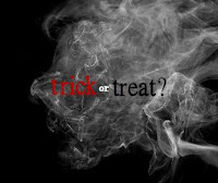
The next was a more interactive piece, offering the choice between Trick or Treat? This means it is user navigated and they should feel a sense of involvement when interacting with the banner. They are choosing a route towards an outcome.
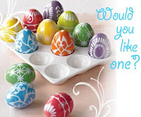
After opting for this design, really nice visual backdrops were found, and so the continuation of a good visual look was prioritised as important to maintain. The original design didn't quite fit in with this goal. The image of a smiling child just didn't fit, it was a little too... amateur? To overcome this, an image of some luxury confectionary was chosen. Combining this new image with a fanciful typeface means there seems a bit more to the Treat section now, it seems a bit classier.
Another point that I thought should be exploited was using a contrast between trick and treat, light and dark, good and evil. Hence, when you choose Trick, the page remains dark and denotes a bad tone. Meanwhile, the Treat section is white, so feels light and airy. The transition between the sections is therefore also more noticeable and emphasised.


The final design decision revolved around sound and whether to include or not to include. Initially, the decision went against using audio effects as from experience a noisy banner can be more off putting rather than enticing. However, I thought that the shock moment would be more exaggerated and striking with a cackle effect. The simplicity of an evil laugh works well, it's meaning connects very well with the user and hopefully makes the impact better.
---
Word of warning though, my copy of Flash automatically set templates at AS1. This is understandable to a degree - you want to make it so the banner will function in the most basic version of Flash enabled browsers. However, what with AS3 being the future and all that, this banner is made of a blank AS3 canvas modified in size.
@

No comments:
Post a Comment