
Notably, our NTU Art&Design handbook has made it in. I knew Un.titled (sublime creative agency) were at the top of their game after perusing this book and their website portfolio.
However, there are so many other good examples on looking at the article. Stand-outs for me include the National Geographic - who would have thought it.

The orange contrasting with the varying shades of light, medium and deep green works as a great eye-catching device. The blocky typeface is strong and again proves a great constrast against the flowing, curvy natural leaves. Here, the tiger image which would normally have taken priority seems a lesser faction. In my opinion, the neon orange works better, yet I appreciate on inner pages of the brochure, this may prove too distracting/overwhelming. Nonetheless, as it is now, I would be very proud if I had created this.
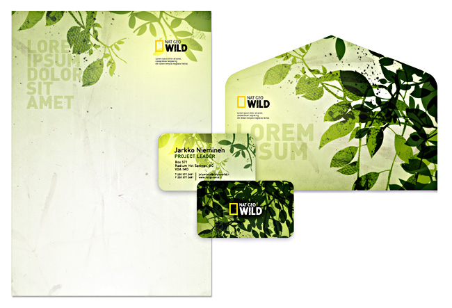
And it doesn't stop there. Their stationary is even better, and I would be astounded should I ever receive something as distinct as this in the post.
Interestingly, the people behind this National Geographic design were also behind a logo I commented on (Bahamas) way back in the first year. Their talent is widespread.
--
This next example goes all out to capture your attention through it's use of pinky/reddy text and cramming the page with varying degrees of sized text.

In all reality, it doesn't appear to make that much sense and so could be criticised for failing to effectively impart information (one of the fundamentals of graphic design) yet this adds to it's alluring, interesting nature. The white space that uses diamonds to shape the letters is also unclear as to what it is showing, but again this difference proves to draw the eye into the space not covered with a barrage of red text.
One thing this article does show is that there is no end to the potential with the same 26 characters of our alphabet. Fundamentally, they form great pieces of eye candy and even better, sometimes serve as a superb mode for conveying information.
@
No comments:
Post a Comment