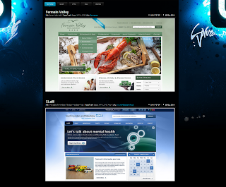
I've decided to put in a bit of research to see how professional companies out there display their web work.
It's harder to put together than you think. After all, a website is typically viewed in landscape parts, not in it's entirety (of course there are exceptions to this).
Here is the range of what I discovered:
Liquid light - slanted landscape zoom

Net dreams - hi res, straight forward
Addictivity -slanted portrait zoom
Bourn - browser screen capture
Soula - specific graphic zoom
Turbo Web - 3D stack
NClud - 2D stack spread out
Consider Creation - iPad & desktop
Un.titled - monitor
The Pixel - wooden picture frame
Skive - top left zoom
Tick Tock Design - laptop
-------------
Particular stand outs include the forward thinking, iPad design, alongside un.titled and ticktockdesign who using the screen or monitor on which the site would be typically viewed. It makes sense to put the context into the image too. Looking at it you know it to be a website. However, it does mean that the size of the actual website is smaller and doesn't have the same impact due to competing with the frame within it sits.
The others which zoom in give a more arty/graphics feel, which is good. But doesn't really indicate from the start that I am a web designer.
I shall give these monitor frames, along with altering the perspective of the image, to see which stand out as feasible for my images. One consideration is browser URL bar visible or not??
@


No comments:
Post a Comment