Tuesday, 26 January 2010

Client - website costs #3

The Creative Store again offers a reasonably consistent package to that which I am providing for my client:

5 page HTML website from £525 plus Vat
8 page HTML website from £765 plus Vat
12 page HTML website from £1055 plus Vat

WHAT WE INCLUDE:

  • A telephone conversation or meeting at our offices with one of our account managers
  • Design two proposals based on information provided about the websites you like. We will then combine your logo, photos and colour scheme into the design work. On feedback from you we will make minor adjustments to the chosen design
  • Registration of a FREE .co.uk or .com domain name if required or site set up pointing to your existing domain name
  • Choice of horizontal or vertical navigation
  • Latest HTML standards
  • Choose your pages and add-on options
  • Unlimited web page links
  • Basic SEO (search engine optimisation) is included such as addition of page titles, main headings (H1 tag), meta description and meta keywords for each page
  • *6 months FREE web hosting including fully backed up data at all times
  • Online web statistics to track visitor information and site hits

    Content management system

    We offer our own DoubleQuick content management system. This gives you the following functionality:

    • Ability to set up pass worded administration rights for specific personnel
    • Administrator can add new user, edit or delete a user
    • Four different levels of access
    • Ability to content manage the body copy and images within the site
    • Ability to create new pages under existing parent pages using existing templates from within the site
    • Ability to set page order of new pages
    • Ability to create links and upload PDF’s
    • Ability to set and alter meta description, meta keywords, page titles, H1, H2 and alt tags for SEO the cost of adding this to the site would be £375 including a one hour training session at our offices.

Client - website costs #2

Global Prospect again provides a typical idea of how much one would expect to pay for the site I am developing:

Website Design Starter Sites (up to 10 pages)

We get loads of companies approach us for this type of website design. Mostly, they are startup companies needing to keep their initial advertising costs down. If you look through our portfolio you'll be hard pushed to tell the difference between the expensive sites and the inexpensive websites because everything we do is bespoke.

What will I get?
• Up to 10 professionally written pages and an online contact form which are CSS/XHTML Valid which are tested in various Internet Browsers.
• A
FREE .co.uk domain name
• 1 Years'
FREE hosting (normally £130)
• An XML Site map
• An HTML Site map
• Google Analytics Setup
• Initial Submission to the Google Index

What won't I get?
• A Website Template, which was probably purchased through another company and then re-sold to you and anyone else who wanted the same design. Did you build your company based on someone else's? No... Thought not.

Our prices start from £499.00.

-----

Content Managed Websites:

Lately, we're getting more and more companies asking us for Content Managed Websites.. from being able to simply change information or upload images to a gallery without the need to contact us (or anyone else) to do the updates for you... this type of website needs you serious consideration if you have customers with a desire for up-to-date and accurate information.

With a Content Managed Website you can make your own website updates daily if you wish.

Prices from £699

Client - website costs

Info from http://www.bromleywebdesign.co.uk/prices.html costs a website similar to that of my clients:


10 Page Website @ £399.99 £349.99

    blue
  • 10 Static HTML Webpages designed around your choice of theme or company colours
  • Email Contact Form including Anti-Spam Protection
  • Free .co.uk domain name
  • 1 years Free hosting
  • 10 Free Email Addresses
  • 3 Months Free Content Updates (Max 2 Hours per month)
  • Search Engine Submission to Google, MSN, Yahoo! etc
  • Logo & Content to be provided by customer*

Content Management Websites (CMS) & Blogs from £499.99

    green
  • Dynamic Webpages designed around your choice of theme or company colours
  • Unlimited Webpages
  • Easy to use control panel to add your own content
  • Free .co.uk domain name
  • 1 years Free hosting
  • 20 Free Email Addresses
  • 3 Months Free Content Updates (Max 2 Hours per month)
  • Search Engine Submission to Google, MSN, Yahoo! etc
  • Logo & Content to be provided by customer*

Monday, 25 January 2010

PRP - artifact #1 - CSS 3.0 compliance

Although my desktop design attempted to use some of the more modern design schemes to try out on the mobile browsers, there are still a few more that I have decided to test out. This is a result of finding that the mobile browsers, most of them modern, are capable of applying features that even Internet Explorer has yet to catch up with!

I will be experimenting with what CSS 3.0 features work. This offers great possibilities, including the new way to apply custom fonts online, and I personally can't wait for everyone to get updated to a CSS 3.0 compliant browser.

Some of the other possibilities of CSS 3 include drop shadows, rounded corners, opacity, as well as the above mentioned font-face. These are the elements I will test out.

---------------

RESULTS

To get the font-face to work, I had to provide a variety of formats, such as TTF, OTF, EOT, WOFT, this last hopefully being the agreed format that all the modern browsers will look for and accept.

The results were both surprising and disappointing.

iPhone:


The most useful elements of CSS3, font-face and transparency work, alongside drop shaow. This is good. Rounded corners do not, yet this could probably be accomplished through specifying specific browsers in the code. This is the best render of all the browsers tested.

Importantly, I had to remove the 'opacity' tag and swap it for rgba(lpha) for all tests as currently the spec dictates that all child elements acquire opacity too. RGBA doesn't and so proves more useful.

ANDROID:


Rounded corners, transparency and drop shadows, but no font-face. This is disappointing.Some people have hacked Android to get it to function, but as of version 2.0, it doesn't work.

NOKIA:


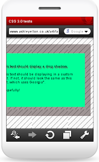
Technically this is how it should display. I chose to render the green box as about 25% width of the screen, and 100% height. Unfortunately, no font-face, no rounded boxes, no transparency and no shadow. Worst of the test subjects.

OPERA MINI:


Transparency, drop shadow - check. Rounded corners and font-face no, so an average but mainly poor render. Furthermore, like Nokia it doesn't alter the typeface to Georgia, apparently only having in house fonts.

-------------

Overall, I've learned from this that CSS3 support is iffy, and therefore cannot be relied on. Should I be a sole iPhone designer, a viable market admittedly, I could proceed in utilising the modern tags, yet as with the desktop browsers, it seems like its going to be a cross-browser nightmare to get consistency.

@

Friday, 22 January 2010

Client - background image


After meeting and deciding upon the modern white-space design, the next consideration was to give the site a complimentary background image.


The main cause for this was the white-space was too over powering and thereby made it a little too bland.

After a brainstorming session, it was decided that something natural, be it through the content, or its colouring, would perhaps work well.

--

The following were backgrounds we subsequently tried out:


The client and I shared the opinion that the first one, with the fresh green leaves proves a nice backdrop. Furthermore, a select colour, from one of the hues of green, could be picked out to become a highlight colour used within the main body of the design. It appears fresh, natural and has an alternative remedies, natural feel about it.


The autumnal coloured one appeared nice, it's colours being quite vibrant and rich, yet alongside the orange, it proved a little too much and didn't quite fit with the core content.


The last one creates a holiday feel and the colours tie together well - the white of the wave with the transparency layer, the blue contrasting with the orange, the sand complimenting the nude colouring of the pictures. The foot prints are viewable when the white layer is given a transparency effect, however they aren't otherwise that noticeable.

--

To implement the fullscreen backdrop, which currently proves evasive through HTML and CSS, I intend to use some Javascript. The site demo-ing this and offering the solution is Supersized.
It is clear to see the effect a full screen image can have in the browser. It stands out superbly.

One of the beneficial features of Supersized is the ability to slideshow the background images, however, I realise this could prove more distracting, so for now we're just going with the green leaves, static.

@

SPP3 - employment - web designer #2

Another job opportunities courtesy of the DirectGov site proves even more enticing: Web designer in Enderby, Leicester.


Wage

£20,000 - £24,000 PER ANNUM

Hours

40 PER WEEK, MONDAY TO FRIDAY, DAYS

Location

ENDERBY, LEICESTER, LEICS LE19

Duration

Permanent

Date posted

13 January 2010

Closing date

09 February 2010


This vacancy is being advertised on behalf of Big fish Recruitment who is operating as an employment agency. This role requires an individual with a strong online web background. You will be working for this innovative business and be involved in concepts for all new web initiatives. You must have a strong online portfolio & have a natural flair for design and creativity with a good understanding of colour theory. It is important that you have worked within a commercial environment and have a high level of Adobe Photoshop and Illustrator proficiency as well as experience of Flash and HTML. Previous experience of project management from conception to completion is required as well as excellent time management skills. .

How to apply

You can apply for this job by sending a CV/written application to Cerys Heath at Big Fish Recruitment, cerysh.63652.776@bigfishrecruitment.aplitrak.com.

Employer

Big Fish Recruitment


---


Advantages:

  • Great renumeration package £20-24K
  • Could commute from family home as it is within the East Midlands
  • Full time position
  • Requirements: Photoshop, Illustrator, HTML and Flash, I can fully comply with, these being the areas of focus I personally thrive in
  • Time, management and efficiency are core skills I obtain, which are requirements for this position
Disadvantages:
  • ?? ... Perhaps being a graduate, it could be deemed that I don't have enough commercial experience, but obviously you have to get a job in the first place to gain more of this! I have worked for several clients though, this involving working in a commercial environment
@

SPP3 - employment - web designer

After a search on the DirectGov site, I was surprised to find some reasonable offers out there. Optimum Websites are looking for a web designer.


Advantages:

  • Requires skills that I have experience in - HTML, PHP, Flash
  • The flexible nature of the role would make for a more independently driven working pattern
  • Opportunity to work from home
  • Wage is reasonable at £10 ph
  • Could commute from my family home
  • I could bring fresh ideas to the company, with modern design skills etc, confirmed by some of the designs in their portfolio


Disadvantages:
  • At 10-15 hours a week, it wouldn't be enough for a salary - £7800 (including tax)
  • My experience with PHP has been brief, so could find myself feeling a little incompetent. However, I am willing to invest and learn
@

Monday, 18 January 2010

PRP - artifact #1 - Android mobile browser results

Following on, Android v2.0 results have been collected. I decided not to operate using the latest version (v 2.1) as this is not yet available in UK and is reported to only fix bugs of the 2.0 version that I used.

I was pleasantly surprised with the results. They prove Google's open source OS to be proficient in tackling desktop sites on a mobile screen.


Firstly, the site's homepage is rendered correctly, with the header links all fitting in the top bar. SUCCESS The H1 tag is displayed in Italics SUCCESS yet has an alternate line break to that I originally produced. Checking in the Settings, if I untick 'Auto-fit pages' the site, and it's line breaks, are just as on the desktop. HALF-SUCCESS as people are unlikely to venture in the Settings unless interested.

The body text is not legible at all, even after squinting on the original zoom level. FAIL The H1 is more readable, but again, it would take concentration and focus to do so, made worse by the fact that it is in Italics. A double click on your chosen paragraph of text and the browser zooms in making it an acceptable size for reading, but again, could benefit from being larger - another setting available for the user, but will likely go unused for the majority and perhaps best as it means line breaks occur more and overlay text making for a more confusing presentation:


The hyperlinks on the inner pages stand out sufficiently on the Android render. Notably on the default zoom level, medium, the edges of the three column layouts are clipped.

I was very impressed with the Lightbox reproduction.


The transparency layer is very good, the pictures of a nice quality and also size.

--

In all, a more than satisfactory rendering of the desktop site. I expected text sizing to be an issue and it indeed was. I have never tried Android before, but this has proved encouraging as a mobile platform.

PRP - artifact #1 - Opera Mini browser results

Using a mixture of the online emulator and an actual phone with the browser, I have collected results from Opera Mini 5. Being one of the largest browsers in use worldwide, I had great hopes. My own phone uses this browser and I have always found it a reasonable enough effort.

Unfortunately, Opera which attempts to take the key features of a site and intelligently present these components in a mobile friendly, less data intensive form, failed to fully render the test site... just as I had hoped for.


The homepage is as is on the desktop version, SUCCESS, however, as can be seen, everything is vastly reduced in size - one of the necessities I guess when converting a landscape desktop design to a vastly reduced portrait mobile screen.

Text on this page is not legible at the original viewing level without zoom. When you do zoom, the H1 tag lacks the italic effect. FAIL


Whereas iPhone's Safari managed to fit all the gallery photos on their respective lines, Opera Mini wraps the images across multiple lines. FAIL


Furthermore, Opera Mini is unable to successfully reproduce Lightbox properly - the black overlay is there, yet the page becomes haphazardly disjointed, and the image doesn't expand. FAIL


Accessing the site in Mobile View (non default setting) presents the site in a more typical WAP form - it has taken all the site components and removed the layout and styling. As you might expect from this stripped back setting, Lightbox doesn't function. In all, at least you can see the content in it's entirety, but obviously not styled, which is what my research attempts to succeed at.


@

PRP - Mobile web emulators

Found this great article that lists quite a plethora of mobile devices, and their relevant emulators. This means that I theoretically can test for a greater spread of devices rather than those I am able to obtain through friends, family etc.


http://mobiforge.com/emulators/page/mobile-emulators

Notable entries include the Opera Mini browser which has quite a wide audience. I am also just downloading the Android OS to see how it functions there. Notably, some of the SDKs are not MAC compatible, so I'll try the others when on my PC.

@

SPP3 - postgraduate course - Loughborough Uni

I found this course courtesy of Sarah's tip for hotcourses.com.

Ever since leaving school I have wondered whether I should have just gone straight forward and got a job. After all, there's nothing wrong with working your way up the ladder. The same again has applied throughout University, on graduation I presumed I would head straight out and look for employment.

However, after finding this course, it does make the premise of an Masters quite appealing.


The advantages:
  • Loughborough is about 20 minutes from home so I would be able to commute even easier than in my current situation which involves commuting to Nottingham for Uni
  • The price of a Masters has often been made out to be much much higher than an Undergraduate course. I was therefore surprised to learn that the one year of taught is £3500. Notably you have to find this money yourself, as Student Loans Company

  • don't cover Postgrad.
  • Full time actually means full time on a Masters course. Part of the problem with the current course in the first two years was that it didn't seem consuming enough. With full days, this Masters course would likely have me on the ball continually.
  • I would be learning valuable information that will complement the skills I have gained through my undergraduate degree study. Key examples include Java, legalities of IT and digital networks.
The downsides:
  • Would be adding to my student debt with no guarantee of a better job position simply because I have a Masters
  • May not be of much worth for the job I end up getting (admittedly though, the more knowledge the better)
  • Having to complete more research, projects
  • Delaying the commercial experience so often sought after by employers for web design/dev

Sunday, 17 January 2010

PRP - artifact #1 - desktop site created

Following my last post where I identified a few design trends that are modern, popular and used across the web, I have now formed the first artifact: a desktop website that will be accessed from a touch screen device.


I couldn't really think of what to make the site about, however as this isn't fundamentally important for this artifact I put together a portfolio type site about myself.

The main desktop design features included are:
  • A top navigation bar that I have used as a Quick Links bar
  • A three column layout to section the information
  • Large H1 text/typography
  • Styled hyperlinks, this time being indicated by the fashionable dotted underline
  • Hover effects which 'box' the links
  • Lightbox optimised gallery
  • A large footer
The next step after producing the site will be to monitor and analyse the desktop site on a mobile touch screen device. I will be seeking out legibility of text, scrolling, how noticeable hyperlinks are, and any issues they encountered, amongst other things.

I can already hypothesise what will disrupt the browsing experience through my research in the literary sources.

  • The inline textual hyperlinks, smaller in their nature, will be harder to notice and more difficult to activate.
  • The large H1 text will be the only text they can easily read and likely notice.
  • The three column layout will expand out of a portrait oriented device, meaning that horizontal scrolling will need to occur to find the information. This can be disorientating and mean content goes unseen.
  • The Lightbox gallery will not run on all devices due to it's coding foundation
  • The hover effects will be of no worth, as touch screen doesn't have a physical 'hover' interaction
  • The images will not have the clarity that is achievable on a larger screen, due to lower resolutions. They will likely also add to the download time due to their size.

  • In the meantime, should anyone want to have a look at the site, they can do so on this link: www.ashleyelton.co.uk/artifact1.

    I shall be back soon to post my results.

    @

    Client - website designs

    Originally, with the square orange block logo, I thought I could use it as a label, or expand the edge of the square out and use it as a total header box.

    I have put these ideas into effect with Photoshop.


    This first one uses a green backing to provide a contrast with the logo, which (I think) plays nicely on the eye, whilst the size of it, being large, is a design trend for 2010 I really like. I added the transparent foot as a larger indication of the nature of the site.

    The colours used below are very much naturally based, such as beiges, mustard seed yellow and also khaki greens (not visible) etc.

    Of all the designs, I think this one would most tie in with Body Shop type shoppers. The target market for the company is basically 20+, which becomes quite a difficult market to design for, due to the sheer scope of what a younger woman of 22 would find engaging in a site, compared with someone in their 50s.

    --

    The second design reminds me greatly of a letter head, a modern one nonetheless.


    I took the square and stretched it's burnt orange gradient across the width of the page. The navigation on top is another modern look, which lists several pages of the site, in the name of hopefully holding some information of interest to visitors rather than just a few lead headings.

    The post it note limits the impact of the diagonal header, but I wanted to emphasise the personal side to the business, hence the note with handwritten scribbles.

    I am not totally convinced on this design, it reminds me a little too much of Easyjet with the excessive orange. Furthermore, orange, I am finding, is a somewhat difficult colour to have complimentary colours alongside for my colour palette. Green contrasts, but isn't quite right. Royal blue, the opposite of orange in the colour spectrum, doesn't suit as a colour in regard to the nature of the business. The option suggested was to pursue autumnal colours i.e. reds, oranges and yellows. This I feel could be a route forward.

    --


    This is the latest design I've put together and as can be seen, includes lots of white space. It will definitely need a background image surrounding it, to add interest to the page. Too much white can make for a bland, uninteresting design.

    Also, I still need to nail colours that suit the orange used in the logo. Here orange and grey have been used, which although nice, do not provide enough variety. It needs a final colour. I'm wondering whether neon light blue would do?

    --

    Overall, these designs have definitely given me fruit for thought. We'll see which route the client would like to take tomorrow!!

    @

    Client - Logo #5

    A request came in from my client to try an offshoot design. The request was simple - the company name within a foot. Initially I was a little wary of this, after conducting market research it was quite a common logo and the majority of the time, wasn't done that well.
    This first one used a handwritten typeface to try and put over a personal, non corporate look. Sue really liked the orange, so I kept this. My only doubt is whether 'by Sue' needs to be made larger and more legible/noticeable.

    The latest draft now uses Trashand, it has a quirky look, informal and I like the subtle gradient, which in some respects does make it look like it's been written on the sole of the foot with a tippex pen.
    I realised that using this logo would alter the possibilities in the web design. A minimalist, modern design springs to mind, and so I shall put this logo into effect, to see it in action now.

    I'll post Photoshop mock ups of these designs next.

    @