I thought a good start was to be imaginative with footprints. This then evolved to a fingerprint font I have called Fingerprints Inside.
Again, I opted for off-green colours which help form the natural feel sought after and in general, appear quite fresh. The leaf item I used to try and add some interest to the background.
However, the fingerprints I find not to work as well as I would have hoped. The several layers of various colours and gradients make for a slightly uncomfortable look too, so I continued developing.
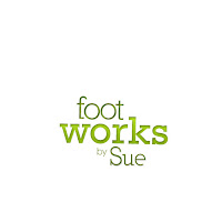
I went back to basics and actually like the simplicity of the interim design:
As mentioned before, Rockwell is a popular typeface online for contemporary design. As a result, I tried to work a combination of Rockwell type fonts. This design could always prove a good fallback should nothing work for the client whatsoever.
Taking it on, I decided to try and continue natural by adding an alternate leaf. Over this I then added quite eye catching, fresh colours.
OK, the leaf has nothing to do with feet, but it gives a flowing delicacy to the logo and the gradient is bright and nicely sets up the true green found in 'works'. Plus, the Body Shop features nature as a good visual metaphor, so I don't see why the leaf should be completely ruled out.
--
I may try and develop this type of design further, pushing oncemore at a foot image, which should help build a better understanding for a viewer. In the meantime, I'm meeting with Sue next week where we can discuss the site design more.
@


No comments:
Post a Comment