Thursday, 30 April 2009

Mining - Interactive Ideas

As the younger generation is being considered for the mining website, it is important to try and appeal to their level. We translated this to mean interactive pieces/games rather than having lines and lines of text that they won't attempt to understand or believe useful.

Below are the examples we came up with:


1. Mining depth gauge - 


The user is allowed to set the depth to which the pully goes into the ground. After choosing a depth, an animation plays of the wheel moving and the pully going down into the ground.

 Example inputs would include:

§  15cm – which returns a worm on the end of the line

§  1.5m – a skeleton

§  10m – clay

§  Xm – coal


 2. Interactive map on the history of coal


A swirly “map” represents the timeline of coal. Along this line are several intervals which are interactive. On hovering over with the mouse, the user is presented with extra information. An input is required so to allow the maze to progress with colour, or information. An example input would be to water the seed which turns into the tree that will die, decompose and eventually end up as coal.


 3.    Cogs puzzle


 The user is presented with various pieces of machinery, i.e. cogs. They are required to put the parts together. On achieving this, they push a button and the cogs become animated, then playing a video related to Bestwood or coal mining process.


 4.       Equip the miner


Using a click and drag setup, the user can pick from several “correct” but also “incorrect “ items to dress up the miner with. On sending him down the mine, an animation plays and if any incorrect items have been chosen, it will show the resulting trouble. Example items would include, a helmet with lamp for correct, whilst flip-flops would be incorrect.


5.       Charcoal rubbing


The user has to pick from a selection of rocks/utensils and then rub it against a palette. This will reveal images/messages that they have to decipher. Questions will follow to check whether they have understood the information.

@

Robinsons 'Be Natural'


This has never been done before and so it's uniqueness becomes one of it's strengths. The switching of human life with a bird proves humorous and interesting.

@

Mining - Catering for younger tastes

Bearing in mind that the younger generation are being targeted as a key market to encourage through the Bestwood website, games/interaction is imporant to get right.

The pieces will have to have an information/educational background to them and the mining theme fortunately offers a few ideas.

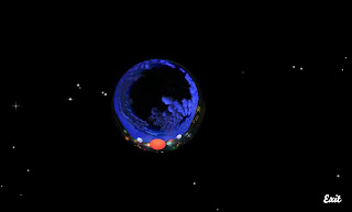
I located this website which was touted as being good for informational interactivity.


The site achieves a kid-friendly status by using bright colours, setting the content against a starry night sky adding a mystical quality, furthemore it presents it's information in the form of a TV. This sets it in on the right track to being of interest to youngsters.

The site is easily navigated through four large button found on the right hand side of the page. The sections are easy to understand too, notable entries being downloads and video.

The downloads section I think it a good example of what youngsters will expect online nowadays. The content is reasonably simplistic to implement too, wallpapers, audio samples being noticeable. These still have an educational imprint so it constantly serve the site's point.


The video section again uses the starry night sky to act as a perfect backdrop to house the video. It is easily legible, and maintains the space theme. However, it mentions at the start that the video is best viewed at the space-dome and this small size video serves as a teaser/advertisement that will encourage users to want to visit the site.


I think this site succeeds through being familiar in it's presentation - the TV is easily recognisable. The content is brief and not surplus to requirements, navigated through four main buttons. The content itself recognises modern day trends of downloading music, along with offering a teaser of a sample exhibition on display at the venue. This will definitely encourage users to want to visit and experience the real thing.

These are a few important things that should be beared in mind when developing our interactive pieces. Using this example, we can learn from experience.

@

Wednesday, 29 April 2009

Black and white as it's best


Rob Mckeown a UK photographer achieved second place with this Snowy Sheep shot for black and white nature shots. 

I think the scene is brilliantly represented with just the two colours (or three - grey). The white depletes the shot of any warmth, a great reinforcement of the weather in the scene.

@

Mobile banking


I'd heard about the G1 Android app that allows users to snap a picture of say, a DVD in HMV, which then calls up the product details using a 3G connection to the Cloud and lists the cheapest prices and at which retailers.


Now however, courtesy of this article on Gizmodo, http://gizmodo.com/5231716/did-you-ever-think-you-could-deposit-checks-using-your-phone-neither-did-i it seems we can take a picture of a cheque, send it off to your bank presumably via MMS or WiFi and it'll be checked etc, before being added to your bank account. 

I certainly know this would make my life easier, but the mind boggles as to what else is achievable. 

-Take a picture which is then added to a Google Map based on your location in the world? Done. 
-Hear a song you like but don't know what it is. Find out by playing said song to an app? Done.

What next? Take a picture of the sky and it will detail weather forecasts for the next few days?

@

Mining - first "client" meeting

When tackling a client project, one of the fundamentals is creating/maintaing sound connections with your contact. 

After being told not to go directly to the council, but instead Deborah Tuck, yesterday we had our first brief meeting.

To begin fully with designs/direction a brief brief was provided and the main problem highlighted was trying to attract younger people to the mining site. Deb hinted at interactive pieces/games. However, the most fundamental point is that the Council are not aware that we are making this tender, so when it is presented, it will be as an unofficial suggestion. Whilst this frees us from strict guidelines and signing off procedures within the Council, permitting a chance for creativity, on the contrary, it can prove too open and therefore could develop into something that is totally away from what would be sought. 

Straight away, this meant one thing. The concept of using a tradition/aged newspaper look would be out of the window in light of the suggestion of appealing to youngsters. They appreciate fresh looks, modern design. Nothing that appears too boring or dull.

Foruntately, as we each are producing two designs, I had completed the newspaper one, but then transitioned to making a nice, modern (large background!) looking one. 


The typeface here is really effective. Named Carnvalee Freakshow it adopts a solid black look, using nice curvature to stop it from appearing too blocky. I like the flicks, for example on the bottom of the stem of the F, it gives it a more detailed look. The font works well in the grand scheme of things, being highly legible courtesy of it's strong black body. 


Either way, I believe the second to the be the better of the designs, as it looks distinct, uses key colour elements and would be easier in terms of copyright etc, when considering photographic images and typefaces. See Kirsty's blog for her verdict of this design. (We are analysing, evaluating each other's designs to offer a more critical point of view.)

I purposefully included a footer with a lot of information, and will increase this when the pages become more apparent. This is a technique that is being promoted at Webdesignerwall. Rather than incorporating a full site map, an expanded footer with the links there is used widely now as on scrolling to the bottom of the page, the user will hopefully spot another page and be encouraged to view that, rather than exit.

Next up, idea generation is required for the interactive pieces. 

@

Monday, 27 April 2009

Impressive mouses

Courtesy of engadget and co.

Mining - design site analysis #2


I picked this site as it has good and bad points which should be acknowledged.


Firstly, the site goes with a direct theme, and sticks to it. The large flowery handdrawn illustration proves a strong eye-catching focal point. It's use of colour - pinks, yellows, green all contend for your attention. However, to a large extent, the flowery illustrations prove distracting, and jarr with the main content. Your eye finds that it cannot rest.

It is the hand drawn illustrations that give this site it's character. My favourite bit is the dynamic date display, which is represented in a pencil like typeface. This look is often referenced throughout the site, for instance in the title, headings and link borders.

The pastel colours here are nice, in fact you probably could list at least 6 colours on the page. Whilst this makes for a vibrant site, it also makes it jumbled and too much.


Interestingly, I couldn't ascertain straight away where the staple navigation options were. On scrolling to the bottom of the page, I found a list that resembled what I expected. 


Going back up the page, the links are presented in a vertical list but in the middle of the page. This is unsual and like me, could hinder a user's understanding of the site.

The site breaks down it's information in different manners. The most successful I feel is the video options on the Media page. Surrounded with a light blue wavy border, it appears aesthetically pleasing and rests OK on the eye.


Compare this to the right hand article links, which uses a combination of orange or pink crayon borders. This creates quite a childish look and the conflicting colours make for a confusing appearance. 

Information on the whole is positioned in varying places and so seems to appear a little disarrayed. A good website succeeds through letting the user access information quickly and in the most stress-free, uncomplicated manner. This site challenges somewhat.

If I were to alter the Tennessee site, it would be to go for a simpler colour palette, along with toning down the strength of the large background image. Furthermore, I would adopt a unified layout with more whitespace so that on clicking through the pages, information in it's location, is easy to distinguish. The best bit of the site however is the hand-drawn pencil typography and this I would make this the defining feature.


@

Saturday, 25 April 2009

Mining - site design analysis #1


I saw this site some time earlier in the year and when thinking of a theme for the mining site design, this one struck me as being a plausible, profitable venture.


Using an inverted white on black look, it proves quite striking when most websites nowadays adopt for a white background. Instantly, courtesy of the typeface and the type of image used, it is notably a reference to an American newspaper from the last century. In particular, the theme is helped along by the illustration with it's dollar bill like look. 

I even like the small addition of a subheading that has ornate lines on either side. It is tiny finessing features like this that help build the overall authenticity of a piece. 


Further in the page, there is a bit of a contrast. Some images are in black and white and seem in keeping with the design. However, some blog posts have full colour images and whilst these certainly stand out, they seem off-key with the design theme.

Interestingly, further down the page, a three column structure is used. This is one of many design trends for 2009 that I have spotted around the site. It helps distinguish information in a manageable form to the user. It is something I suggest using for our site too, as information will presumably be in abundance and so will need an orderly form to aid the reader's consumption of the site.


Here, I like the numbered bullets on the site. Again, this sort of idea will already be familiar to internet shoppers as most sites, such as Amazon, Play, iTunes have rankings in terms of popularity/sales. Furthermore, it is another neat way of sectioning information that may be of interest to the user.

It is also here that I spotted another of the design trends - ribbons that curve round from the back of the box.

One design point that is different but I think works somewhat is their sectioning of information. Whereas a popular technique currently is to have div boxes with borders so you can see where the information starts and where the information ends. Here however, they have gone for whole page horizontal sectioning, using dividers along with a sophisticated gradient effect which helps distinguish where a section begins and ends.


Notably here however, it does seem that the page lacks some colour or something to draw your attention. This makes it clear that it isn't the easiest to get a balance between keeping with the theme - all black and white photos, or using something away from the colour palette - posing the risk of being too outlandish and sticking out in the wrong way.

Further down the page is a commendable idea, one that I have not actually encountered before: a repeated navigation bar. It seems a sensible, intelligent design choice and one I had not considered before, instead preferring to fill the footer with a shortened site map.


It will already be familiar to the user after having seen it atop the page and therefore should encourage them on getting to the bottom of the information on the page to then click and go elsewhere in the site, rather than having to scroll back up or worst, leave.

There are downsides that I critique this site with however.

In short, it isn't very consistent in it's navigation/layout. Links can appear where you wouldn't expect them, presented in a different form. Furthermore, random pages can be navigated to which don't bear the trademarks set out in the previous staple pages, i.e. where is the main navigation bar to click?


This made me as a user confused, and it did dent the overall perception of the site. I believe poor website structure to be one of the reasons a site can fail. Being a fan of visual design, for me it can be made up, but still, most people want the information and then they want out. Here, they could spend some time having to find it... or more likely, won't.

In all, I drew most from this site through the visual design. It crafts a good look, being striking through it's individualism. This sort of style could prove a winner for our mining museum site. However, it was also noteworthy that a random navigation proves irksome and leads to being a downfall and so this would need to be have close attention paid.

@

Friday, 24 April 2009

iPhone apps downloads 1BN, mobile web up

For my third year projects I had a brain storm and eventually decided to head to the future... namely, mobile web. However, being more specific, I decided to focus that further to iPhone web design. 


For my client project I was a little unsure of the profitability, i.e. should I be limiting myself just to iPhone. However, today, courtesy of an article in the NY Times, another on ITPortal and a blog entry on BBC News Technology, I discovered that iPhones apps sales are up, in addition to stats that of all the mobile web users, the iPhone dominates. 


"The results, from a January survey of more than 10,000 adults, are somewhat dramatic. 84.8 percent of iPhone users report accessing news and information from the hand-held device." (NY Times)

Importantly however, it should be noted that "the iPhone represents only 2 percent of the mobile phones in the UK." (ITPortal) Nonetheless, this still amounts to over a million (ComputerWeekly). That's a substantial audience.

---

For my research it was advised that accessibility has been done enough and therefore, perhaps I should consider mobile web or mobile media as a whole, for research. Interestingly, that could be interpreted to include appls, cloud computing (Google Android), games and the like. I think it definitely holds potential.


@

Mining - museum website analysis #2


This site goes in a different direction than other museums as it is less serious, but incorporates very nice motion effects. Whereas before, the use of a large, eye catching colour image on the homepage proved to be a key component in the NCM Museum site's success, Heineken have taken it one step further. Not only is their image the central piece of the website, taking up about 75% of the page, but it is also a motion piece, using a slow zoom effect. Just this tiny addition makes glancing at the site more inducing. It has a quality which provides a sense of ease, this probably being due to the slow zoom being fluid, and calm.

 ->  

Furthermore, the colour branding is substantive and undeniable. Green here, is very noticeable as being Heineken's colour. Furthermore, the recognisable Heineken font is used around the site. This too helps aid the characteristics of the brand, which have already been successfully been built up in the packaging of the product and their TV/print based adverts.

Where the site succeeds is that the slow zoom motion pieces are repeated on every page of the site. I believe that to find one that isn't moving, makes it seem uncomplete, as is evident on this page which is under construction. 


As a user, once you have been introduced to a familiar effect on page 1, 2 and 3, on page 4, you are expectant of it. When it doesn't come, it does challenge the feeling of overall polish to the site. 

Some pages however have content that bears more importance, or cannot be conveyed as well using a moving image, for example the News page. Here, however, a smaller banner still lines the page. Admittedly they have attempted to appease the expectation of the repeated effect as I mention above, however it does feel a little too small an effort. 


Layout would help repair this. Had they had adopted a left column for a banner then a right column for content this would have allowed both motion piece, and information to display. 

I would have personally preferred the same large scale motion piece with the information presented below, however I am aware that this may challenge a user's perception of usability. When they click a button they expect to see it. To have to scroll down, even something as minor as that would add an essence of the site not being as refined as one expects. This therefore is a consideration we will have to consider when in the design phase for our mining site, as we want to make use of an eye catching motion piece too.

A downside that I can note about the site is that contact details are hidden away behind a tiny link found at the bottom of all the content. Admittedly, using a larger screen resolution means this isn't too much of a problem as everything displays on the page at one time, however, if I were visiting this site to find out how I can conatct them, I would expect this information in the top navigation bar, in the least. 


Notably, the menu bar used in Heineken is quite effective. It doesn't take up too much space, and is simple and straight forward in it's titling, i.e. 'tickets' you naturally expect to allow you to book some, or find out prices and so it does. This bodes well for users who expect to find the information they seek in quickest manner. It doesn't offer any opportunity to confuse, especially as using a top header nav bar is a widely distributed method everywhere online.

I hate to be a bore but using Flash raises the dilemma of not being accessible to everyone. For the tiny majority who don't have the plug-in installed, they shan't be able to experience all of the Heineken. This is admittedly the user's own loss but when creating a museum website it is important to make it as accessible as much to the general public in their entirety. Importantly however, a Flash banner won't hinder the site too much as the textual information, prices or opening times for example are still viewable. This is an important note for our own design considerations as a council led project will require usability and accessibility.

Lastly, one area that Heineken step out of the box is a quirky user interaction section. Titled 'helloooo' they have a secret video footage from two intruders sneeking into their factory. The user is required to watch the piece and act like detectives, sending off information to Heineken reporting on their discoveries. I like this. It has an exciting quality to it, surely making the user feel included by having them conduct the investigation. Furthermore, from a business perspective, it acts as a great promotional tool for the new exhibitions that were unveiled in the 'secret' footage. 


This sort of applet would be great for our own site, perhaps aimed at children, so to appease their conception of a museum website. Mystery/investigation holds great intrigue, particularly for myself, so ideas are already formulating.

In all, from the analysis conducted on the Heineken Experience website, I found that motion pieces, subtle in their delivery, add an extra element that works well for websites. It takes itto the next stage over just using eye catching images. However, with using the motion piece incurs dilemmas over true accessibility particulary when considering our project. Furthermore, consistency is once more an issue when establishing the overall finesse of a site. Lastly, quick simple navigation links are important, however, make sure the information is easily viewable is of greater importance for websites, as discovered for the 'contact' section for this site.

@

Thursday, 23 April 2009

Mining - museum website analysis #1

National Coal Mining Museum


This site proved better than I expected. Most smaller type museums have inferior designs, or are just out of date. 

Immediately the site attracts the user by having a large colour image in the center of the page to draw attention. Colour is important here too as the green, purple, blue and red although not neon in their hue still prove strong components on the page. The detail of using a roof effect atop the image/below the coloured menu links provides more visual interest, it catches the eye just that little bit more.

The sections on the front page also are quite important in maintaining the visitors attention. News/Events shows what is happening at the moment, being relavent to the user and showing the site isn't out of date. This is a good thing, as an untouched/unupdated site casts a bad shadow over the actual physical business. It definitely has an offputting feeling about when considering the service/company and how they are presenting themselves.

I really like how they have included a virtual tour applet... or at least initially I did. On clicking through to the relevant section, it brings up a map with various information dotted around. 


Reference-wise, it does seem very much like a themepark map, and for youngsters, this could prove valuable as it will hopefully positively influence their perception somewhat of a museum visit. 

As I said, the premise seemed great, but the implementation leaves something to be desired. Clicking on some of the marked dots simply brings up a new window with a green box and information:


Others bring up a window which loads interactive 3D revolving footage, where the user is allowed to pan left and right around the room. 


The problem with it's implementation here is that they haven't really featured anything of interest. One room I clicked on appeared to be like a locker room and had handwritten notes around the walls, yet these were too small to even be able to read. The technology was a little over eager too and moved far too quickly. Notably however, the site does comment that this will be undergoing development.


I like how the site is coloured thematically for each section. Clicking on the green link from the homepage for the Visitor Zone launches that section with the green continued in the visual, also located in the same place.

One downside I do have to note however is that the menu on the left hand side, although initially detailed, on clicking, becomes even more so again using the colours for sectional links. However, these go unnoticed in light of the large images and geography of the navigation bar. The main content has you looking at the center, not the side, and so could be missed, initally. 


If I were to make any changes to this site I would perhaps pay attention to their logo. Indeed, it isn't bad at all, yet, when looking at the colours used for the site, the logo does seem as if it came before and wasn't altered. The header bar with phone number and opening times nicely compliments the logo, sharing the same scheme. However, in comparison to the rest of the site, it could be made to tie in even more. Consistency, even in the most minute detail such as using a slightly different hue of green in the main content and the logo proves irksome to me as a designer. Naturally, most people won't ever notice this, but I believe in consistency, it aids an overall feel of quality design work.

One thing that is also noticeable with most museum type websites is that typefaces have to be quite straightforward and legible. These sites cater for a broad demograph so naturally need to be usable, and accessible. This facet of information does make the freedom of design seem somewhat restricted. Hopefully it will be manageable to achieve a compromise - both nice in terms of design, but also highly legible.

In all, I think this National Coal Mining museum site goes some way in achieving what is possible. The strong colours which form themes on the homepage are a clever design decision, drawing the eye and providing some form of subconcious awareness of location within the site. 

I have learnt that consistency aids the overall perception of a site's quality, in addition to making things visible/noticeable being important. Information is presented in manageable chunks, and the most important information, such as opening times and contact numbers are ever present on the header, consistently available for the user to easily find.

@

Mining - mood board

Today saw our first meeting and it went well.

First up we decided it would be worthwhile to create an image board based around the mining theme. It actually proved a little tougher than expected, as once you've listed coal, a pick and shovel and a miner, there isn't much more to coal mining. But we persevered and created the following mood board.


An initial idea that has come from this is a Victorian themed newspaper look. The newspaper sample in particular provided a three page column look which is a design trend for 2009. Furthermore, we really liked the potential of the large iconic wheel which could be interpreted as a motion piece in Flash and have a pully lift as a vertical banner etc.
Next up we're doing market research of other museum type sites, then other sites we like analysing their visual designs, in addition to sourcing suitable typefaces in terms of commercial use etc. From this we are then making potential designs.
@