For SPP1, we were been asked to take a picture that screams colour and light.Having a look through my wallpapers that I've collected from the internet over time, these pictures screamed colour and light, well to me anyway.


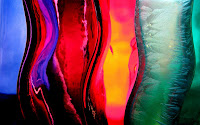
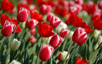 All these pictures were posted online by users who wished to share the images they'd captured, more particularly, putting them forward as highly aesthetic and suitable desktop wallpapers. Of particular note is that all these images are formed by nature: grass, leaves, tulips. I really like these photos due to the strong hues, and there tends to be one predominant colour in each respective photo. The grass has different variations of the green due to the brightness of the light differing in response to the thickness of the grass stem. The autumnal leaves feature strong colours too, red, orange, and green, but obviously it is the strength of the bright red which catches your eye in this picture, almost a fiery feel to it. Lastly the red tulips I believe make up a strong colour and light photo due to the volume of tulip heads, each of which are tipped with white. Again, the red provides the vibrancy, contrasting against the softer green and tips of white.If I were to chose from the three which I believe fits the 'colour and light' title the most, I believe it would be the grass. It is definitely colourful, albeit that there is just one colour, the sheer quality of the green, how it changes in saturation around the photo, and then coupled with the light surrounding and even sort of permeating through the stems, it makes an altogether vibrant picture. To find such a photo that can I could take myself, I am met with one problem. We are currently in Winter, in England, and therefore the chances of finding something colourful and light is going to be quite hard, nature wise. Nonetheless, graffiti, electric lights of all colours, or even different coloured liquids lined up with a spot light behind, would be worthy candidiates of colour and light (inspiration from my wallpaper collections, again!)
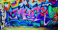
 Next up, I've decided to comment on Sarah's blog in regards to her choice of a colour and light image.
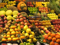 "I think this is a blatant display of colour. There are the bright yellows, oranges, reds and then even some greens in there giving this a dramatic and quite punchy feel. Also, the way in which the fruit has been arranged means that we get blocks of colour, and this distinction between colours provides a contrast, drawing the eye. It has almost a mosaic quality to it.
You are right too, Sarah. The way that the actual content of the image expands further than the edges of the photo, impacts on our overall impression of all the colour. From wall to wall, it is non-stop colour.
You could say light is provided by the colour. If we were to have dull, dank objects it would draw the piece down and make it seem darker. On the contrary, this bright, colourful picture is vivid, bold and vibrant, featuring the warmer hues of the colour spectrum. The image, to me, has the feel of being sourced somewhere overshores, perhaps tropical... and sure enough, the photo was taken in Barcelona; a sunny, vibrant location.
When comparing to my own selections, all I will say is nature again, really does provide."
@


