Wednesday, 11 March 2009

Flash game update - 'Amazing Memory?'

Since my last post, I've made and implemented quite a few new features. I have found that development is manageable by doing it in reasonable stages: level designs, alpha transformation to 0, countdown clock, reveal option. 

Firstly, one of the key objectives I set out beforehand was to have levels that increased in difficulty. Henceforth, I have created 7 designs which I think will cater for a decent amount of gameplay. I did discard some other designs as I felt them a little too repetitive. However, luckily I noticed that by altering the start and end positions will make for variety within the game, sometimes you'll be heading clockwise, sometimes anti-clockwise, sometimes north and so on.

I was cautious of making the first level in the least simple, so to ease the player in and encourage them to enjoy the game.


From then on, the gameplay becomes more difficult by adding in more complex routes, or little walls that will get in the way if not remember and eat up some time as the user tries to get around the obstacle.


Importantly, these are not how the designs will stay, visually. At the moment they provide a function. On completing all the additional code based tasks, I will return to the designs and update them. I am considering themes, such as an Aztec look, or Roman, along with Egyptian or Japanese. 

The unique selling point of the game relies upon the fact that the user must remember the route/maze as it disappears within a set period of time. I moved onto installing this event.

After having researched online, I learnt that it was possible to create fading tweens within the action script. However, it appeared long and quite laborious, so I decided to opt for a straight reduction in the alpha state - from 1, to 0. 


This is achieved only after a 'remember time' clock counts down. So I had to install this too.
Courtesy of David Downes' Flash examples, I was able to look up the code required for a countdown clock. 

I decided a suitable amount of time was 8 seconds, and so set the remembertimer variable to 8. However, I soon found on testing the movie that whilst the 'remember clock' counts down, the user is able to begin their route through the map. Hence, I had to remove the stage event that listens for key events whilst the remembertimer is active.

Here is the code that now is required to suitably allow the user to remember the maze, not play, but then be allowed to play when remembering is over: 

 
maze.alpha=1;

var remembertime=8;
// total time to countdown

var remembertimer:Timer = new Timer(1000, 0);
//(delay in milliseconds, number of repeats)

function remembertimerStart() {
   // start timer and starts timerHandler function when the act is completed
        remembertimer.addEventListener("timer", remembertimerHandler);
        remembertimer.start();
rememberclock.text=remembertime;
}

function remembertimerHandler(event:TimerEvent):void{
      remembertime=remembertime-1; // remove 1 second every 1000 milliseconds
      rememberclock.text=remembertime; 
 // when clock reaches 0 then it will stop the timer and the walls will become transparent
 // the keys will become usable
 // the clock will be reset ready for the next level
      if (remembertime==0) {  
 remembertimer.stop();
  rememberclock.text="";
 maze.alpha=0;
 stage.addEventListener(KeyboardEvent.KEY_DOWN,detecthit1);
 leveltimerStart();
 }
}

As can be seen, this activates the next timer, the leveltimer, which is the total time allowed to hunt round the maze. It was necessary to use rememberclock.text="" when it completes as I decided from a design point of view to have the clocks in the same position. Otherwise, I encountered the problem that the rememberclock read 0 and overlapped the levelclock which counts down.


Lastly, through playing the test versions myself, I became aware of how difficult the game can be when not paying full attention. This resulted in me allowing more generous time allowances per maze, upping it from 30, to 40, yet still this could prove difficult in the latter stages. I am wary of extreme difficulty, as it was sometime I found I disliked through my Flash game analysis.

To combat this, from an early stage I realised the option for a 'reveal' button would be helpful. I found the implementing of code easy enough... or so I thought. Harking back to my very first days using Flash, it was a case of setting up an event listener for when the reveal button is pushed:

revealBtn.addEventListener(MouseEvent.CLICK,revealtimerStart);
 

However, I received an error concerning the third countdown clock I have working in this game. It repeatedly sought a type of event. Having always been a little unclear on the purpose of myEventObject, or e:event, or event:MouseEvent  it was courtesy of a surgery session that allowed me to get it cleared up.

Now, the 'remember clock' counts down, the 'level clock' then is cued, and should the user need it, they can push reveal and the 'reveal clock' will be activated, which pauses the 'level clock' but then makes it continue after the alotted time. 


I am pleased so far with my progress. I have tried to steer away from quick fixes, and unlike my previous history with Flash, my coding is not too superfluous. The functions that set up and make the game run are all on the first frame. Thereafter, the following slides just require calling the rememberTimerStart () function, which begins the processes.


So far I have been fortunate in encountering little trouble in the development of my game. Nonetheless, advances can still be made. As I mentioned beforehand, the design needs enhancing, but then also, I would like to add in bonus points, which that in itself requires sorting out a points score system. I have tried a little but failed in my efforts. Lastly, if time feasible, I want to limit the amount of times reveal can be used. This will no doubt concern using a variable options setting up the amount. 

@


Saturday, 7 March 2009

Collaborative mindmapping online - internet app

Courtesy of BBC Click, I found out about this app for creatives: online mind mapping.

According to the reporter, it's intuitive, clutter free and great for collaboration as you can share the mind map online, or you could print it off, or export it as a PDF etc.


Should be good for group projects.
@

Girl Effect - a different kind of website

When I was first introduced to the FWA I plunged into the greatness that is Flash. The possibilities seem unlimited, if you want it to look like this, it can, if you want it to do this, it can.

However, with time, and perhaps influenced by a more HTML focus this year, I found Flash sites to sometimes be a little over the top. Is it really necessary to be swinging around 360' when all you want is to find out their phone number? Hence, CSS became my new favourite thing. Well actually, being more specific, large background websites using CSS.

I am surprised, therefore, that a site I've come across uses Flash but in a genre I'm starting to like, increasingly reminding me of postcards. The visual web really is the new postcard. Enter The Girl Effect.


Striking, bold and quite brash, the large black, domineering text instantly creates for the site a sense of character. By directly addressing the user and asking them to agree of disagree with it's opinion through the choice of two options you do feel directed involved. Straightaway, you can tell that this isn't really the sort of stuff you'd expect to receive on a postcard. - Another clever idea implemented by the creators.  


On choosing an answer, the postcard flips (a recurring visual technique) and then goes on to show a sort of advanced Powerpoint presentation. Each time you click a link, the flip reveals an image, briefly, of a real life girl, before then flipping again to the textual information. I think this is a clever technique - it brings you closer to reality, it puts a concrete image in your mind of the sorts of girls that the site, as a whole, informs and talks about.

Before getting access to the site, you are shown a slightly advanced form of a Powerpoint presentation. Using this medium on a website usually means I ditch it and go look at another site, however, the relatively charismatic but quaint background music, quite akin to what Apple sample in the background for all their TV adverts, made me stay tuned and give it a go.


There are no images* (OK, there is one repeated graphic) within the presentation, merely text. It is sharp and to the point, often with only a few words per slide. I liked this brevity, it provided a pace to the piece, which actually increased throughout the presentation, signalling momento and then a build up to the big, main event. At one stage I did start thinking that people who couldn't read very well would be lost, but the language being used was simple and regardless of how little it appeared on screen, I found myself keeping up and following. 

Normally informative pieces can be very dull and when there is a political/charitable purpose it can sometimes be quite encouraging to make you switch off. However, with the simple information flashing on and off the screen in good time, along with an informal register that tells the story, I found myself engaged. 


There are some nice motion graphic effects at play here - motion graphics being something that I too have an interest in, and so found myself approving of their techniques. Even the simple colour palette - black for anything none girl related, orange for the girl focused bits meant that you could tell a distinction between what it was highlighting as good and bad. 

I feel that they got it right in regards to their 'Powerpoint' on womens' right to education. The  size of the text varies throughout, however the large, domineeting words are clearly emphasising key information, and definitely increases the impact of what is being said. This, I found, was another clever design. Alongside the informal, simplistic language and quaint music in the background, it altogether tied in to make a successful informative piece. Even when the words were so large that they were being split in half, you accepted it and read it fluently, as it has been implemented right. 


Coming out of the presentation, the design is notably consistent. The postcards use the same typeface and form for their layout, in addition to their colourisation. I particuarly liked the large headings. They make it very simple to tell what the content is about. The content too is all quite short, sharp and to the point, being concise and clear. However, after the limited nature of the presentation's, certain points within the site feel a little information overloaded. Nonetheless, the white space consideration in regards to the page surrounding the postcard means you never feel too cramped. 


There is a simple three option navigation bar that looks like a bookmark, which is consistently located in the top left hand corner. Again, I praise their minimalism, and how they have neatly tied in their ingenius logo too. At first glance it's a recycling arrow, but then after going through the site, it becomes clear it is infact a 'g' for girl.


If I were to aim any criticism at the site I would probably question the lack of images or iconography within the site. Yes, there almost full screen images upon each click, but when you are viewing the postcards it does appear a little bland. Icons could address this. This is only a minor suggestion though, as I support this site for what it sets out to do and how it actually achieves it.

Yet again, I've found another form for a website that I could experiment with and develop. It even uses a Powerpoint type presentation which is informative and entertaining. I love web for how unlimited* it is. 

@

* Bearing in mind browser capabilities, the user's internet connection, whether they are using a screen reader, if the font is available on their operating system, what version of a plug in they have, or don't have... lol

Friday, 6 March 2009

Great graphics practitioners

Courtesy of a link from Jools on the NOW and Netdiver, I today found some excellent visual designers.

Sometimes when you come across someone good, you can instantly recognise it but don't fully tie in yourself with what they are or what they do. Two things that I personally like are colour, and substantive graphics/type that have a real presence on the "page".

The first artist I found emulates this very well: Joevw.


These thumbs are individual samples of what he's done. It pangs of colour and geometry. 

Of them all, I prefer this ribbon like one. The different layers, where sometimes it goes over another string, whilst then it can be underneath another ribbon makes for an interesting piece to look at. Furthermore, such work allows the mind to create images itself. The symmetry in his work is notable and I find it beneficial, it seems right to the eye and the mind - a sort of necessary semblance. OK, it is just a stream of intertwined lines, but you certainly take a good look at it.


Notably I found it humorous where he has added his own captions alongside certain works. This next image does have quite a spacey feel, with the gradients on the silver providing a metallic look, which is again referenced by the effect on the type. 


On first reading it you think, "what?", but then on second thought, it does somehow make sense. In the deep expanse of space, 'look me up some time' is quite a good one liner. Juxtaposed against the symmetrical alien figure though adds that oddness that can get works noticed.

---

Somewhat maintaining the geometric design theme, but also exploiting typography, Sicksystems makes creative works that are eye catching, being hugely stylish and contemporary. 


One personal favourite is this grey and light blue piece. Perhaps because I have ties logo-wise with such a colour palette, and loving Wii.


I like the contrasts found within the piece. The phat but curvy typeface in the background makes for a good constrast against the thin linear strokes. Colour is well used, with the grey gradients proving a good distinguisher against the black and then the neon light blue. It takes a good look to see what is being said initially, but its the indetermant combination that makes you pay attention at first. 

I like his use of iconography in this hellride logo. Again, it took a second to regist what the image below the text was, but then it pretty well symbols up the genre of the sport it represents, being semantic. 

This next slanted piece is really effective, in my opinion. It's angular nature adds a dynamacy that attracts the eye. Again, his semantic use of the laces in the image reminds me of myself and how I laterally design things.

It is a small feature, but Sicksystems slices half of a letter and then shifts the bottom bit across slightly, creating a jagged look. This is really easy to achieve but it adds a uniqueness to his work, perhaps being his signature design device

I never really considered wallet design as a viable medium, but really it is an area that is open and appeals to the fashion savvy. The use of the large 'CASH' inside is a really nice touch, again being quite semantic, but works humorously.


@

Wednesday, 4 March 2009

Social networking - designs

Taking in what I've researched, for the design stage I tried to implement what I have learnt.

I thought the majority of the social networking sites missed an opportunity in trying to reincarnate the visual designs of the actual consoles. Admittedly this might be to do with copyright and IP, but making something in the vein of that will familiarise the user, and maintain a strong visual standard.

Following a useful tutorial that I found a few weeks ago, I started trying a Wii look.


I particularly like the glow effect of the neon light blue to show which page you are on. Soft grey gradients are very popular nowadays, making for a quite a spacious feel. Plus, a design trend for 2009 is large type so I thought that the buttons although simplistic, work. Couple that with big easy to hit buttons, and it mimics the Wii well.

The next attempt was somewhat Xbox360 like, with nice web2.0 glossy buttons. However, compared to the other designs, this one felt limited. I couldn't picture a full layout, perhaps due to a lack of familiarity with the console. Furthermore, the green that I was trying to couple it with just didn't work in one package. 


It was the Playstation 3/Vista look that I really felt had potential. Knowing that the Wii design was too much of a rip off, I wished to incorporate the neon light blue which is a great colour for highlights/distinction etc. 


Again, the use of big buttons, perhaps amateurish to some, but I like it when you hover over and it changes quite a large slab of button to the hover display. The gradients here aren't horizontal which is what most do, instead using a combination of diagonal effects adds subtle highlights. 

This design could be described as quite dark and broody, which is somewhat associated with the image of more traditional gamers, but I find that the glass buttons and blue outlinedicons referencing gaming icons - space invader alien, Playstation control add a little more light hearted character.

Whilst experimenting in Photoshop I produced a really distinct off-shoot design. Using a LCD like dot font in the similar shade colour as the background, but then adding a gradient makes for an interesting look. I really wanted to try to develop the look, feeling it had potential, but I met with difficulty in transferring the dot font look elsewhere for the main content in the site. 


In all, I think the clear winner is the black PS3 one. I've not seen anything like that in my research for social networking sites, yes it is black and a bit typical look, but the added effects such as the glass buttons, the neon blue, and sophisticated gradients make it different, in my opinion. It looks stylised and this is why I favour it. Perhaps a little too much so, so that might need addressing shortly.

@

Monday, 2 March 2009

U2 logo


I'm surprised at how much I like the new logo. It's the most primitive it could be, reminding me constantly of the blocky text we got used to years ago on old mobile phones. 

But there is something in the blockiness, and bluntness that I think works well. It has an impact. It isn't light and non challenging. 

A great idea as an extension of the brand is when they teamed up with the BBC. The square logo we recognise for the BBC nows seem not right, a little too fancy, compared with the rigid structure of U2 that compliments a square housing.


Perhaps it's something to do with the neat symmetry that makes it appealing. It certainly couldn't be accused of being messy. Instead, it's regimented, strong. Interestingly, where the style has been tried and tested elsewhere, it's again been for music related genres. I particularly admire the 4Music spin on things, by putting it on a rotated axis and adding the third dimension. 


Definitely a look I may try to implement in the near future. 

@

Sunday, 1 March 2009

FWA - Nokia E71 online analysis

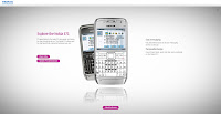
I commented a few months ago about an advert featuring fluid visuals, for the Nokia E71. This time, I found the Flash based online advertising


http://www.nokia.co.uk/e71

Firstly, I like the thinking for the navigation. As you would navigate on the phone using the joystiq, they have created a version here. I tend to think in this sort of way, for example, the restaurant website made recently. Literal thinking. Notably, they haven't hid a smaller menu with the options in a corner to appease user's more traditional expectations of navigation. Then again, the content and theme they have chosen perhaps wouldn't appease the more traditional web user anyway. 

I can see that there is a consistency with the visual branding - the animations flow on nicely, and the colourful nature of the advert is referenced again well. Even subtle hints are available straight away as the logo features a blend of colours. 


Rather than going for a 'the phone has this feature' this marketing seems to follow a more abstract way of thinking.

Clicking left on the phone joystick allows you to create user generated multimedia. User submitted media seems to be very popular nowadays. Everyone wants to put their stamp on something, represent themselves in some way.


As with the fluid animations in the TV advert, they are demonstrated here in abundance. Again, they capitalise on current trends by providing user generated content for the animations. I really like the graphics that appear on mouse_over for a particular section of the navigation. In particular, this colourful one is punchy, and vibrant. It goes nicely against the modern silvers that represent the actual phone. 


I do feel that they miss out what users may expect in regards to information about the phone. Previous experience with phone sites set up the expectation of being information/fact laden. However, as this site deals with  the abstract side of things, the hyperlink to the typical Nokia site seems somewhat redeemable. 


In all, the site is more of a visual feast, rather than informative marketing piece. Perhaps it's personal taste. The Web 2.0 reflection is a subtle touch, which I only really noticed when casting an analytical eye. Such a technique adds a sleekness and modernity, feeding the modern, contemporary feel of the overall visuals. Alongside this is the softly diffused grey and white background, again, something quite atypical with minimalist, modern efforts elsewhere online. 

If I were to choose, I still prefer the TV ad. It fits together and flows very well, and I seem to buy into that sort of abstract idea on the TV, whereas I found this user generated content qualititative indeed, but a little cliche now for web. The literal thinking for the navigation was a clever effect, which I believe almost all mobile phone users (so pretty much all people) will get and agree with.

@