It's always the case, you wait for one bus and along come two. The SPP1 task I blogged about before saw us finding a practitioner. I today sat down to analyse another website for the Identities module and got both.
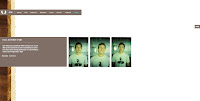
Matt Titone is the winner of the FWA today (Sun 20th April), and of the sites that I looked through, I fought that this is the nearest I've seen so far to a traditional website. However, it isn't that close to traditional when you look at it, really.
There are two navigation methods: the familiar point and click, which automatically you tend to choose, but then he has also included the option to navigate using keys. There is no exclusivity to the choice you make, you can swap between them at any point. Most computer users will be in tune with such a set up, for example, when writing a document, you flick between mouse and keyboard several times, so I think this is a worthwhile inclusion.
The menu options he uses are clear, it is easy to understand a distinction between print work, film work, interactive work.
The purpose of the site is to showcase his work, and as it is done by a graphic designer, as expected, it presents itself in a visually stylish way. The in colours nowadays are quite neutral, natural ones, so the browns looks quite suave. Also, when you want to look at the product he's created, most of the time it's a decent sized image - not a tiny thumbnail that requires you to squint. This is something I like, personally.
When navigating through the pieces of work he's made, your natural instinct is to click and wallah, on clicking, it swishes on to the next item, vertically. No need to scroll or follow a link (although the links are discreetly available). One suggestion that I could make, as noted before, is to let people know what to do, perhaps by a little note. You could just sit there and not see or know that there is more work.
The online portfolio, as a genre, is something reasonably simplistic. You put on what you've made, and just let people have a look. What is important though, is the overall presentation. It needs to be clear, and it needs to look good, as a respresentative of what you can make. Also, it needs to be easy to look around. Otherwise, the short attention span of web users will cast it aside if they can't click and see different thing, easily.
--
As a quick side, I looked at the coke zero game and haagen daaz site, liked how they loaded their site slightly differently. For coke zero, instead of counting up to 100%, they count down, which for some reason gives it a slightly different feel. I liked it when I saw it, but now, I can't decide which I prefer, counting up, or counting down?! People are used to waiting a little now for a site to load, they just have to endure it. But a slight variation adds a little interest, breaking up the monotony. Be it a little line of text or animation, as in the honeybees site, where they say "hang in there, the bees are worth it".
@


1 comment:
Hello. This post is likeable, and your blog is very interesting, congratulations :-). I will add in my blogroll =). If possible gives a last there on my blog, it is about the Fragmentadora de Papel, I hope you enjoy. The address is http://fragmentadora-de-papel.blogspot.com. A hug.
Post a Comment