Wednesday, 4 June 2008

A promo is a copy...right?

The copyright wars continue.

BBC News report that Universal Music Group are suing an E-bayer who was selling rare, specialist promo CDs. They deem this as an infringement of copyright.

Have a read to make up your own mind, but to me, I can see it from both angles - the record companies give out these CDs free to DJs etc. Is there that much harm for a devotee fan getting hold of unreleased material from their favourite bands?! But then again, the company didn't give the disc for you to use and there needs to be some discipline in business.

At the end of the day, I think this all leads back to money. People want the money they think they deserve. If I remember correctly, we read in the Bible that the love of money is the root of all evil. Hmmm...?!

@

Sunday, 1 June 2008

Introducing Apture

Lessig, the guy who writes about copyright, copyleft, copywrongs, also wrote on his blog about a useful application for blogging.


It is a really effective reference tool that makes your entries more enhanced, or more multi-media. You simply highlight a word and it provides all the links that you may possibly want your users to see for reference, enlightenment etc.

You can choose from wiki information, youtube and google video, flickr images, yahoo website searches, or even upload your own images, along with Word, Powerpoint and Excel files, PDFs. It really has great potential in this area.

There is a slight downside in that the info box that pops up to users is quite like those adverts that most of the time you click off before it can even load.

As you can see, jotted around this post I've used Apture to add reference points to show what it can do. It makes it so easy.

So, those interested can have a browse, download and get adding more media to your blogs!

Apture.com

@

Ironman - the technology

I know I'm a little late in getting into the buzz of this film, but I saw it the other night, and wow, was it impressive.


If I were to sum it up in two words, it would be this: technologically definitive.

The computer system seen in the film was unbelievable. For one, he had a voice recognition system that could perfectly handle a human conversation, including knowing when to stop and listen, along with being able to handle pauses for thought and interruptions. It seemed perfectly in sync with it's user. Cut to reality and we have robot like computer voices dictating direction for sat nav, or requesting that we repeat our request, for the seventh time! Speaking to a computer to dictate words seems bland in comparison.

Furthermore, Stark's system was intelligent, running commands in advance of being requested. The computer even mentioned the need to upload hundreds of terabytes, once more, confirming they are ahead of our current technology generation. Terabytes are slowly being introduced to our market at the minute. One terabyte is 1024GB and we deem this huge. It is! But I wouldn't be surprised at all if in the film, they streamed ultra HD (the next step up - yes, the generations can keep advancing!) media flawlessly. We are only just being introduced to HD streaming, and that is still a way off from perfection.


The film really was a computer geeks nirvana whilst watching. We've seen it before with the likes of Terminator, but the visual feed from the Iron Man suit that tracked items, referencing information just seemed unbelievable. The mechanics that work his suit were superb too. Who wouldn't turn down the chance to be able to fly?

The film in all, was exciting, gripping and very much a successful comic book translation. The CGI was superb, seeing him interact with holographic constructions.
I have the tiniest grain of sand of knowledge in 3D, but I knew this
must have taken ages, and from someone with real skill. Hats off to
them. It blew my mind!

Even the piece of kit Stark supposedly is able to produce in a grubby, dark cave to keep him alive is far superior to what we could do, both in size and functionality. Maybe I'm getting too hooked up in science fiction though. All this stuff is completely hypothetical, it's a story after all!

But I wish it was here now though... hang on, there is a place where I could live a life like that, and in 2008... Hollywood! lol

5 Stars from me.

@

Friday, 30 May 2008

Honda - Difficult Is Worth Doing

For the first time in a long while (apparently the heydays were the 1950s), Honda last night aired a live TV commercial. It arrived on my TV screen out of the blue.

What they did really pushed the boundaries for live TV and more importantly, live advertising. In under three and a half minutes, their skydivers spelt out HONDA and introduced us to their upcoming slogan: Difficult Is Worth Doing. I can associate with this tag line, it rings true for myself, definitely for Multimedia anyway.

The event lasted the duration of the ad break and afterwards, I honestly thought that that's how adverts should be. OK, it's costly to put on a full three and a half minute advert, but it was effective. Instead of the stop and start, constantly repeated messages that are played to us every break, this is was new, innovative and really impressed me. You sit up and pay attention.


Over the last few years, we've come to expect some interesting,
intriguing stuff from HONDA and this live ad will continue to carry
forth that reputation.

Part of the Identity module required us to form some sort of branding
for ourselves. I got quite into it, and enjoyed crafting my Identity
brand. Cut to HONDA and I have real admiration. They think totally out of the box.

In the past we've had the cog parts that all ran into each other and cause a chain of events:


This was definitely something that got you talking the next day.

We've had the choir imitating the audio of a car journey:


Recently we had a rubix cube inspired one, where they built a model of a car from blocks.


In all, I have real praise for the Honda advertisers. They break the mould for adverts, and not in a bad way. They make quality pieces of work. Admittedly it's not so clear as to what what they're selling (can you name three of their cars?) but the brand name sticks in your head, it has a following and a reputation now in terms of advertising, and I'd thereby assume themselves as a company as well.

So with the new strap line being ushered in, we can only hope for bigger and better things to come. I predict that in the same way I sat and watched their other adverts, on it ending, I'll think to myself - "wow". Well done, Honda.


@

prime creative - online web analysis

Another day, another snazzy Flash site found- Prime Creative

First things first, it is a feast for your eyes being rich in colour, generously sized and including motion effects.

This opening image reminds me of the
Pushing Daisies ident. I like this look. I've found it used before, and think the lush, natural scenario of blue sky, green grass blades contrast very well against your geometric, box computer screen.

Also, this may be one of the first few sites I've come across that uses full-screen Flash. It really makes a difference. Everything is big, you can see it all, and it gives it a commanding presence on the screen rather than the usual sites which are flanked with borders.

On clicking the links on the right hand side, the page flows down (or up) very nicely. This popular technique provides a sophisticated, professional feel when clicking and going to the desired section.

A sense of distinction comes with the change in image from page to page. The main page has the landscape look, 'about' has the artistic strokes/swirls, next are celebratory, party-like lights for 'creative', followed up by hundreds of buttons for 'marketing'! Again, these all dominate the screen, being large and detailed. A critic might note that these make the text more difficult to read, which is true, but it is all still legible. Just requires focus!


Design rules for websites usually lean towards using static layouts with continuous colour schemes. This provides an anchor for the user to familiarise themselves with whilst navigating. Here though, I don't think that by avoiding the same colour (by this I mean background) rule makes Prime Creative a bad site. By far, it lends itself to the site and works in it's favour.

The only downside I can find to this site is that the 'careers' section oddly links to a bog standard (and in comparison to what you've just experienced) bland page that merely provides an email address. This could be very simply updated, as it isn't too dissimilar to the 'contact' page where they provide details, in addition to a contact form. It dents the continuity which otherwise runs well throughout the rest of the site.


It was only on visiting this site that I learnt of the dba. Along with BPif, these are quite good credentials to associate yourself with.

In all, I like what prime creative are doing. They seem a little different to the boxy, geometric flash sites elsewhere on the net. I think their name goes a long way in confirming this - creativity is their prime motive. I

After seeing this, I think I'd like to have a go at full-page Flash. It seems so more in your face (in a good way) and really shows off the advantages of Flash - rich media content, online.

@

Thursday, 22 May 2008

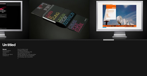
Un.titled.co.uk - creative design agency

I came across this site the other day and was thoroughly impressed.


www.un.titled.co.uk

Firstly, if the site looks good on arrival, normally by means of the colours, or typeface, and layout, I'm usually looked. Thereafter, if you have nice fade on/fade off and smooth panning of pictures, I'm hook, line and sunk!

They have worked for many reputable companies, to name but a few, Kickers, Nike, Lacoste Footwear... oh and NTU! They made the really good quality Art and Design handbooks they gave out on the Open Days.


Funnily enough, this is another example of a Midlands based group I've managed to find (Jam-factory). I don't know if it's just me, but I always presume good work, and so good folk always live and work in London, not from Leicester, my home town!


It is all in black, with a continual layout, so reflects a real professional feel (black has connotations with that for some reason). Furthermore, even the little touches of the over and off states of the buttons fading on and off, instead of just going on and off, make for a more qualitative look/feel.

In all, this has made it's way into being another of my favourites.

Un.titled definitely deserve being named - very, very good.

@

Wednesday, 21 May 2008

ingenious

I just spotted this logo and well, as you can see from the title of this post, thought it very good!


This got me thinking, because it's humorous little things like this that actually make a more noticeable impression when you first see the logo.

I remember back in 2006 (so so long ago!) there is was the introduction of the Punto logo:


At first I couldn't see it, but look again, and there's a little man sitting down driving! Ingenious!

As you can tell, I quite like logos. Whether it be shiny ones, clever ones (the FedEx has an arrow in between the e and x symbolising the next day delivery), or just nice ones.


But back to chair, the 'literal' design idea is actually very good if you can get it right.

Anyway, random post over.

@