Friday, 30 May 2008

Honda - Difficult Is Worth Doing

For the first time in a long while (apparently the heydays were the 1950s), Honda last night aired a live TV commercial. It arrived on my TV screen out of the blue.

What they did really pushed the boundaries for live TV and more importantly, live advertising. In under three and a half minutes, their skydivers spelt out HONDA and introduced us to their upcoming slogan: Difficult Is Worth Doing. I can associate with this tag line, it rings true for myself, definitely for Multimedia anyway.

The event lasted the duration of the ad break and afterwards, I honestly thought that that's how adverts should be. OK, it's costly to put on a full three and a half minute advert, but it was effective. Instead of the stop and start, constantly repeated messages that are played to us every break, this is was new, innovative and really impressed me. You sit up and pay attention.


Over the last few years, we've come to expect some interesting,
intriguing stuff from HONDA and this live ad will continue to carry
forth that reputation.

Part of the Identity module required us to form some sort of branding
for ourselves. I got quite into it, and enjoyed crafting my Identity
brand. Cut to HONDA and I have real admiration. They think totally out of the box.

In the past we've had the cog parts that all ran into each other and cause a chain of events:


This was definitely something that got you talking the next day.

We've had the choir imitating the audio of a car journey:


Recently we had a rubix cube inspired one, where they built a model of a car from blocks.


In all, I have real praise for the Honda advertisers. They break the mould for adverts, and not in a bad way. They make quality pieces of work. Admittedly it's not so clear as to what what they're selling (can you name three of their cars?) but the brand name sticks in your head, it has a following and a reputation now in terms of advertising, and I'd thereby assume themselves as a company as well.

So with the new strap line being ushered in, we can only hope for bigger and better things to come. I predict that in the same way I sat and watched their other adverts, on it ending, I'll think to myself - "wow". Well done, Honda.


@

prime creative - online web analysis

Another day, another snazzy Flash site found- Prime Creative

First things first, it is a feast for your eyes being rich in colour, generously sized and including motion effects.

This opening image reminds me of the
Pushing Daisies ident. I like this look. I've found it used before, and think the lush, natural scenario of blue sky, green grass blades contrast very well against your geometric, box computer screen.

Also, this may be one of the first few sites I've come across that uses full-screen Flash. It really makes a difference. Everything is big, you can see it all, and it gives it a commanding presence on the screen rather than the usual sites which are flanked with borders.

On clicking the links on the right hand side, the page flows down (or up) very nicely. This popular technique provides a sophisticated, professional feel when clicking and going to the desired section.

A sense of distinction comes with the change in image from page to page. The main page has the landscape look, 'about' has the artistic strokes/swirls, next are celebratory, party-like lights for 'creative', followed up by hundreds of buttons for 'marketing'! Again, these all dominate the screen, being large and detailed. A critic might note that these make the text more difficult to read, which is true, but it is all still legible. Just requires focus!


Design rules for websites usually lean towards using static layouts with continuous colour schemes. This provides an anchor for the user to familiarise themselves with whilst navigating. Here though, I don't think that by avoiding the same colour (by this I mean background) rule makes Prime Creative a bad site. By far, it lends itself to the site and works in it's favour.

The only downside I can find to this site is that the 'careers' section oddly links to a bog standard (and in comparison to what you've just experienced) bland page that merely provides an email address. This could be very simply updated, as it isn't too dissimilar to the 'contact' page where they provide details, in addition to a contact form. It dents the continuity which otherwise runs well throughout the rest of the site.


It was only on visiting this site that I learnt of the dba. Along with BPif, these are quite good credentials to associate yourself with.

In all, I like what prime creative are doing. They seem a little different to the boxy, geometric flash sites elsewhere on the net. I think their name goes a long way in confirming this - creativity is their prime motive. I

After seeing this, I think I'd like to have a go at full-page Flash. It seems so more in your face (in a good way) and really shows off the advantages of Flash - rich media content, online.

@

Thursday, 22 May 2008

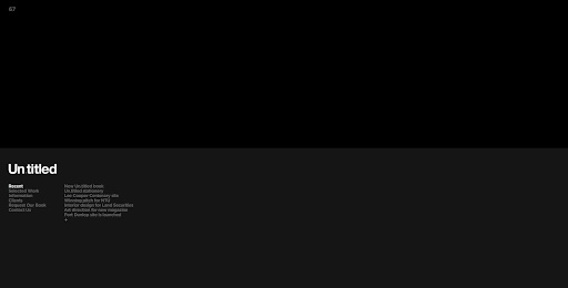
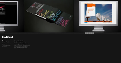
Un.titled.co.uk - creative design agency

I came across this site the other day and was thoroughly impressed.


www.un.titled.co.uk

Firstly, if the site looks good on arrival, normally by means of the colours, or typeface, and layout, I'm usually looked. Thereafter, if you have nice fade on/fade off and smooth panning of pictures, I'm hook, line and sunk!

They have worked for many reputable companies, to name but a few, Kickers, Nike, Lacoste Footwear... oh and NTU! They made the really good quality Art and Design handbooks they gave out on the Open Days.


Funnily enough, this is another example of a Midlands based group I've managed to find (Jam-factory). I don't know if it's just me, but I always presume good work, and so good folk always live and work in London, not from Leicester, my home town!


It is all in black, with a continual layout, so reflects a real professional feel (black has connotations with that for some reason). Furthermore, even the little touches of the over and off states of the buttons fading on and off, instead of just going on and off, make for a more qualitative look/feel.

In all, this has made it's way into being another of my favourites.

Un.titled definitely deserve being named - very, very good.

@

Wednesday, 21 May 2008

ingenious

I just spotted this logo and well, as you can see from the title of this post, thought it very good!


This got me thinking, because it's humorous little things like this that actually make a more noticeable impression when you first see the logo.

I remember back in 2006 (so so long ago!) there is was the introduction of the Punto logo:


At first I couldn't see it, but look again, and there's a little man sitting down driving! Ingenious!

As you can tell, I quite like logos. Whether it be shiny ones, clever ones (the FedEx has an arrow in between the e and x symbolising the next day delivery), or just nice ones.


But back to chair, the 'literal' design idea is actually very good if you can get it right.

Anyway, random post over.

@

Monday, 19 May 2008

Scribefire

Another browse through a second yr, online environment student blog and I found out about this neat little add-on for Firefox. Instead of having to go to blogger.com and log in etc, I am typing this at the bottom of my browser, whilst a video uploads to youtube, for example.

There are option to link a youtube video...


I can add an image from Flickr...


Below, I'll give it a tag...

...and above I've given it a title.


This will certainly make blogging easier on the fly, say if I find an article etc. Now all that's left is to press publish, and hopefully "bob's ya uncle".

@


InteractiviWii

http://news.bbc.co.uk/1/hi/technology/7264353.stm

Interesting thoughts around the idea of giving access to the user. It reminds me of the argument to do with copyright, or should that be copyleft?

It is slowly but surely starting to happen - homebrews are becoming available, online or Xbox Live in particular being a great example. And why not, who says you have to be an official Microsoft/Sony/Nintendo games developer to be able to make cool games for people to play?

Allowing home made content seems a more organic idea to me. Ok, it could be abused by people just making rubbish, but then again, it could also turn into a gold mine. Let creativity prosper!

@

Monday, 12 May 2008

slide.com

On browsing through the second year blogs, I saw a sliding banner that looked really good. Luckily, this really good looking banner is available for free at slide.com.

It is really simple to set up, there are several styles, themes, effects that can be applied, and you can pretty much grab images from anywhere (facebook, myspace, flickr, bebo, oh and the now old fashioned C: drive!)

I made a quick one with a simple sliding effect to showcase some of the colour and light images I collected for SPP1.

Very useful utility in my opinion. I predict it will be used quite a bit!

@