Wednesday, 3 March 2010

That thing called the internet... its caught on

JESS3 / The State of The Internet from Jesse Thomas on Vimeo.


The amount of photos on Facebook is alarming. What happens when the cloud gets too full? Oh thats right, Facebook will add some more servers!!

Design wise, the motion graphics flow on and off the screen fluidly, staving off any threat of dullness. The big type makes the content interesting and dominant on the page.

@

Monday, 1 March 2010

CSS drop down menus


Just what the Doctor ordered. And from a site I trust.

Client - clashing colours

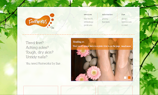
I've realised that through choosing orange contrasted with green I was limiting my colour options elsewhere on the site. On the top of the homepage I am trying to implement the phone number. After having used too much orange, I have tried to contrast with a green phone button but it looks awful.

I tried changing the banner than heads the slideshow. Here's what I mean:


None of these really go. For now, I've had to keep the all orange look.


Obviously the eventual pictures that go into the slideshow will affect the perception of the page.

Any suggestions?

Opacity in IE7/8

Debugging proves to be what a web designer spends most of their time doing.

On the homepage, the slideshow which demonstrates what people can expect to find on the inner pages uses an alpha value to apply opacity.

Unsurprisingly, IE doesn't yet support the rgba tag yet.

UPDATE - just realised that rgba is a CSS3 tag and so older Firefox etc won't even support it. This means using the less useful opacity tag which unfortunately makes all children within have opacity too :( Help provided here. The opacity damages legibility so I'm going to just provide a PNG for as a background-image.


I found a developer online who has coded a quick app to translate the regular background-color: rgba(229,124,19,0.7); but for Internet Explorer 8,

into

{background:transparent;filter:progid:DXImageTransform.Microsoft.gradient(startColorstr=#B2E57C13,endColorstr=#B2E57C13);zoom: 1;}
which you can stick in conditional comments for IE.
This works for IE8, but not IE7. Grrr

@


Goodbye IE6,7,8?

Todays the day that Windows users, XP through to 7 will get a popup asking them to choose a browser.


It's an encouraging move but ultimately I don't think it will be as effective as hoped. If you picture the typical mindset of a non-techy web surfer, they will know that the existing blue 'e' on their desktop means internet. It even says internet in its name. Furthermore, they will know the user interface and have their favourite sites stored.

Enter a window asking them what browser they want to use and most will cross it off. Hopefully the pop-up will continue to appear and make people choose. Alternatively, the user will see the familiar blue 'e' and they'll get IE8 which is a marked improvement over its predecessors. This is the least we can hope for.

Encouraging news goes to show that the quick adoption rate of Windows 7 which comes prepacked with IE8 has meant that IE6 is now the underdog Internet Explorer. Good riddance if you ask me.

Fingers crossed for this.

@

Client - mid-build browser testing

I haven't done it this way before, but I decided to look up the site midway through it's build and check it in the other browsers. It makes sense really, you can tackle problems as they occur. Development lesson learnt.

As can always be relied on, Firefox, Chrome, Safari all rendered as I wished the design to be laid out. Nothing really surprising there.


----------------

Opera seemed on the whole fine, but the line-height on the sIFR was off a little on random links. Nothing massive, but a little strange.


---------------

IE8 managed to tackle all the main site features well, which is encouraging, but struggled on the slideshow plugin. This may be a faux pas on my part. I used RGBA, a CSS3 feature I believe, and so this doesn't work in IE8. This can be easily remedied though by using opacity tag instead.


-------------------

IE7 starts the typical run of IE errors. The divider line is incorrectly positioned, top right for some reason. Bizarrely this doesn't happen in IE6? Also, the shadow effect that I have built around the main div holding the content continues off the page. This needs to stop when the main div does.


Again, the orange alpha layer has been omitted. I expect this to work when I use a special IE stylesheet and select opacity instead. That is if opacity works for IE!!

Applying a GIF with transparency and background-repeat:repeat applied does not work either. I believe this is something to do with how the slideshow code works.


----------------

Internet Explorer 6 again has proved the bain in the build process.


The background image doesn't allow the content div to sit on top. Instead it was found at the bottom of the page. The shadow effects can be seen bunched together above, and obviously don't work as they are transparent PNGs.

I'm actually considering whether to ditch IE6 support. With today's browser choice, users will be encouraged to update to IE8. I will try to get the master div to sit atop the background, but other intricacies will require extra attention. Then again, considering the target market, it could well be that they are the type of people who don't update their browsers and ignore security updates... ??

@

Client - book now buttons

The more I look at the word 'book' the more I feel like saying it like those up North.

In terms of suitability, I tried a range of suitable fonts:

Vag Rounded

Georgia

Nilland (the typeface used in the main design)

Steinem (popular free typeface doing the rounds at the minute)

---------------

These seemed a little too boxy, so I rounded the corners:

As can be seen I also tried using the contrasting green as I thought these buttons are important features on the page and so would suit being highly contrasted.

--------------------


I think these may prove too contemporary and not formal enough for the site, but I'm pleased with the peeled sticker look. If not used here, always useful on a different project. They would certainly stand out on the page, helped by the big bold type.

-------------

Shall forward to the client as part of a mock up to see which she likes the look of.

@