Wednesday, 21 January 2009

A browse for social networking sites

We all know the generic ones now - Facebook, and Myspace. However, after delving a little deeper online, I managed to find a few others which weren't as mainstream or polished as the big ones.

The first, ZigiMe, seemed to put over a very stripped back computer techy feel from the start, noted through it's visuals. To me, the use of green upon black reminds me of the very old school computer days, or the Matrix code. 


Clicking through to some of the sections, such as Browse, for instance, alters the green to red. Yet, the boxy/rigid look still remains. What comes as a surprise is the type of people using the site - it almost seems unexpected. Normal people! The rainbow use throughout the site does provide a little life, however I am not really into the boxy line look. It seems almost amateurish or for an era goneby. 

--

Then there's Google not so known effort - orkut. Apparently this didn't pan out too well, apart from Brazil.


As can be seen, it looks very much like the old Facebook. That might please some.

What I really like is that the photos of friends are are displayed on one side of the page, you don't need to click through several links to find the folder you want - I suppose this mimics myspace pretty well. This is something Facebook seem to have distanced themselves from, along with moving everything everything else to a set place, behind a tabbed menu option. I also like how the options are really clearly displayed on the left handside, they don't seem ambiguous which is another problem I found with Facebook - I knew what I wanted, but had to search through several menu tabs to find it. 

Unfortunately however, with applications like iFan and the ability to share photographs, Orkut just joins the list of social networking sites, as in, it doesn't seem to do anything different or specialise in a particular area/way. Perhaps being simple and clear counts?

--

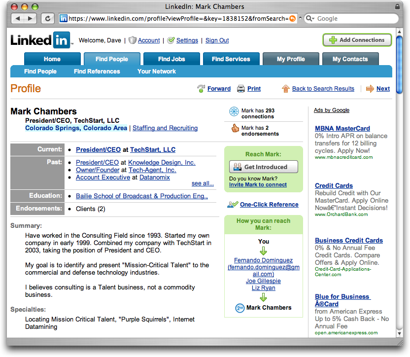
One last site seemed quite useful, in regards to networking. Linkedin.


It advertises itself very much in the same vein as all the others (FriendsReunited, Facebook etc) but then also has a section for finding yourself a job/careers advice through professional contacts. Interesting. And that was actually enough to get me to consider signing up! - Job done you might say in terms of the successfulness of a social networking site - the more members, the supposedly more popular it is.

In terms of looks I do find it to appear quite like a price comparison site, or on thinking about it - Play.com? I think that may be down to using the same coloured links for Adverts (right hand side) as well as internal links all in a similar blue. If those GoogleAds weren't dotted around the site, it perhaps wouldn't seem so overloaded with textual information - not enough whitespace for my liking.

It is clearly sectioned at the top - find friends, find jobs etc so the user wouldn't be confused in terms of where they should click. I suppose being business minded it doesn't wish to emphasise a fun/playful character, hence the more formal look.

--

Soooo, just from looking at those three examples it has helped me recognise what my expectations of a social network site are, what I like in a site and more importantly what I don't. - Focusing on the social side, I wish my site to not be too formal, or serious. I want it to be simple to understand, but have a nice modern, shiny, visual aesthetic. 

@

Web based typography - an article

One of Shaun's favourite things to comment on is the availability of custom/"nice" fonts for use in future versions of web design. Obviously at this stage in time, we're not quite there in terms of having the ability to embed fonts within CSS. 


I returned to my new favourite site, the webdesignerwall and found this article on that exact topic. It details all the methods that have and can be used... for now. 

Personally, I think Flash have got it right in allowing you to embed the font file in the swf, however we all know that even Flash isn't always embedded in everybodys browsers! 

The idea (that is working it's way through dev stages) of having an online font folder that you would sort of link in a 'ahref' stylee in your CSS3 code when specifying a font is logical, it's natural (if technological coding can ever be referred to as natural?)

For now, image placeholders will just have to do.

UPDATE: Apparently not just image place holders will do. The Pro Advice section in .net lists such a topic and provides three possibilities for typography replacement methods. 

One that seems useful, but also importantly, is achievable for myself, is sIFR. However the thing that makes that seem a little limited is that if the user has no Flash then it no worky. 

Then, (and I feared I would actually need it at some point) there's PHP and Javascript versions - dynamic text replacement. 


...but I now don't love the convoluted method to get it to display!

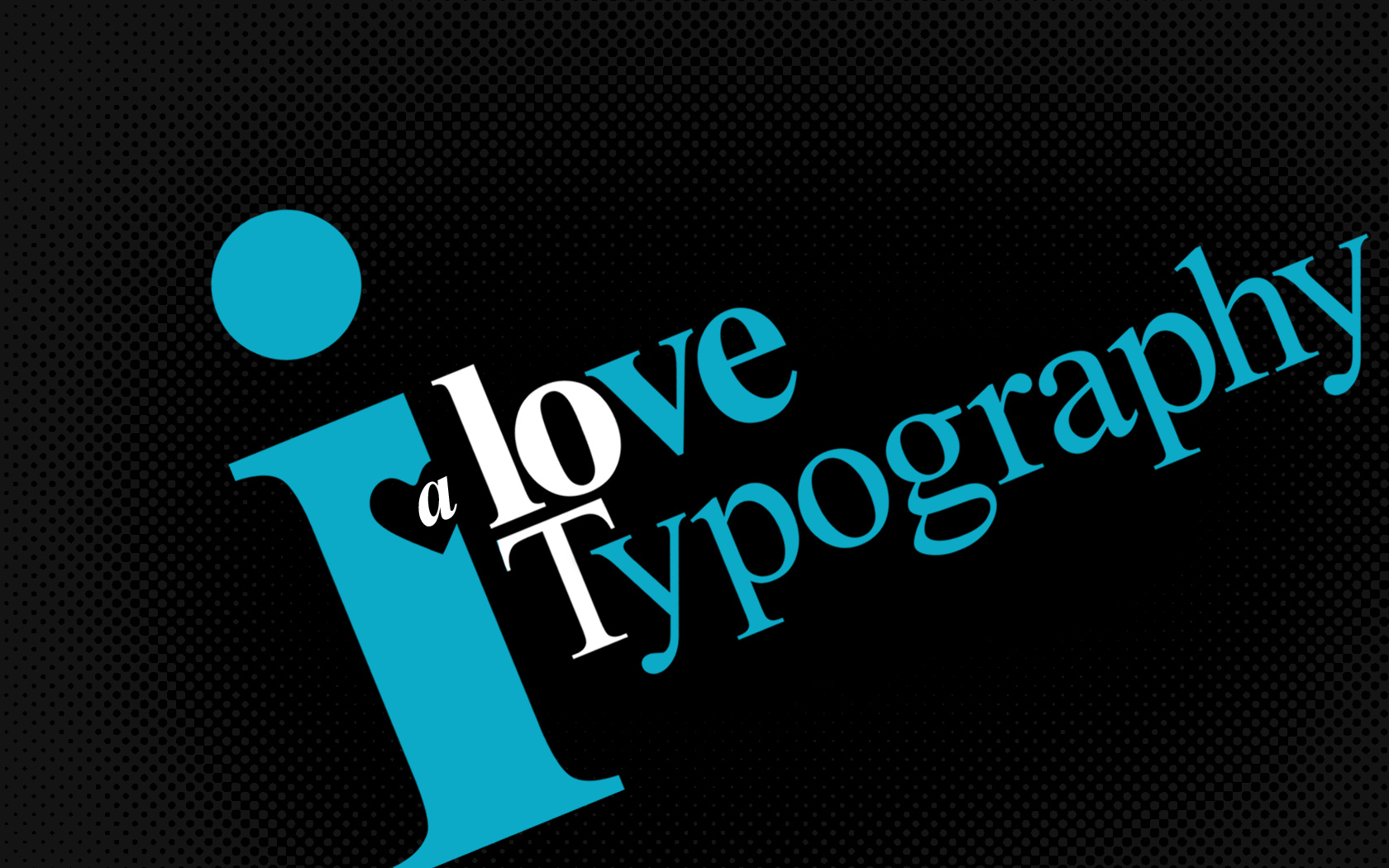
On the whole though, it's now quite true. I'm now a big fan of character based visuals. The arrangement, the colours, the form of the fonts, the weight... so much choice and so much variation that can come from it. And that's only using our alphabet. Try Arabic. Or Japanese.

@

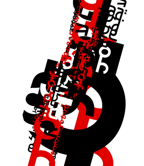
P.S. Whilst we're on the subject, I love this example of typography, the blurred effect makes it seem quite psychedelic (and yes, again, the colours attracted me!) 

Monday, 19 January 2009

Redswish (plus others) - web design blogs

After browsing through quite a few of the pages on ImgisEverything I came across a decent blogger and found his content to be suitable for me in Online Environments.


Redswish Give it a read, he covers more or less everything: design, markup, commerce, applications...

What I'd like to comment on is his post on Improving Yourself as a Designer.

As a student we have the time to experiment with all kinds of different methods/approaches to find what learning style we work best with. Redswish provides you with loads of different approaches, and the one that stood out to me was Reading, and more specifically telling us to 'have them open on your desk, read on the train, in bed, wherever…' It is so simple, but true. I buy the books, but then until I need them, tend to stow them away. So I'll now have that attractive PHP book by my side, whilst blogging! 

"My target" (as we used to set ourselves at the start of a new term) is to everyday find/follow sites of inspiration. Try out their tutorials, explore the news items they post. Basically, immerse myself in the world of web even more so.

I really liked his recommendation for inspirational site the Web Designer Wall.


All I can say is, what a beautiful site. It is so instantly striking. I love the use of colour, the flow and curves of the large ornate hand drawn background image. This hand drawn, craft like, paper look seems to be very a la mode in 08/09. 

What I perceive to be a great design decision is have further on down the page coloured hues behind each post title (&intentional or not, but colourful ad boxes, which feed into the chromatic visual style). This works well, it continues the styling. Some pages can have an ace header topping their page, but this then doesn't follow through once you scroll down. 

Also...

Courtesy of the Web Designer Wall this post  probably no web designer should go without looking at: The best CSS of 08. I could pick at least a handful of sites that I couldn't and wouldn't want to change (Viget Exchange, Design Disease, Tennessee...) 

However, I think I may have found my achilles heel for web design, my calling - large background websites. 


SURF. The hues of the sea make this site appear really vivid, strong. The large image instantly draws in the eye. You then walk in from the sea, to the sand which blends perfectly with the background colour of the content - an excellent example of effective imagery.

To me, the use of a large heading image provides an overall theme to which it is then much easier to add your individual design elements. 

We are told to find something that really interests us. I think I have.

@

Sunday, 18 January 2009

Web design CV/Jobs blog posts

I'm in the process of writing my 'focused CV' which will be used to hopefully get me a bit of work experience in the holidays. 

I came across this great site which has several posters relatively new to the web design scene, but then also employers of the scene, who share their ideas/experiences/know how. 

I found it useful as it isn't some government correct info, it's real people talking in a real way.


Plus the comments are worthwhile reading too. First thing I'm going to do is switch over to my domain name email address.

@

Friday, 16 January 2009

Great visual advert - Nokia E71


I saw this advert, and on the first watch, perhaps even the first few seconds in, knew it to be brilliant.

The way the individual letters from the words all float back onto the page, the to-ing and fro-ing effect when it represents communicating, the electric city feel that is presented through the cool blues. In all, I was drew to this advert through the vibrancy, fluidity, and colourfulness of the motion graphics.

What was surprising is that it is promoting a new Nokia! Regardless of whether it is suitable, it caught my attention and it's message worked on me due to the great visuals.

@

Tuesday, 13 January 2009

Online web analysis - recom ad agency

Long time since I did one of these and with so many different analytical aspects to consider sites with now, I thought I'd catch up with what offerings the FWA deemed worthy of site of the day.

Of everything I flicked through, this one (recom) caught my attention due to a unique selling point that is actually quite brilliant. 

Now you could just stick all your posters, postcards, billboards etc online in a catalogue style. Yawn. Who hasn't? Or you could organise everything by the color it uses, and not just broad colours as in red, blue, green, how about r354 g38 b11? Yes, they have.


The Structure Principle -

The unique aspect of the site, finding by colour, is navigated using the colour cube on the right handside, this is reasonably easy to pick up and proves a good idea rather than a gimmick. 

The main menu for other categories heads the page at the top, hidden away at first but then appears on roll over. Other random menu options are placed around the outer space of the screen. There seems to be a little inconsistency about the placement for this. 

The Simplicity Principle - 

With no instructions immediately, you sort of have to find out for yourself, but after a few tries on the colour cube it proves a really straight forward approach. The only downside I can forsee is if someone wanted a specific ad campaign, which they knew was in green, but then clicked on the wrong shade of green would prove frustrating. 


There are categories tucked away behind the main menu links, but these seem non intuitive compared to the colour cube, sort of a long laboured approach!

I would have to criticise the size of these menu items too. You find yourself having to squint. If you struggle to use a site, you'll often find people just won't struggle at all. They'll leave.

The feedback principle

The site being Flash based has a number of wipe on/fizzle on animations. The colour for such menu options mean they are noticeable, 

The loading bar is placed at the top of the screen on first load, this is found to be a new position and liked it. People with lower res screens may miss all this though. WIth the files being quite high quality it takes a second for two for them to load. In the mean time you are displayed scrambled TV screens. Again, an unknowing user may think it to be a fault. However, in terms of audience, you would probably expect a certain type user to be viewing such a site, somebody who is probably aware of visual arts, perhaps a little tech savvy, and so this shouldn't prove too much of a problem.

The re use principle

The layout is consistent throughout, along with the interactive features. The colour cube is always on the right, can always be swivelled etc. 

The animation used to enlarge the thumbnail images remains the same throughout, and ties in with the main menu, by using the same dust formation look. However this is only in the Portfolio section. 


Click through to the About Us section and you'll find a cover flow sort of design. Then on another section you are shown a slideshow of images. These are all valid and contemporary methods but does put a slight dampner when considering consistency.

The tolerance principle

As I mentioned before, the small text options may be off putting to some and with it being Flash, user accessibility isn't considered the top priority - no zoom function.

Furthermore, on the new section, it only gives access to three further news links and you are required to scroll down to view more, so one click means another one link for you to click.


This seems to a step back and is probably something that I would try to address. Once you then click on an item, it isn't obvious in how to return to the menu, even with options provided on the left hand side. 

Overall...

In all, I like this site for it's main selling point - the colour cube. It's unique, and actually works. When you click on a colour and then find that the work that appears is in such a shade it seems quite wow-ing.

@

Thursday, 8 January 2009

Wordpress

Over the holidays the task was to get Wordpress up and running.

As far as I was aware, Wordpress was just another variant of blogger, but with more user modifications available, as in, could take the system's workings and install personally.

So, on learning that I could and Shaun wanted us to try, I had a go at installing on my own server, which comes courtesy of the package I use, provided by one.com. I got as far as logging into phpmyadmin, but from then on it was all a bit over my head/ I don't have that much know how for php so didn't manage to create a new database.

So, using the simpler online version, I managed to set one up, and then tried some CSS changes.


The difficult thing I found was knowing what each of the CSS tags referred to. Having not made the site, I wasn't sure what each tag specifically covered. So it was a case of random changes to the colour, size, font etc on any random tag.

@