Sunday, 30 March 2008

Remember your A B Cs? - little game

I've been playing around and have come up with another little interactive game. I've called it 'Remember your A B Cs?'


This time, instead of focusing on the colours and how it all looks (which is what i did in the first game), I paid attention to the actual gameplay, making it more like what you'd expect from a publisher. You can't just click randomly this time and get away with it!!

It was a hassle at one stage cos Powerpoint just wouldn't refresh the slide builds, but several attempts later and I've got round it. A OK (at least, I think it is!)

When you click the link, it's best to save it to your computer, as opening it in the browser doesn't always work (pages get stuck).

So anyway, brains in gear... focus... GO

@

Saturday, 22 March 2008

Publicis & Hal Riney - online web task

After persuing a few more favourite web award sites, some good, some ok, I have decided to plump for a comment on this site - HRP, or Publicis & Hal Riney. These guys are a new media group, just generally wanting to showcase some of their work and unique (so far in my experience of the online world) experiment with the navigation methods.

And so, the unique thing with this site is that you can navigate by mouse, or... webcam and hand gestures!


So rather than just the traditional affair of click here, click there, instead you can wave your hands about like a goon playing Wii, or using the Eyetoy, and try to find your way through.

I did try webcam, and I can see how it would work, but unfortunately, the site needed more bandwidth than what I could offer, so had to give in for the trusty desk rodent (that's a mouse.) Plus, for me, websites shouldn't be frustrating, they should be alluring. And this alternate method would probably have annoyed me, by being an unneccessary gimmic (and that's coming from me, the Nintendo Fanboy who loves the motion sensitive interactivity and navigation of the Wii!)

Once you are in, you are shown a visual animation of something which instantly strikes as being blood! It oozes onto the screen, floating around as if diffusing through water. It is a very nice looking animation, quite captivating really just watching it float around.


The site oncemore ditches the traditional left hand side, or top navigation bar (hey, it's the future) and instead creates it's own solution - it embeds links within the blood. You hover your mouse over and the link associated with that area of the image appears.

This is where I'd criticise the site, though. When you first start, you are given no indication of what to do. You have to guess, and what with the subtle colours schemes used (beige, and white) it is quite hard to see what you're doing. Add to that a slow connection and this thing would be a nightmare to look around.

When you get through to the leadership section, again, the site has something a little different. Instead of just a still picture of the person and their biography, HPR have a video which sits on top at the right of the screen, and actually shows the person doing something. OK, it isn't fundamental to the piece, but it's a nice little extra. It hints at the things that we might see in use, in future new media pieces.

On first look, you might just think that they simply have one page, which is about one man. However, clicking on an arrow on the right hand side of the page brings the next biography onto show. It does this by horizontally 'swishing' (technical term) the information onto the screen from the right.

->

Looking at these screens, you can very much see that the site is similar in looks to what you'd see in a graphic design magazine. It is all quite minimalist, with striking typefaces and layouts used, along with the unusual graphic of the blood, splattering at the bottom. Personally, I think it's not perfect for a website, as I've already mentioned, it's hard to find the links to click on the navigate around. This is fundamental to the success of a website, so perhaps a stronger contrast, colourwise, would work better.

Having explored the site though, there is some familiarity in terms of navigation. HRP have a sort of progress line in the bottom left hand corner (hard to see again, courtesy of white being more or less indeterminable with beige), which allows you to navigate to, for example, home - work. These are working links and I really like how hovering over 'work' brings up the other menu options. Obviously this sort of exanding menu is now often used in websites, but the geography of it, how it was in the bottom left, and the menu expanded upwards, is what I noted and liked in particular.


When considering the branding being reflected in their product, I would say that certainly HRP know how to make a good looking, attractive, and somthing visually alluring. However, the issue to do with navigating means this site would, within 10 seconds, lose a number of inexperienced users by not knowing what to do. OK, there is a help button, but who wants to read instructions on using a website?!

In terms of target market, I'd expect customers wanting a high calibre of graphically acute design to be able to manage to get through and find the information they want. Yes, it makes a site so much more when it looks stunning, but not being able to see the other amazing techniques used and so on, because you simply can't see the arrows, is a real error of ways. Therefore, colour schemes and seeing what you are meant to do is fundamental, to the successfulness of a site... so memo to self: bear this in mind!

@

Friday, 14 March 2008

logo creation

For the presentation at the end of part 1, I made up some doodles of possible logos. Some were just playing around with shapes, some with letters... and results wise, some were good some were bad!
.
First though, I put in some market research, looking at proper company logos etc. And being as I've done one for pretty much everything else, new craze and all, I made a moodboard!
.

.
Of all these, I liked the SKY logo - reason being that the glassy, shiny effect always catches my eye when it's on tv etc. It looks nice. And this seems to confirm to me that I'm like a magpie - attracted to shiny objects and wanting to steal them! (but in Multimedia terms it's not stealing, it's a form of inspiration!) OK, the actual graphology of the letters is pretty basic, but I would note that the k and y join up, so I looked into this technique when sketching.
.

.
Of these, I like the pitchfork one, it reminds me of a devlish brand or something (Bacardi maybe, with their bat?) and then the digital joined up, (almost neon shop light type) ash. The other one I can see as potential is the circles with little tails, making an a and e. Andy too picked up on this, saying that it could be make quite funny, with eyes in the middle!

So to help confirm a decision in a logo to go with, I 'digitized' the potentials:
.

.
These are very simple forms, a step up from their paperbased cousins - just simple black lines.

.
The problem when making a logo is that you tend to focus too much and after a while you see past what the actual image is and just see a hash of lines that don't have much semblance.
.
So I did a little survey asking for preferences and the curly ae logo came back the most popular.
.
This is when I stuck a wall. What could I do with it? Should I work in a symbolic object that is reminiscent of me in some way? Should the logo just be letters, but in different colours? Should it have a background?
.
I basically started playing around. The first results were rubbish, but when I hit on something I liked, it fitted instantly.
.

.
With these going nowhere, I went back to thinking again. I came up with thinking of some of the recent and popular design schemes used. The one that hit me was the Wii one. They use a three colour palette: striking light blue, grey and white, and then applying these colours to circles that resonate from the text. From the sample I made, I knew I was definitely going to use this route.
.

.
I really like the way that the circle's edge tapers out at different points. The whole thing has a ripple effect feel to me, or maybe when water goes down the plug, that little cyclone.

I continued playing and made several other variations. Some have had the circles shifted so the 'opening' is in a different place. I included a few more shapes to add a different point of focus. One I've emphasised the a e by making it bolder and hopefully drawing the main attention there.
.

.
It's really quite hard to choose a favourite. Each time I look at them I find something I like more in one, and then something I don't in another. Next look and it's gone and I prefer this over that one! It was totally unintentional, but I think the star logo above bears a very slight resemblance (typeface, icon) to the macy's logo?

I like the whole contemporary look, something sleek, modern (perhaps slightly minimalist). It was suggested in my progress presentation that I should try and garner/develop my style. If anything, the above description I think suits me extremely well.
.
Any comments or suggestions from you, I welcome! I'm more than happy to try something if it means making it better.
.
However, after reading Bryan Lawson's book How Designers Think and reading about the evaluation stage, he says that work doesn't have "an identifiable end" and it's always possible to do better, until that better is not negatable much more!
.
So for now, that's one task of part 2 completed and I'm very happy with it. I've found I have enjoyed the logo making process; the market samples, the doodling, the putting it together on the computer and playing around with shapes.
.
It'l be just my luck that a brief comes out, or I read something that makes my logo seem inappropriate.
.
@

whitevoid - online web task

Whitevoid are a great example of multimedia practitioners. Their site suitably reflects this by being really dynamic and subsequently highly efficient (to me anyway!) to showcase their past work projects.
.
The company set out to be a modern, professional interactive and graphically designed body. The site seems to use a primarily visual basis, keeping textual information to roughly one slide out of six. This is probably the best approach as most of the time, all we want to do is look at what they've made, not be grossly over informed at long length, the theoretical background, inspirations, artistic contributions, it's positioning in society etc etc.
.
You are presented with a light airy screen and then the main whitevoid box/catalogue/whatever it actually is. From the off, the site clearly breaks the mould, ditching the traditional navigation bar with home, contact us, products, terms and conditions and instead you simply get home and back in the top left hand corner - needless to say, I found these obselete as the site is so well designed, you simply do not need to use them.
.


It is organised in a familiar setup that computer users will recognise: an expanding folder setup, sort of like a tree diagram or heirarchy. You click on the main folder and it gives you the next folders to choose from below. These are all sectioned thematically, and so you know what to expect when you open that layer. And indeed, when you do so, it all happens very smoothly, giving it a well made, professional feel. It's quite flashy and shiny too.
.
.
An interesting thing about the whole piece is that it is set on a sort of 3D axis, so that if you put your mouse in the outer parts of the screen, the 'camera' will pan to give you a perspective from that angle. It's pretty cool, but sometimes gets in the way when you're trying to look at something and the camera is still swirling around.
.
.
When you click on one of the images, it brings up a larger view of it, whilst still still showing the surrounding images and if you decide to choose them, the camera will swish across to show you. Alternatively if you click on the blue background, it will zoom out and take you "up" a menu level. To me, it all very much makes sense and would too, for an inexperienced computer user.
.

.
One particular thing I fought was ideal is that if you want to just go back to a specific location on the site, you can click on the required box, regardless of where it is in the 'stack' and straight away you get what you want. In normal websites, if you want a previous menu it can sometimes mean going back and forth through several pages - time consuming and inefficient when compared to whitevoid's solution!
.
Admittedly, some websites use a text based scheme which displays what sections you have clicked through to get to your current position. However, I think it is the visual layout which brings it all together, as you can remember clicking on that specific icon etc and it just seems simpler to understand.
.
In regards to interactivity, nowadays interaction is all about being suitable for the user, and simplicity - their site is this. We get videos, the swirling viewpoint, the clicking of links to sections (again pretty much the standard fare for browsing a webpage, yet this time, in a unique and successful manner). It lends well when thinking about the work they produce too.

Any mention of easy navigation this analysis simply contributes to the image of the company and the associated philosophy for good interaction: understandable to the audience and easy to use. If you were to look for a company who could make a Flash based site, and make one well, you wouldn't doubt Whitevoid are capable and talented enough to do so. - The best public image you could hope for!
.
@

Thursday, 13 March 2008

samsung giorgio armani - online web task

The site I'm focusing on today is the one mentioned in the title - the collaboration between Samsung and Giorgio Armani, in the form of a phone.
.
However, this is a fashion themed product, and with the criteria of Armani to boot, it is evidently clear that the site seeks to look highly fashionable, well designed and good to look at, in a sophisticated, classy manner. There are swirls and curves in the background, as opposed to refined geometric shapes which would be used for a clinical, straight cut look. It is clear that the years of expertise that Armani have garnered has not been overlooked here. They know their brand identity and they know how to craft it.
.
It is all very chic and sophisticated with beiges, blacks and cream colours. Before you are even presented with the main design of the site, you hear a piano and violins playing music, this being an even greater signifier of the ethos to expect. The option to turn it off was available, but the audio was in keeping with the site and didn't jarr too soon, so I left it on.
.
.
The navigation of the site takes place within a central bar providing the links. I've never seen a setup like this before, and it is a welcome change. It seems more natural to place it here, as you aren't needing to look all around for the links, they are just smack bang in the middle. They are all sectioned in an appropriate manner, relevant, and on clicking one of the links, the screen has a wipe effect which horizontally fill the page and leaves just a thin horizontal line, this forming the loading bar. These motion graphics are very pleasing to the eye.
.
.
On finishing loading, the page then sophisticatively wipes out to reveal the chosen section. The nav bar moves a little further down the page, but again, is still easily locatable, more so than other layouts, I think. It makes sense in that, on a web page, once you read the information you tend to be looking at the bottom of the screen, and so having the navigation here is more logical.
.
.
Once you reach the section, again, it all very much is in fitting with the branding of the product: elegant, classy. You are provided with a few more mini links accompanied with photos, to show what you can expect from following that route. Alternatively, at the very sides of the screen, are arrows, which can take you through one by one, to the next page of the section.
.
When considering the branding aspect, this site is very very clear. It has a real professionalism to it - the site is dealing with a major fashion brand Armani and so it has to be.
.
Even the minor touches and effects aren't independent, they too build the bigger picture. For instance, the downloads section lets you download a wallpaper. When choosing one of the pictures to enlarge it, the others too are emphasised, by resizing; the line of images gradually growing, leading up to your chosen image being the largest. The process of this is all very smooth, and again, reinforces the sophistication and elegance of the site.
,
.
In terms of interaction, there is as mentioned above, with the little effects that just make it all the more immersive. Furthermore, there is a 360' 3D viewer, so you can scroll around and see the product in it's totality. The general clicking and following around the site is interaction, but the expected for a website.
.
Overall, I think this site pretty much has nailed branding being reflected in the site. One might quibble that it takes a little longer than would be liked to get to the information, what with it being quite minimal, and making way for the graphical design. Yet, still, it has set a high standard for me now, when looking at sites in the future for analysis.
.
@

Tuesday, 11 March 2008

Completed: Super Paper Mario World and the Video Glasses

At long last, just ahead of presentation today, I've finished (and more importantly) and I'm happy with the completed movie. And here it is....


Being honest, it has taken so many renders! And renders is themself take soooo long. I must have done about 6 renders which take about 4 hours of the walk through part in itself. And each time I'd get a new version and notice something slight and want to change it. For example, the coins weren't as alligned as I wanted, or the rotation on the goompa wasn't enough. So change it I did and render again the computer did. Poor thing has been chugging away day and night for over a week!

My favourite part is where the glasses' videos kicks in. I was going to leave the soundtracks out, but then I thought the Mario music was too much for too long, so I set about including the respective title audio. And here's when I met my next problem! I had cut the titles short to fit in with time available from the pan of the camera. So just playing the audio that came with the video meant it was choppy and didn't sound good at all. So using my direct encode on my MP3, I copied the full title audio and got to work on Audacity, cutting it down, blending bits.

But now it's completed, adding in the syncing with the rythmn of the music at the end, and using a GAME OVER screen I am really pleased. It is lively, it is Mario, and it is all of my creation (apart from the Goompas, I couldn't tamper with their iconic image!)

Even the little touch of putting the glasses on the goompas, something that was suggested in a surgery session, is a neat one. It pre empts the arrival of the glasses at the end, whilst also being a funny addition when you first see them!

Needless to say, this hasn't gone without hitches. I had problems getting Movie Maker to publish the movie in DV AVI. For some reason, it would get to 52% complete and then just stick. So after several failed attempts (can you tell I've been at this final competion stage for quite a while!) I published as an WMV and then converted to DV AVI using a program called Stoik. Technology, ain't it a right pain when it need it not to be!

If I were to change anything... (thinking about it).... I think I would like to expand the environment. OK, the focus was on the avatar, but the environment accompanies it, building up a bigger picture about my identity, so with a little more time (and more material channels please Autodesk!) I could have done the underground section underneath the pipe?

For the video glasses, I would have liked to successfully curve the lenses, making them look even better and more realistic. However, when trying this, I found it disorted the image of the video, making it look really poor. So flat screen was the way to go.

So now for the presentation. Fingers crossed all will go well and nothing will be randomly deleted as I attempt to burn the disc... it has happened before, so I'm taking no chances.

@

Online web task

As part 2 of the Ident module goes, we're required to swap there for some website analysis.

The first site I've had a look at is the Sony one, in particular for Blu ray.


In all, it is a very stylish site using three distinct colours: deep blacks, illuminous blues and distinct white for the text. It is eyecatching, and I like how the components of the product -the blu ray lasers, also double here as a decoratice piece in the background, being aesthetically pleasing and interesting.

There is a simple navigation scheme, with three routes to head down. These are accessed using the large buttons at the top of the screen, pretty much like most website using a header navigation bar. The scrollers to read more text stand out from their design and too make it easy to understand.

However it does steer away from the typical website where we tend to use the back key, as it instead offers it's own RETURN key which takes you back to the previous menu options. From here, you can expected to use the three primary navigation buttons at the top.In addition there is a hidden menu banner (offering the last menu you encountered) that appears once you hover over it, on the right hand side of the page. - This could prove a little confusing, with things popping up randomly, maybe being perceived as lacking consistency. One direct and clear navigation system would be better.

The information that makes up the site is direct and to the point. There is no waffle. It tells you about the new technology; the whys and what fors. It tells you what machines you can buy to play the content, and then also the content that you can buy to play. Personally, I like this approach. You understand where you are in relationship to the whole site, not instead, being two paragraphs through a massive trawling long website, for example. However, I could criticise the site for not having any details on pricing and so on. However I do appreciate that this is more an informative/promotion/marketing piece teaching us about blu ray rather than being about buying it there and then.

The branding of blu ray is entertainment like.no.other. But it is clear that Sony are also trying to pitch blu ray as the futuristic technology we all should adopt. Hence, the website too appears futuristic. Furthermore, high definition is credited throughout the site for it's clarity and precision, and I think this reflects in the site too - it is high quality, whilst the information is clear and easy to understand the information - perhaps using a slight spin on the clarity idea then.

In terms of interaction, the majority of the site is a click and follow affair. You click on the tab you want, it loads up the screen and then you can scroll through the simple text presented. As mentioned earlier, there is interaction with the appearing menu too, which sweeps on and off, depending on the location of the mouse.

In all, I like this site, and I think the main thing that draws me is that it is eye catching and looks very attractive, very modern. The information does seem to come as a second, when compared with the visuals displayed. I sort of expected when visiting this site to get a web based version of blu ray, what with the layouts and effects used, similar perhaps to that when you play a blu ray film. I know I want a blu ray anyway!

@

Friday, 7 March 2008

there.com #16 - So long... farewell...

For the last time, ladies and gentlemen, the there.com ship has set sail and after this post, atlasalone will floated around needlessly in cyber space (unless I'm so bored that in 10 years I need to reminisce and remember the time I spent as a student!!) ha ha!
First of all, I have visited a new place now available on my Favourites, called Round the Rim. On landing, I couldn't really fathom it out - where was the rim? And I couldn't figure what was straight in front of me either? Any guesses? Tropical jail? Lion cage?
.
.
If you look at the enlarged thumbnail you'll be able to see that apparently it's Dragons lair. Now unless somebody is going to fly down from the sky landing with a flaming red mythical beast, I'm not going to believe this :P
.
.
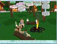
The tropical jail idea wouldn't have been too unsuitable for this lot that I decided to chance my luck upon a decent conversation with. People can always be found at Cosmogirl village, and they always seem to be deep in a conversation each time I arrive on scene. This being the last there, I thought I'd at least try being sociable - I was sort of stunted when black_goddess sitting opposite me started spouting about her friend's drug addiction and how her four children have been taken away. Oh and I musn't forget that she's been on her own since she was 14, she's done weed and speed or whatever she mentioned, and now she knows about the world, she knows what its all about. I couldn't stick around listening to her "dis and dat, and dey and iz". I did chip in that not all the world is like that, to which she uttered something and asked if I "feel her". No I do not. Luckily I only have to come across her in the virtual world, maybe she's better off there!
.
By no means of a pun, I discovered quite a few little easter eggs in there. There was this actual easter egg at the top of a mountain...
.
.
There was this little gnome, just minding his own business. My avatar looked very happy sitting next to him, perched on his own rock. Not a clue why!!
.
.
Then there was the more surreal, you might even say cosmic?
This random board was next to a massive praying buddha. I couldn't interact with it at all, but it caught my eye and so did achieve something. Maybe some swinging 60s folk created this in a nod to their favourite tye dye ways?
.
.
Just behind the cosmic billboard in the same 'lot' was another bizarre addition. It's kinda a given really then. A massive tinted photo frame type thing. You can see from the pic that it's rose tinted - more swinging 60s? It reminded me of the advertising campaign Vue cinemas used where they had people looking through the frame and slogan 'enjoy the Vue' i.e. at the cinema. This frame certainly puts a different light, or should that be shader, or toner on things.
.
.
And before you say anything, no I wasn't still looking through the frame at these trees! They were pinky purpley and bright red. This is all quite normal in there don't you know, me being quite the quite experienced therean now, I've seen many a purple tree in my time!! lol
.
.
Lastly, a nice little catch I found was this airport and helepad setup. I thought at first that somebody had just made some massive big steel tents, but the bird eyes view revealed all (and the two massive H's painted onto the tarmac). It'd be cool if I'd caught people flying in and landing here - takes me back to my Flight Simulator 98 days!
.
.
Oh and I couldn't leave without an animal mention. Here is a bull, with massive horns standing in the sea. Why? I don't know. But it looks the American breed, so maybe the answer lies in our friends over the pond?
.
.
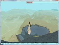
I learnt last time that I was now an Avid Boarder, so could partake in all sorts of hover board goodness. And dang nab it, it's on the last trip that I learn I can do tricks, Tony Hawks styley.
In the pics you can see me pulling of a 'scissor kick', a 'superman' and as confirmation of my amazingness on my board, my avatar punches his fist in the air once you land successfully!
Needless to say, it took quite a few attempts to pull these tricks off. No bumps and scratches on my avatar though, they haven't fought of those yet! :P
/


It's true to say that I've been quite a few places in the last 12 weeks. I started off with a marginally small choice of digs to visit. Now though, that list has grew and grew, and I can visit (are you ready?) Bali Hai, Pool Narcissus, South Tiki Lookout Tower, Hover & Flutter, Slalom Ahead, Zephyr, Sorocco, Malihini, Karuna Plaza, Mirage, Ventrella Cafe... want me to go on? I get the hint!
.

And I didn't give up on my exploring ways that soon. I set myself a last little exploring challenge. I started at the bottom of a ma-hu-ssive mountain. My job, which I chose to accept, was to get myself all the way to the top. Who knows what sort of flags I'd find up there. (I'd pledge my bet on an American one, they're everywhere!)

.
So quite a few air miles later, I reached the top and I was literally, on top of the world. (And yes I am slipping down the side in this picture - quite a plunge.)
.
.
On top of the mountain though, was a sign pointing out North, South, East and West. Hey, it would have been useful if I'd have found this before so I could have known which direction I was heading in, on my treks. Needless to say, the irony that lay in this construction piece showed that I had indeed come to a cross roads in my there.com life, and sadly folks, I didn't head North, South, East or West...
.
.
I headed out.

.
Mission accomplished.
.
@

Wednesday, 5 March 2008

avatar and environment - getting close to fin

Right, I've not posted that much of the latter stages of making my avatar and enviro. I've been quite busy, fiddling, fixing, altering small things. At this stage in time, I've more less completed it all, the camera paths are in there, but I've a few days left before rendering the definitive edition.

For my avatar, I couldn't decide on the layout for the video screens.

-Should I have two screens that show the same thing, i.e. one for each eye?

-Should it just be one large screen?

-Should it be more than one video playing, i.e. a different video for each eye? - obviously this wouldn't work practically, but for the purpose of the project, it would showcase my TV likes quicker


(What's noticeable here is that the two screen effect requires stretching seperate planes and so the actual video images has become jagged.)

I've decided on the one screen layout, it's how we see things - we don't percieve seperate images from each eye when watching/looking at something. Also, the one screen layout is larger, meaning the video images are easier to see, showing off more of their glory.

I added the turbosmooth mod on the loft, so all the small imperfections are nicely blended over, and it looks a very nice package altogther. Of everything I've made, this is what I'm most pleased of aesthetically, it is my favourite creation so far - the reflection of the lense coupled with it's slightly metallic feel, the metal arms, the plastic nub things that sit on the end of the arms are slightly opaque as they are in reality. Lastly, the video screen looks really good, they haven't degraded the quality of the video. Although technically speaking, this is all only the size of a pair of glasses, I've used the largest layout possible, and as with TVs and so on, the bigger, the better! So overall, I'm very happy with my 'video specs'!!


--

Meanwhile, when I've been making this environment, I've only been looking at it from a certain angle. Obviously the camera moves through and sees what I have been seeing. It's when the camera then turns back on itself and you see the black workspace of 3D Max that I've realised I now need to stick in another wall and add some more clouds!

For now though, here's the storyboarding that I've roughly drafted, just to put down on paper where I wish for the camera to pan through. Then also below is the actual first render I made. It's not compete, as there are two parts to my movie. The first walks you through and finishes at the coin box. The second will have the video glasses appearing and spinning round, for a close up look.


What I plan to do is use my mp3 player to capture the jingles and sound effects (for example, collecting a coin, or jumping) and then I will overlay these sounds for the final piece. It should add to the character, it's all very lively, jingly and fits in with Mario, but then also with me, and my identity!


So a little more tweaking and then I'll let you guys see the final product.


@